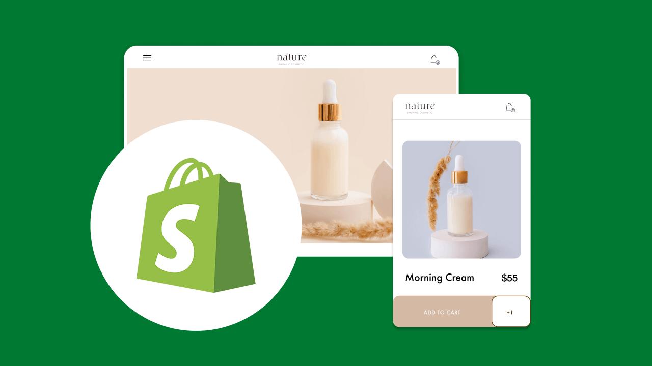
You launch a Shopify store, and traffic looks promising but customers drop off before they buy. That frustration often comes down to Shopify user experience — navigation, product pages, page speed, and checkout flow all matter, which is why choosing from the Best Shopify Page Builders can change your outcome. Want to cut bounce rate and raise conversions? This article shares clear, practical best practices, including layout and content hierarchy, call-to-action placement, mobile optimization, A/B testing, heatmaps,s and analytics, to help you turn visitors into buyers. PagePilot's AI page builder makes those tactics easy by creating fast, responsive pages, simplifying checkout tweaks, and giving you templates and testing tools so you can focus on improving user flow and conversions.
Why User Experience Defines Shopify Success

User experience on Shopify encompasses visual design, site navigation, checkout flow, page speed, mobile optimization, and the ease with which customers can find and purchase products. Every click maps to a point on the conversion funnel. When the UI, information architecture, and product discovery tools work effectively, shoppers move from browsing to buying with confidence. What part of your store creates the most friction for first-time visitors?
The Cost of Poor UX
A single negative interaction can drive high churn. Industry research indicates that 88% of users do not return after a negative user experience. That loss is not about product catalog size or ad spend. It is about usability, trust signals, inconsistent branding, or a checkout that feels unsafe. Which parts of your site would a new visitor judge first?
Speed Kills Hesitation
Google reports that 53% of mobile visitors leave a page that takes longer than three seconds to load. Slow pages increase bounce rates, reduce session durations, and decrease conversion rates at scale. Optimize image compression, enable lazy loading, leverage a CDN, and prioritize critical rendering paths to protect conversion on mobile and desktop.
Checkout Friction Creates Abandonment at the Last Step
Baymard Institute’s research puts the average e-commerce cart abandonment rate near 70%. Complex forms, forced account creation, unclear shipping costs, and unexpected taxes push customers away during checkout. Simplify the checkout flow, offer guest checkout, display progress indicators, and showcase trust badges to reduce abandonment.
Prioritizing Mobile Traffic
Mobile first matters. Most Shopify traffic now originates from phones, so responsive design, large touch targets, thumb-friendly navigation, and a fast mobile checkout are non-negotiable. Mobile search, smart filters, predictive search, and clear product pages with bold CTAs improve product discovery and reduce bounce. Have you run mobile usability tests on your theme?
Design Choices Influence Perceived Trust and Lifetime Value
A clear visual hierarchy, consistent typography, easy-to-scan product pages, high-quality photos, descriptive copy, reviews, and a secure checkout process all signal increased average order value and repeat purchase rates. Personalization and recommended products lift conversion and customer lifetime value when tied to behavior and purchase history.
UX Metrics That Matter
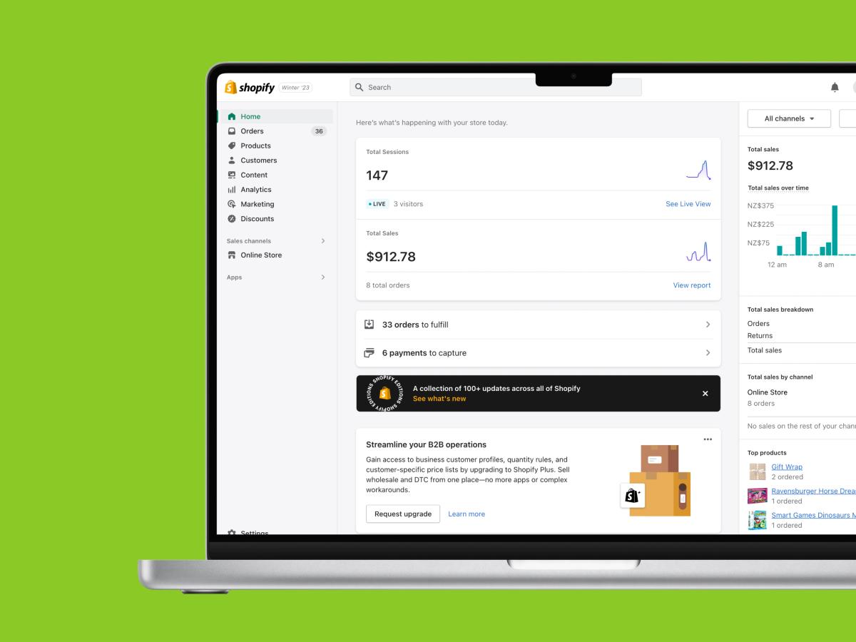
Measure and optimize with metrics that matter for Shopify UX. Track conversion rate, checkout abandonment rate, bounce rate, average session duration, load time, and repeat purchase rate. Use session recordings, heatmaps, funnel analytics, and A/B tests to find where customers hesitate. Which metric would increase your revenue the fastest if it were improved by 10%?
Practical UX Checklist for Shopify Stores You Can Act on Today
- Page speed: Compress images, enable lazy loading, use a CDN, and remove unused theme scripts.
- Mobile UX: Test on real devices, simplify navigation, enlarge buttons, streamline checkout.
- Product discovery: Improve search relevance, add filters, show recommendations, surface reviews.
- Checkout: Guest option, clear shipping and tax, minimal fields, multiple payment methods, one click pay where possible.
- Trust and conversion signals: Secure badges, returns policy, social proof, and clear contact options.
- Testing and analytics: Run A/B tests, record sessions, analyze funnel drop-offs, measure LTV, and retention.
Which part of your Shopify store would you fix first: speed, checkout, or discovery?
Related Reading
- Does Shopify Host Websites
- Is It Worth Buying a Prebuilt Shopify Store
- How Much Does It Cost to Build a Shopify Website
- Shopify Product Page Customization
- What is Custom Liquid Shopify
- How to Customize a Shopify Website
- Shopify Speed Optimization
The Core Elements of a High-Performing Shopify User Experience

Look and Feel: Brand Visuals That Convert
Visual design forms the first handshake with your customer. Use a consistent color palette, typography scale, and spacing system so every page reads as part of one brand. High-resolution product photography, multiple angles, zoom and lifestyle shots replace the physical touch customers miss; add descriptive file names and alt text for image SEO. Keep imagery compressed and use next-gen formats where possible to protect page speed while preserving clarity.
Theme Choices: Structure That Sells
Select a theme that aligns with your product catalog and buyer expectations, then customize only what enhances usability. Lightweight templates with a clear information hierarchy help customers scan and take action. Prioritize flexible product templates, reusable blocks, and global settings for typography and color, ensuring consistent merchandising. Avoid heavy animations or third-party apps that bloat render time and harm conversion.
Frictionless Purchase: Make Buying Easy
Map the user journey from discovery to purchase and remove any unnecessary clicks. Prominent search, filters, and breadcrumbs shorten product discovery. Clear product titles, concise benefits, visible price, and upfront shipping and return info reduce hesitation. Use persistent carts, guest checkout, express payment options and sparse upsell prompts to speed checkouts and lower cart abandonment.
Built for Thumb Users: Mobile Experience That Converts
Design mobile-first. Menus should be thumb-friendly, tap targets should be generous, and images should be responsive for small screens. Offer one-touch payments like Apple Pay or Google Pay and make forms short with auto-complete. Test the full flow on common devices and networks; slow mobile load times kill conversion even if the desktop performs well.
Findability and Growth: SEO and Discoverability
Optimize meta titles, descriptions, and headings to align with natural search intent. Implement structured data for product, price, and review snippets to increase click-through rate.
- Keep URL structures clean
- Use canonical tags to avoid duplicate content
- Submit sitemaps
Page speed, mobile friendliness, and quality content all influence organic placement and bring the right customers.
Product Pages: Copy, Specs, and Social Proof
- Write benefit-driven headlines and scannable bullets that answer common buying questions. Include technical specs, size guides and variant clarity so shoppers know what they get.
- Add reviews, star ratings, and user photos as trust signals.
- Test different hero layouts and CTA language to improve click-to-cart and on-page conversion.
Performance and Speed: Reduce Friction with Fast Pages
Measure load times and remove render-blocking scripts. Use image lazy loading, a CDN and theme code that follows best practices for CSS and JS. Monitor Core Web Vitals and optimize for first contentful paint and largest contentful paint to keep bounce rates low during peak traffic.
Search and Navigation: Help Shoppers Find Products
Implement robust site search with autocomplete, synonym support, and filters for size, color, price and availability. Structure collections and categories to mirror how customers think, not how you organize inventory. Utilize on-site recommendations and recently viewed lists to streamline the purchasing process.
Checkout and Payments: Secure, Simple, Trustworthy
Show security badges, clear pricing, and final shipping estimates before the payment page. Reduce form fields and validate inline so customers complete checkout faster. Offer local payment methods where applicable and ensure PCI compliance and SSL are visibly in place.
Testing and Analytics: Improve with Data
Instrument events for add to cart, checkout steps, and conversions. Use A/B tests, heatmaps, and session recordings to locate friction points. Let analytics guide which pages to optimize first and validate fixes by comparing control vs. variant results.
Accessibility and Inclusivity: Make Your Store Usable for Everyone
Follow accessibility best practices: semantic HTML, proper contrast ratios, keyboard focus, and alt text for images. Accessible stores reach more customers, improve SEO, and reduce legal risk.
Trust Signals and Policy Clarity: Reduce Purchase Anxiety
Display reviews, returns policy, shipping timelines, and contact options prominently. Live chat, clear FAQs and a visible phone or email reduce hesitation and speed decision making.
Personalization and Merchandising: Show What’s Relevant
Use behavioral recommendations, targeted banners, and smart collections to present products that match visitor intent. Personalization increases average order value when it feels relevant and not intrusive.
Content and Product Education: Answer Questions Before They’re Asked
Provide clear product descriptions, how-to-use guides, sizing charts, and comparison pages. Short videos or exploded view images reduce returns and boost confidence. Would you like to prioritize one page first for conversion testing or set up A/B experiments across three SKUs?
Instant High-Converting Pages
PagePilot makes testing product pages simple. Our AI page builder will create high-converting product pages from a competitor or supplier URL and upgrade visuals with the AI Product Image tool so you don’t compete with the same copy and photos. Start a FREE trial and generate 3 product pages for free today (no credit card needed).
14 Best Practices for Improving Your Shopify Store's User Experience
1. Simplify the Navigation
Make it obvious where users go and how they get there. Keep menus clear and intuitive by grouping categories, using dropdowns, and implementing breadcrumb trails, so shoppers always understand their location and next step. Add a prominent search bar with auto-suggestions, filters, and spell-error tolerance because about 69% of shoppers head straight to search on ecommerce sites.
Actionable E-commerce UX
Use load more buttons instead of deep pagination or endless scroll to reduce cognitive load and improve perceived speed. Make CTAs concise, active, and consistently visible; anchor them in areas where users expect to take action. Highlight bestsellers with an icon or badge to add social proof and help undecided buyers make informed decisions. Have you tested whether your top category appears within two taps on mobile?
2. Optimize for Mobile
- Design for thumbs first to increase conversion from phone users.
- Adopt responsive, mobile-first layouts that utilize touch gestures, such as pinch-to-zoom and clear tap targets.
- Use sticky navigation bars and click-to-scroll anchors so customers move quickly between sections.
- Offer a mobile-first checkout with Apple Pay, Google Pay, PayPal, and other mobile wallets to shorten purchase time.
- Synchronize account actions across devices so wishlists and carts persist. Present mobile-friendly pop-ups with large buttons and avoid interrupting flows.
Remember that smartphones drive a major share of traffic, with some studies putting mobile visits near 78% and 91% of smartphone users age 18 to 49 using devices to buy online.
3. Improve Page Load Speed
Speed directly affects conversion and SEO. Compress and resize images, enable lazy loading, and serve scaled assets to reduce payload size. Use a Content Delivery Network and HTTP 2 to:
- Reduce latency
- Enable browser caching to store static resources
- Prefetch critical assets for faster perceived load
Speed for SEO and Sales
Test performance using Google PageSpeed Insights and track Largest Contentful Paint; aim for page loads between 0 and 4 seconds, as many B2B sites load in under 5 seconds. Fast pages reduce abandonment and support higher organic rankings. When was the last time you trimmed unused scripts and app code?
4. Streamline the Checkout Process
- Reduce friction where revenue happens.
- Offer guest checkout and a one-page option to minimize fields and steps.
- Add express checkout buttons and checkout progress indicators to help buyers understand how close they are to completing their order.
- Support multiple payment methods and BNPL options like Klarna to accommodate buying preferences.
- Allow product personalization where relevant and run targeted retargeting to recover near conversions.
- Track drop off by step and remove unnecessary fields, because roughly 69% of online shoppers abandon carts and most leave due to complex or slow checkout flows.
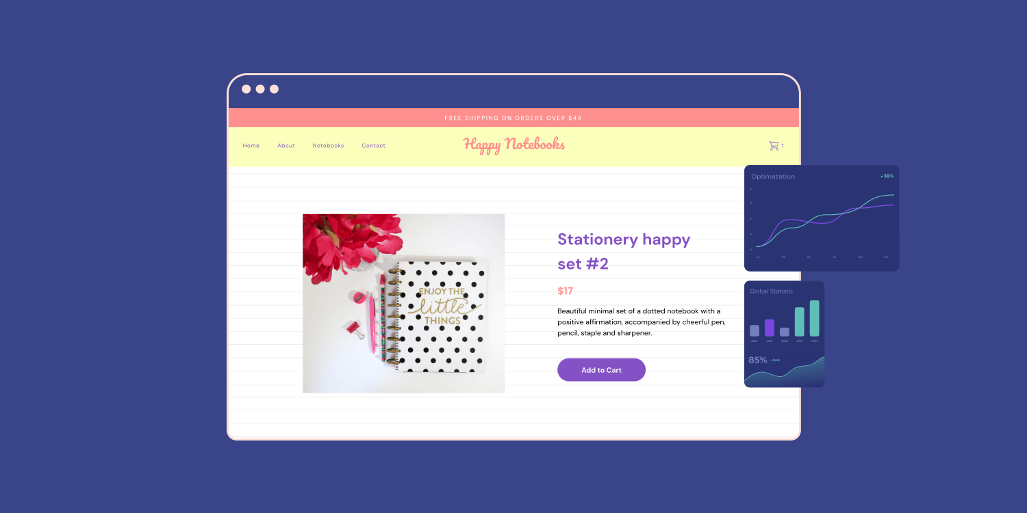
5. Use High-Quality Product Images and Videos
- Let product media replace the in-store experience. Provide multiple high-resolution photos from different angles, including zoom and 360-degree views, and add short demo videos to showcase size and function.
- Use lifestyle images to help shoppers visualize the product in use, while keeping neutral white backgrounds for catalog shots so that color and detail stand out.
- Follow Shopify image guidance—1024 by 1024 recommended up to 2048 by 2048—and serve next gen formats like WebP when possible.
- When you upgrade media, test page speed and mobile rendering to keep performance strong.
6. Implement User Reviews and Ratings
- Build trust with social proof that converts. Enable on-page reviews and ratings, encourage customers to leave feedback, and respond to both praise and complaints to show you act on input.
- Integrate review platforms like Trustpilot or native Shopify review apps, and offer incentives such as discount codes for verified reviews.
- Display aggregate scores prominently and surface recent, detailed testimonials and user photos.
- Maintain transparency in moderation because Baymard finds that many sites use review algorithms in ways that shoppers distrust; authentic, managed reviews stand out.
7. Personalize the User Experience
- Provide customers with relevant options and minimize choice fatigue. Serve product recommendations based on browsing and purchase history, and personalize banners, emails, and special offers to user segments.
- Utilize AI-driven suggestion engines or in-store recommendation apps to boost average order value and facilitate cross-sell opportunities.
- Provide wishlists, recently viewed carousels, and contextual messaging that matches the visitor’s intent.
Personalization matters. About 74% of users leave sites that do not display content relevant to their interests. Which personalization rule would most help your best customers?
8. Enhance Product Descriptions
- Answer questions before they are asked. Write clear, benefit oriented descriptions with key features and technical specs.
- Optimize copy for relevant keywords to support Shopify SEO and include product videos where text cannot effectively convey size or motion.
- Add size guides, material details, shipping costs, and explicit return policy notes on the product page to reduce post-purchase friction.
- Keep descriptions scannable by using bullets and short paragraphs, allowing shoppers to absorb essential information quickly.
9. Simplify and Clarify Your Returns Policy
- Remove doubt by making returns easy and visible. Place your returns policy where shoppers expect it and summarize key points on product pages: return window, steps, refund timing, and any fees.
- Offer hassle-free digital return labels and automated returns management to speed processing and provide tracking updates.
- Offer exchanges as an option and utilize return data to address quality or sizing issues. Returns influence buying decisions: 18% of buyers abandon their carts due to poor return terms, and over 63% are more likely to purchase with free returns.
How quickly can customers find the return steps from checkout?
10. Implement Trust Signals
Show customers you protect their purchase and data. Display SSL and security badges, use recognized payment logos, and explain fraud prevention measures near checkout. Highlight the following:
- Guarantees
- Clear privacy and shipping policies
- Post-trust cues like:
- Media mentions
- Certifications
- Verified review scores
Emphasize unique selling points on product pages and cart pages to reinforce differentiation. Trust signals reduce anxiety and improve conversion rates, especially for smaller brands without widespread name recognition.
11. Leverage Apps and Integrations Without Overcomplicating UX
Add only what moves the needle. Audit installed Shopify apps for load impact and redundant features; each app can add scripts that slow pages and break mobile flows. Prioritize essential integrations. Review the following:
- Widgets that build credibility
- Natural upsell tools that match cart content
- Reliable live chat for support
Test an app’s effect on mobile performance and checkout reliability before committing, and remove unused or overlapping apps. Which three apps deliver measurable increases in conversion or retention for your store?
12. Personalization and Data-Driven UX Optimization
- Utilize behavioral data to inform design adjustments. Install heatmaps, session recordings, and conversion funnels to spot hesitation and friction zones.
- Run A/B tests on layouts, CTA text, and product placement to learn what increases clicks and purchases.
- Feed learned patterns into personalized recommendation rules and email flows. Small iterative changes often yield outsized gains when you measure impact and repeat tests. What metric will you A/B test this week to improve checkout completion?
13. Accessibility and Inclusivity in Shopify Design
Design for everyone to expand your reach to a broader audience. Ensure color contrast meets standards, add descriptive alt text to every image, enable keyboard navigation, and maintain legible fonts across breakpoints. Provide captions for videos and make form fields clear with error validation and assistive labels. Accessibility improves SEO and customer satisfaction while lowering legal risk. Can your store complete a basic accessibility audit in a single day and fix the top three issues?
14. Continuous Improvement: Testing, Feedback, and Iteration
Treat UX as a cycle of measurement and refinement. Collect post-purchase surveys, track NPS, and monitor support tickets to identify recurring pain points. Schedule regular UX audits that include:
- Speed tests
- Checkout walkthroughs
- Mobile reviews
Prioritize fixes that reduce drop off and improve average order value, then validate changes with A/B tests and analytics. Use session replay to confirm whether fixes work in real user sessions. When will you run your following conversion funnel review and implement the first change?
Related Reading
- Hire Someone to Build Shopify Store
- How to Add Products to Shopify
- How to Design Shopify Website
- How to Create a New Page Template in Shopify
- How to Create a Landing Page on Shopify
- Shopify Mobile Optimization
- How to Add a Review Section on Shopify
Common Pitfalls to Avoid with User Experience on Shopify

Slow Elements That Drag Your Store
Slow loading time kills conversions. Heavy scripts, large unoptimized images, autoplay videos, and complex animations like parallax or full-page sliders force users to wait or abandon the page. On Shopify, this shows up as a:
- Higher bounce rate
- Slower page load time
- More cart abandonment
Technical Speed Audit
Run a speed audit with PageSpeed Insights or Lighthouse and check Shopify theme assets for:
- Oversized images
- Unminified CSS or JavaScript
- Apps that inject extra requests
Declutter for Conversion
Replace automatic sliders with a single hero image or a static CTA, swap video backgrounds for poster images with a play button, use responsive image sizes and lazy loading, and remove unused apps and fonts. Ask: Does this element help a user decide to buy, or does it only look fancy?
Inconsiderate Copy That Assumes Prior Knowledge
Copy that assumes a shopper has seen your About page or read site policies creates friction for first-time visitors. Product pages often lack clear, repeatable trust signals, such as:
- Detailed shipping information
- A well-defined return policy
- Sizing guidance
- A concise value proposition
High-Converting Descriptions
Write product descriptions that answer customer questions up front: who is this for, what problem does it solve, what are the specs, and what are the next steps. Use short, scannable blocks, bullet lists for specifications, and inline trust cues like:
- Free shipping thresholds
- Warranty lengths
- Secure checkout badges
Think like a user who arrives from a search or an ad with no prior exposure to your brand.
Forced User Journeys That Fight Customer Behavior
When analytics show users land on specific product pages or blog posts, redirecting them to the homepage wastes attention and ad dollars. Let user flow guide your optimization. If many visitors arrive directly at a certain product, make that product page a conversion hub:
- Clear headline
- Strong imagery
- Prominent Add to Cart button
- Shipping and returns info
- Social proof
- Relevant cross-sells
Avoid gating content behind long funnels or marketing popups that interrupt search intent. Use entry page data to shape where you place resources and split testing. Which pages attract organic traffic, and which pages get lost?
Pages Designed for the Wrong Screen
Mobile-first is usually smart, but some pages are better suited for desktop. Product comparison tables, detailed spec sheets, and complex shipping calculators are easier to use on larger screens. Use analytics to segment device types per page. If a comparison page gets mostly desktop sessions, design it with:
- Side-by-side columns
- Large, high-resolution images
- Persistent tooltips that work with mouse hover
For mobile-heavy pages, keep CTAs thumb reachable, simplify forms, and avoid tiny links that break usability. Balance responsive design with task context, not a one-size-fits-all approach.
Session Replays: Watch Real User Behavior
Session recordings show clicks, scrolls, hesitations, and rage clicks. Tools available for Shopify stores include:
- Lucky Orange
- FullStory
Decoding User Behavior
Look for pauses that reveal confusion, backtracking that signals missing information, and repeated clicks on non-interactive elements that scream poor affordance. Annotate recordings with conversion drop points and replicate issues in a staging theme before making any fixes. Use session replays to validate fixes after deployment.
Page Analytics: Follow the Numbers, Not Assumptions
Google Analytics and Shopify reports reveal:
- Bounce rate
- Exit pages
- Conversion funnels
- Average time on page
Conversion Funnel Deep Dive
Track micro-conversions, such as adding to Cart and newsletter sign-ups, in addition to purchases. Use funnel analysis to find where users drop off in checkout or product discovery. Compare device segments and traffic sources to see which pages need optimization. Run split tests on headlines, CTAs, and image layouts, and measure uplift in conversion rate and average order value.
User Testing: Human Feedback Over Guesswork
Invite actual users to perform tasks such as finding a $120 discount and checking out. Ask them to narrate their thoughts aloud and observe where they hesitate or make a mistake. Use remote moderated sessions or simple in-person tests. Testers reveal pain points that you may not see in analytics, such as:
- Confusing copy
- Unclear size charts
- Missing trust cues
Use their quotes in design briefs to prioritize fixes.
Five Second Test: Does Your Value Show Fast?
Show a page for five seconds and ask what users remember. If they cannot state the product benefit, price, or reason to buy, the page lacks clarity. Apply this test to:
- Product pages
- Landing pages
- Homepage
Tighten headlines, bring key benefits above the fold, and make the primary CTA obvious.
Heat Maps: See Clicks and Scrolls at a Glance
Heat maps reveal where users click, how far they scroll, and which CTAs receive the most attention. If essential elements are located in cold zones, relocate them to hot zones or redesign the layout. Use scroll maps to ensure key info appears before the average fold point. Remove or rework ignored sections to reduce clutter and streamline the information architecture.
Checklist for Fast Wins You Can Do Today
- Audit site speed and remove blockers from the theme.
- Add shipping and returns summary on each product page.
- Make Add to Cart prominent and consistent across devices.
- Replace automatic sliders and background video with static, optimized media.
- Run five-second tests on top traffic pages.
- Record a handful of sessions and tag frustrating behaviors.
- Use heat maps to decide what to trim or move.
- Test copy with real users, not your team.
- Ensure desktop-optimized pages exist where users prefer larger screens.
Questions to Ask During the Audit
- Which pages receive organic traffic but are poorly optimized for conversion?
- Where do users click, but nothing happens?
- Which device types drive purchases and which drive returns?
Address those first and use split testing to measure the impact on the Shopify user experience and conversion rate.
Start a FREE Trial and Generate 3 Product Pages with Our AI Page Builder today
PagePilot generates product pages that prioritize conversion and a seamless Shopify user experience. Feed it a competitor or supplier URL and the AI extracts:
- Headlines
- Benefits
- Specs
- Reviews
- Layout cues
End-to-End Page Optimization
PagePilot rewrites copy, restructures the product page layout, and places clear calls to action to nudge buyers through the customer journey. Expect attention to product descriptions, image placement, trust badges, social proof, and responsive design so the storefront feels polished on mobile and desktop. Would you like the page to prioritize quick checkout or maximum product detail?
How the Competitor URL Workflow Gets Pages Live Faster
Paste a URL, let the AI parse content, and produce a ready-to-publish page. The system:Identifies key selling points
- Extracts customer language from reviews
- Maps section order to proven UX patterns
- Formats product details for easy skim reading
That reduces the time you spend on copywriting, UI adjustments, and page structure revisions. You keep control of tone and metadata while skipping repetitive manual work that slows down product testing.
Upgrade Product Images with AI Visuals
PagePilot’s AI Product Image function cleans and enhances visuals so your listings do not mirror the same stock shots every competitor uses. It creates clean cutouts, lifestyle mockups, color variants, and optimized zoom images while keeping file size and load time in check for better page speed. The tool also generates alt text and consistent aspect ratios so product galleries behave predictably across responsive breakpoints. How would improved visuals change your click-through and add-to-cart rates?
Speed Testing Products and Angles Without Coding
You can generate multiple page variants fast and run split testing with native analytics or your favorite tracking tools. PagePilot supports rapid A/B experiments on headlines, hero images, CTA placement, and price presentation so you can isolate what moves conversion and lowers cart abandonment. Combine heatmaps and session recordings to see where visitors hesitate, then publish the winning variant without rebuilding templates from scratch.
How PagePilot Supports Shopify User Experience Goals
PagePilot focuses on core Shopify UX metrics: page speed, navigation simplicity, mobile optimization, checkout friction, and on-page readability. It produces pages that load quickly, maintain a clear visual hierarchy, and minimize cognitive load during the purchase path. To make search and rich results behave better, the builder respects:
- Accessibility basics
- Consistent UI elements
- Schema markup
You get pages that play nicely with site search, filtering, and the Shopify cart flow.
Onboarding and Free Trial Workflow
Sign up to start a free trial, create your shop connection, and generate up to three product pages without a credit card. Choose a template, paste a competitor or supplier URL, tweak copy and images in the editor, then publish directly to your Shopify store or export the assets. The trial provides tangible examples that you can test live on your store and iterate on as you monitor conversion metrics.
Best Practices When Using PagePilot for Higher Conversions
Test one change at a time and run experiments across devices to capture mobile behavior. Use clear primary CTAs, concise benefit bullets, honest customer reviews, and trust signals near the add to cart area. Monitor bounce rates, conversion funnels, average order value, and load time as you iterate. Keep images compressed for speed while preserving detail for zoom. Examine the mobile layout to avoid blocked checkout buttons or hidden CTAs.