You've spent hours perfecting your Shopify store, curating products, and designing pages that convert. But have you noticed that tiny icon sitting in your browser tab? That small square, your favicon, appears everywhere: in bookmarks, browser tabs, and mobile home screens. When you examine successful Shopify product page examples, you'll notice the best stores nail even these small branding details. This article walks you through changing your favicon on Shopify, explaining why this simple update strengthens your brand recognition and makes your store look polished and professional.
PagePilot's AI page builder can help you design cohesive Shopify pages that match your updated branding. Once you've customized your favicon, you'll want the rest of your store to reflect that same attention to detail. PagePilot simplifies building product pages, landing pages, and collections that align with your visual identity, so every element of your store works together to create a memorable shopping experience.
Summary
- A missing or generic favicon doesn't break your store, but it creates invisible friction across every shopping session. Shoppers scanning multiple browser tabs rely on visual recognition to navigate between stores, and without a custom icon, your store blends into a sea of identical placeholders.
- Mobile browsers strip away page titles and leave only the favicon visible in tab switchers and bookmark lists. Without a custom icon, your store becomes harder to identify when shoppers are comparing products across multiple sites or trying to return to a bookmarked page days later.
- File size and simplicity determine whether a favicon actually works at browser scale. At 16x16 pixels, you're working with 256 individual color squares, which means detailed illustrations and thin lines disappear entirely when compressed. The maximum file size for favicon.ico files should remain 15 KB to avoid slowing page load times on mobile networks, and PNGs with transparent backgrounds adapt cleanly to both light and dark browser themes without creating awkward white boxes.
- Browser caching can cause confusion when updating favicons, as browsers store local copies to avoid redundant server requests. After uploading a new favicon, the old version persists in standard browser tabs until you open an incognito window or clear cached files.
- Mobile traffic now accounts for 50% of total web traffic, meaning half your shoppers never see the desktop version of your favicon. Testing on actual phones reveals how icons perform when scaled up for retina displays or compressed for smaller mobile contexts, and what reads clearly at 16x16 pixels on desktop monitors might look pixelated or lose critical details at different mobile sizes.
PagePilot's AI page builder generates product pages that structure branding consistency and visual details into the framework rather than adding them as separate checklist items, so stores scale without requiring manual vigilance on every new page.
Why a Missing or Generic Favicon Hurts Your Store
A missing or generic favicon doesn't break your store, but it quietly erodes trust every time someone opens a new tab. It signals incompleteness in a space where attention is already fragmented, making your store harder to recognize and more likely to be forgotten when shoppers compare options across multiple tabs.
The problem isn't that customers consciously notice the missing icon. Most won't. The issue is what happens in the split second when they're scanning ten open browser tabs, trying to remember which store had the product they wanted. Your store becomes invisible in that moment, blending into a sea of identical tabs while competitors with custom favicons stand out as distinct, finished destinations.
The Recognition Gap Gets Worse on Mobile
Desktop browsers show at least part of your page title alongside the favicon. Mobile browsers strip that away. On a phone, your store becomes nothing more than a tiny square in a list of recently visited sites or open tabs. Without a custom icon, there's no visual anchor at all, just generic Shopify branding or an empty placeholder.
The Visual Shortcut for Recognition
When someone bookmarks your product page to compare prices later, that bookmark lives in a long list of similar links. A custom favicon acts as a visual shortcut, the kind of recognition that happens faster than reading. Without it, your store requires extra cognitive effort to identify, and in eCommerce, that extra effort usually gets skipped.
Building Brand Permanence on Mobile
Home screen shortcuts follow the same pattern. Shoppers who add your store to their phone's home screen expect to see a branded icon, something that feels intentional and permanent. A generic placeholder makes the shortcut look temporary, like something they installed by accident rather than a store they chose to return to.
Small Signals Compound Into Perception
The favicon sits at the intersection of dozens of micro-interactions throughout a shopping session. Each one is small. None of them individually determines whether someone buys. But together, they shape how legitimate your store feels at a glance.
Driving Growth Through Micro-Conversions
Search Engine Journal reported in its 2024 analysis that websites with custom favicons see measurably higher click-through rates in search results than those without. The lift isn't dramatic, usually a few percentage points, but compounded across thousands of impressions, those clicks turn into real traffic.
The favicon doesn't convince anyone to click; it just removes one small source of friction when someone's deciding which result looks most trustworthy.
Sustaining Attention in Crowded Tabs
The same dynamic plays out in browser tabs. When your tab looks identical to every other Shopify store, it's easier to close by mistake. Easier to lose track of. Easier to forget entirely when the shopper moves on to the next task. A custom favicon doesn't make your products better, but it keeps your store visually present in a crowded digital space where presence matters.
Bridging the Professionalism Gap
Most dropshippers focus on product selection and ad creative because those feel like the big levers. They are. But the stores that convert best aren't just the ones with great products; they're the ones that feel cohesive and intentional at every touchpoint. A missing favicon is a visible gap in that cohesion, a detail that suggests other details might also be overlooked.
When you're testing products quickly, it's tempting to skip these finishing touches. Launch fast, see what sells, optimize later. That approach works for validating demand, but it leaves money on the table if the store itself feels unfinished.
Tools like PagePilot's AI page builder help close that gap by generating polished, conversion-focused product pages in minutes, so you're not choosing between speed and professionalism. The favicon is part of that same philosophy: small details that take minutes to fix but quietly reinforce trust across every session.
Bookmarks Become Invisible Without Icons
Bookmarks used to be organized in folders with descriptive names. Now, most people rely on visual scanning, scrolling through a toolbar or dropdown menu to find the icon they recognize.
The Cost of Visual Anonymity
Text becomes secondary. The favicon is the identifier. Without one, your store is just another line of text in a list. Shoppers who bookmarked your product page to think about it overnight won't find it easily the next day. They'll skim past it, click a competitor with a recognizable icon, and your chance to close that sale disappears because of a missing 16x16-pixel image.
The same thing happens with browser history. When someone's trying to find that store they visited last week, they're not reading URLs or page titles carefully. They're looking for the icon they remember. A generic Shopify logo doesn't jog memory. A custom favicon does.
The Fix Takes Minutes, But Most Stores Skip It
Changing a favicon isn't technically complex. Upload an image, save the settings, and refresh the page. The entire process takes less time than writing a product description. Yet a surprising number of Shopify stores launch without one, or keep the default icon for months, because it never feels urgent.
The Invisible Barrier to Retention
The urgency shows up later, in metrics that are harder to trace back to a single cause. Lower return visitor rates. Higher bounce rates from organic search. Tabs that get closed before the shopper finishes comparing prices. None of these failure points directly points to the missing favicon, but the favicon is part of the environment that makes those failures more likely.
Eliminating Micro-Signals of Mistrust
Professionalism in eCommerce isn't about perfection. It's about eliminating the small signals that make shoppers second-guess whether your store is worth their time. A custom favicon is one of the easiest signals to fix, and one of the most visible when it's missing. But before you upload just any image and call it done, understanding what actually makes a favicon work matters more than you'd think.
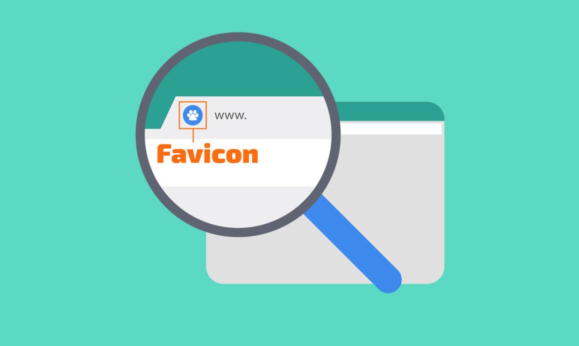
What a Shopify Favicon Actually Is
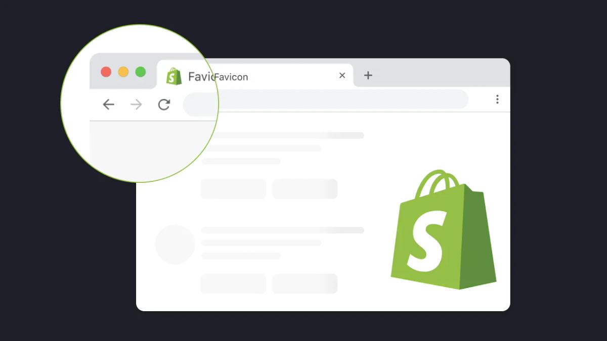
A Shopify favicon is a small square image, typically 16x16 or 32x32 pixels, that appears in browser tabs, bookmarks, and mobile shortcuts to visually identify your store. It's the icon shoppers use to recognize your site when they have multiple tabs open or need to find a saved page later.
Shopify accepts PNG, JPG, GIF, and ICO formats, automatically resizing whatever you upload to fit different contexts across devices.
Anchoring Credibility in Design
That technical simplicity is exactly why most store owners overlook it. Upload an image, click save, and move on. But the favicon's role extends beyond decoration. According to the Stanford Web Credibility Project's 2002 research, which remains foundational in web design psychology, approximately 75% of users judge a company's credibility based on overall website design.
When a standard technical element like a favicon is missing, the site registers as incomplete or unprofessional in ways shoppers can't always articulate but definitely feel.
Where the Favicon Actually Appears
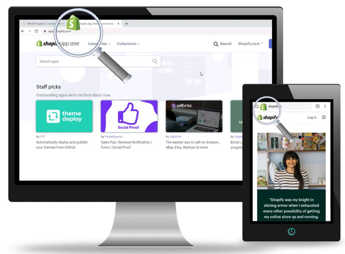
Browser tabs are the most obvious placement, but they're not the only touchpoint. When someone bookmarks your product page, that bookmark sits in a list with dozens of others. The favicon becomes a visual shortcut that helps them find your store again without having to read every URL or page title.
On mobile devices, where screen space is even tighter, the favicon is often the only identifier visible in the tab switcher or recent sites list.
Securing a Permanent Mobile Presence
Home screen shortcuts follow the same pattern. When a shopper adds your store to their phone's home screen for quick access, the favicon becomes the app-style icon they tap to return to your store. A generic placeholder makes that shortcut look temporary, like something installed by accident rather than a destination they intentionally chose.
The difference between a custom icon and a default one is the difference between looking like a real store and looking like a test site someone forgot to finish.
Navigating Search Engine Visibility
Search results occasionally display favicons next to URLs, depending on the browser and search engine. Google started showing them in mobile search results in 2019, then briefly in desktop results before rolling that back due to ad confusion. But the pattern persists across other contexts.
When your store appears in a list of options, whether that's search results, browser history, or a dropdown menu of recently visited sites, the favicon is often the first visual element a shopper processes.
File Formats and Technical Requirements
Shopify accepts PNG, JPG, GIF, and ICO files, but not all formats perform equally across contexts. PNG is the most reliable choice because it supports transparency, preventing awkward white boxes around your icon in dark browser themes.
Selecting the Right File Format
JPG works but doesn't handle transparency, so your favicon will always sit in a square background regardless of the browser's appearance. ICO files are the traditional favicon format, designed specifically for this use case, but they're less common now because modern browsers handle PNG just as well.
Understanding Multi-Device Scaling
The platform automatically generates multiple sizes from whatever you upload. Browsers request different dimensions depending on where the icon appears. A 16x16 pixel version for standard tabs, 32x32 for high-resolution displays, 180x180 for Apple touch icons on iOS devices.
You don't need to create each size manually. Shopify handles the resizing, but the quality of those automated versions depends entirely on what you upload in the first place.
Designing for Small-Scale Clarity
Most stores upload a square version of their logo and assume that's sufficient. Sometimes it is. But logos designed for full-size display don't always scale down cleanly. Fine details disappear. Text becomes illegible. Complex shapes turn into blurry blobs. The best favicons are either simple geometric marks or carefully simplified versions of the full logo, designed specifically to remain recognizable at tiny sizes.
Why Size and Simplicity Matter More Than You'd Expect
At 16x16 pixels, you're working with 256 individual color squares. That's not much space to communicate anything complex. Detailed illustrations, thin lines, and small text all of it vanishes when compressed to favicon dimensions. What looks sharp at 500 pixels wide becomes an indistinct smudge at 16.
The "Postage Stamp" Clarity Test
Testing your favicon before uploading it saves frustration later. Open your image in any editor and zoom out until it's roughly the size of a postage stamp. If you can't immediately recognize what it is from across the room, it won't work as a favicon. Simplicity isn't a design preference here; it's a functional requirement.
Bold shapes, high contrast, minimal detail. Those constraints aren't limitations; they're the rules of the format.
When stores launch quickly to test product demand, it's easy to treat the favicon as something to fix later. But later often means weeks or months of sessions where your store blends into the background of every shopper's browser.
Speed Without Sacrificing Professionalism
Tools like PagePilot's AI page builder help dropshippers move fast without sacrificing polish, generating conversion-focused product pages in minutes so speed doesn't have to mean skipping the details that make a store feel finished. The favicon fits the same philosophy. It takes five minutes to upload, but it works across every session, every bookmark, every tab, quietly reinforcing that your store is intentional and complete.
What Happens When Shopify Can't Display Your Favicon
If you don't upload a custom favicon, Shopify doesn't leave the space blank. Depending on the browser and context, shoppers see either a generic Shopify logo or a default browser icon. Neither option helps your store stand out. Both signal that the store owner either didn't know how to change it or didn't care enough to try. That perception isn't fair, but it's real.
Breaking Through the Shopify Default
The default Shopify favicon isn't ugly. It's just not yours. When someone has five tabs open, comparing similar products across different stores, the ones with custom favicons become landmarks. The ones with default icons blur together. That's not a branding problem in the abstract sense.
Solving the Practical Navigation Gap
It's a practical navigation issue that affects whether shoppers can find your store again after they've moved on to check something else. The fix is straightforward, but knowing what makes a favicon work is only half the process. The other half is actually changing it, which is simpler than most technical tasks but still trips people up if they've never done it before.
Related Reading
- Shopify Product Page Examples
- How to Make Your Shopify Store Look Professional
- How to Increase Conversion Rate Shopify
- Best Size for Shopify Product Images
- eCommerce Product Page Optimization
- Shopify Banner Size
- How to Create Multiple Product Pages in Shopify
- How to Change Favicon on Shopify
- How to Add Size Chart in Shopify
- How to Customize Shopify Checkout Page
How to Change a Favicon on Shopify (Step-by-Step)

Log in to your Shopify admin, navigate to Online Store, click Themes, select Customize on your active theme, open Theme Settings from the left sidebar, scroll to Favicon, upload your square image file, and click Save. The entire process takes about two minutes if you already have your image ready.
Most store owners expect the change to appear instantly. It doesn't. Browsers cache favicons aggressively because they're designed to load once and persist across sessions. That caching behavior means you might not see your new icon for several minutes, or until you force a refresh by opening a new incognito window or clearing your browser cache.
The delay isn't a sign that something went wrong. It's just how browsers handle these files to reduce server requests.
Preparing Your Image File
Before you open Shopify's theme editor, make sure your image meets the technical requirements. According to LR Digital’s guide to changing a favicon in Shopify, favicons should be at least 32×32 pixels; uploading a larger square image, such as 512×512, gives Shopify more flexibility when generating the required sizes for different contexts.
PNG format with a transparent background works best because it adapts cleanly to both light and dark browser themes without leaving awkward white boxes around your icon. Open your image in any basic editor and confirm it's perfectly square.
Non-square images are automatically cropped, often cutting off important parts of your logo or design. If your full logo is rectangular, create a simplified square version now rather than letting Shopify's automated cropping make that decision for you.
The Five-Foot Recognition Test
Test readability at small sizes before uploading. Zoom out until the image is roughly the size of a postage stamp on your screen. If you can't immediately identify what it is from a few feet away, simplify further. Remove fine details, increase contrast, and eliminate text smaller than a few letters. The favicon exists to be recognized instantly, not admired closely.
Navigating Shopify's Theme Editor
Once your image is ready, the upload process itself is straightforward but easy to miss if you're unfamiliar with Shopify's interface. The Theme Settings menu sits at the bottom of the left sidebar in the theme editor, below all the section-specific options, such as Header, Footer, and Product Pages.
New users often scan past it, looking for something labeled "Site Settings" or "General Options." It's just called Theme Settings, and the Favicon option lives inside that menu. Click the Favicon field, then either drag your image file directly into the upload area or click Browse to select it from your computer.
Navigating Format and Display Limits
Shopify accepts PNG, JPG, and ICO files, though PNG remains the most reliable choice for the transparency reasons mentioned earlier. The platform doesn't show a preview at the actual favicon size during upload, so you're trusting that your preparation work handled the scaling correctly.
The Critical Final Step
After uploading, click Save in the top right corner of the theme editor. That's the step people most often forget. The theme editor doesn't auto-save, and navigating away without clicking Save means your favicon change disappears entirely. If you've uploaded an image but don't see it after refreshing, check whether you actually saved the theme settings before closing the editor.
Why Browsers Don't Show Changes Immediately
The favicon appears in your browser tab, but it doesn't reload when you refresh the page. Browsers store a local copy to avoid making redundant server requests for files that rarely change. That efficiency creates frustration when you're actively trying to update the icon, because your browser keeps showing the old version even after Shopify confirms the new file is live.
Verifying Your Changes Locally
Opening a new incognito or private browsing window forces the browser to reload everything, including the favicon. That's the fastest way to confirm your change worked. Alternatively, you can clear your browser's cache entirely, though that's overkill for checking a single image file.
In most browsers, a hard refresh (Ctrl+Shift+R on Windows, Cmd+Shift+R on Mac) clears the cache for the current page, including the favicon.
Forcing Mobile Icon Updates
Mobile devices follow the same caching behavior but with even longer persistence. If you've bookmarked your store or added it to your home screen, that saved icon won't update until you delete the bookmark and recreate it, or remove and re-add the home screen shortcut. The cached version lives in the bookmark itself, not just the browser's temporary files.
When stores launch quickly to test product demand, it's easy to treat technical polish as something to handle later. But later often means weeks of sessions where small details like a missing favicon quietly signal incompleteness.
Speed Meets Strategic Detail
Platforms like PagePilot's AI page builder help dropshippers move fast without sacrificing the finishing touches that make a store feel intentional, generating conversion-focused product pages in minutes, so speed doesn't require skipping the details that reinforce trust. The favicon fits that same philosophy. Five minutes to upload, but it works across every session, every bookmark, every tab.
Confirming the Change Across Devices
After the favicon appears in your desktop browser, check how it looks on mobile. The icon displays differently in mobile tab switchers and bookmark lists, often at larger sizes than the tiny 16x16 pixel version shown in desktop tabs. What reads clearly at small sizes on a desktop monitor might look pixelated or blurry when scaled up for a phone's retina display.
The Mobile Clarity Test
Open your store on your phone and add it to your home screen. That action generates an Apple touch icon on iOS or a similar shortcut icon on Android, both of which pull from the same favicon file you uploaded. If the icon looks sharp and recognizable, your file quality is sufficient. If it looks fuzzy or poorly cropped, you'll need to upload a higher resolution version and repeat the process.
Monitoring Search Console Status
Google Search Console occasionally shows your favicon in search results, though the behavior varies by device and search context. You can't force Google to display it, but you can confirm the file is accessible by checking the Coverage report in Search Console. If Google has successfully crawled and indexed your favicon, it appears in the report under the valid indexed URLs section.
If it shows errors or warnings, the file might be too large, incorrectly formatted, or blocked by your robots.txt file. But uploading the file correctly is only half the equation. The other half is avoiding the mistakes that make favicons unreadable, unprofessional, or invisible across certain contexts.
Common Mistakes to Avoid When Uploading a Favicon
Uploading a file that's too large or too detailed ranks as the most common mistake. Browsers expect favicons to load instantly, and files that exceed reasonable sizes cause unnecessary delays. favicon.ico.
Prioritizing Performance and Payload
According to the Favicon.im blog’s guide on essential favicon sizes, the maximum file size for a favicon.ico should be kept under 15 KB to ensure optimal browser compatibility and performance. Anything larger slows down page load times in ways most store owners never notice because they're testing on fast connections, but shoppers on mobile networks or slower devices feel the lag immediately.
Designing for the 16-Pixel Limit
The second issue shows up in the design itself. Store owners upload their full logo without simplifying it first, assuming the browser will handle the scaling gracefully. It doesn't. Fine lines disappear. Text becomes illegible blobs. Gradients turn muddy. What looked sharp at 500 pixels wide becomes an unrecognizable smudge at 16x16. The favicon needs to be designed at its actual size, not just shrunk from a larger version.
Ignoring Transparency and Background Colors
PNG files support transparent backgrounds, which matters more than most people realize. When you upload a favicon with a white background, it looks fine on light browser themes but creates an awkward white square on dark themes. The icon appears boxed in, visually disconnected from the tab itself.
Transparency lets the favicon blend naturally with the shopper's theme, maintaining visual consistency across contexts.
The Transparency Compromise
Some stores upload JPG files because that's what they have readily available. JPG doesn't support transparency, so your icon will always sit in a colored rectangle regardless of the browser's appearance. That's not a deal breaker, but it's a visible compromise that signals you didn't optimize the file for its specific use case.
Uploading Non-Square Images
Browsers expect favicons to be perfectly square. When you upload a rectangular image, Shopify automatically crops it, often cutting off important parts of your design that you won't notice until you see the live result.
The automated crop doesn't know which part of your image matters most. It just centers the image and trims the edges, which might remove key elements of your logo or leave awkward empty space around what remains.
Mastering the Manual Crop
Testing the crop before uploading saves frustration. Open your image in a basic editor and manually crop it to a perfect square, ensuring the most recognizable part of your design is centered in the frame. That way, you control what gets kept and what gets removed, rather than letting an algorithm make that decision for you.
Assuming Desktop Testing Covers Mobile Display
The favicon looks different on mobile devices, both in its size and where it appears. According to the Favicon.im blog, mobile traffic now accounts for 50% of total web traffic, meaning that half of your shoppers may never see the desktop version of your site’s icon.
They see it in mobile tab switchers, bookmark lists, and home screen shortcuts, where the display size and context differ significantly from desktop browser tabs.
Cross-Device Performance Testing
What reads clearly at 16x16 pixels on a desktop monitor might look pixelated when scaled up for a phone's retina display. The opposite problem happens too. An icon designed to look good at larger sizes might lose critical details when compressed for smaller mobile contexts.
Testing on an actual phone, not just resizing your browser window, reveals how the icon performs in real-world use cases.
When stores launch quickly to test product demand, it's easy to treat these technical details as something to fix later. But later often means weeks of sessions where small inconsistencies quietly signal incompleteness.
Efficiency Without Sacrificing Trust
Platforms like PagePilot's AI page builder help dropshippers move fast without sacrificing polish, generating conversion-focused product pages in minutes, so speed doesn't require skipping the details that reinforce trust. The favicon fits that same philosophy. Five minutes of testing prevents months of inconsistent branding across devices.
Forgetting to Clear the Cache After Uploading
You upload a new favicon, save the settings, refresh your browser, and nothing changes. The old icon still sits in the tab, making you wonder if Shopify saved your changes at all. The file was uploaded correctly. The problem is browser caching, which stores a local copy of the favicon to avoid redundant server requests.
Bypassing Browser Cache
That efficiency creates confusion when you're actively updating the icon, because your browser keeps showing the cached version even after the new file is live. Opening an incognito window forces the browser to reload everything, including the favicon. That's the fastest way to confirm your change worked without clearing your entire cache or waiting for the cached version to expire naturally.
Mobile devices follow the same pattern, but with longer persistence, especially for bookmarked pages or home screen shortcuts, which store their own copies of the icon independent of the browser's temporary files.
Using Inconsistent Icons Across Touchpoints
Some stores upload different images for their favicon and their Apple Touch icon, thinking they need separate designs for different contexts. That creates visual inconsistency when shoppers encounter your store across multiple devices or save it in different ways.
The favicon that appears in their desktop browser doesn't match the icon on their phone's home screen, which doesn't match the bookmark in their mobile browser. Each version looks like it belongs to a different store.
Consistency Builds Instant Brand Recognition
Shopify generates multiple sizes from the single file you upload, which means one well-designed square image covers all the contexts where your icon appears. Using the same design everywhere reinforces recognition. Shoppers learn to associate that specific icon with your store, and that association only works if the icon stays consistent across every touchpoint.
But getting the technical details right is only part of the equation. The bigger question is whether you're spending your limited time on the optimizations that actually move revenue.
Related Reading
• How To Add Frequently Bought Together On Shopify
• Best Shopify Themes For Conversion
• How To Add A Pop Up On Shopify
• How To Customize Shopify Checkout Page
• How To Choose A Shopify Theme
• Shopify Variants Vs Options
• Product Recommendations Shopify
• Shopify Order Confirmation Page
• Shopify Websites Examples
How PagePilot Helps You Get These Details Right Automatically

Favicons are a good example of a bigger pattern. Most store owners don't forget details because they don't care. They forget them because manual store building forces you to think in checklists. One detail at a time. One fix after another.
PagePilot works differently. Instead of treating product and landing pages as one-off builds, PagePilot's AI page builder generates complete pages as a system. When a page is created, visual consistency and branding details are considered as part of the overall structure, not as things you remember to fix later.
Pages Built as Complete Systems, Not Isolated Sections
Manual page building means assembling pieces separately. You write the headline, then the product description, then you remember to add trust badges, then you realize the colors don't match your brand, then you notice the favicon is still missing. Each element requires a separate decision, a separate action, a separate moment where you might forget or run out of time.
Built-In Design Integrity
PagePilot generates layouts where hierarchy and visual flow are aligned from the start. The page doesn't emerge from a checklist. It emerges as a cohesive structure where branding elements, spacing, and design consistency are built into the framework. You're not patching together sections and hoping they look intentional. The page is designed to feel finished the moment it's created.
Scalability Without Chaos
The shift matters more as your store grows. When testing a single product, you can manually verify that everything matches. When you're launching ten products in a week, manual consistency breaks down. You forgot which color scheme you used on the last page. You can't remember if you updated the logo file.
Small inconsistencies multiply until your store feels like it was built by three different people who never talked to each other.
Branding Consistency Handled at the System Level
Most page builders treat branding as something you apply after the layout exists.
- Choose your fonts
- Pick your colors
- Upload your logo
Each choice is separate, so it can be forgotten or applied inconsistently across pages.
Systemic Visual Cohesion
When pages are generated as systems, visual elements are structured to feel cohesive across every page you create. The same design logic that shapes one product page shapes the next, so your store doesn't feel patched together as it grows. Shoppers moving from one product to another don't encounter jarring shifts in layout or style that make them wonder if they've left your store entirely.
Automated Brand Consistency
This approach removes the cognitive load of remembering what you did last time. You're not keeping mental notes about which button style you used or whether the last page had a border around the product image. The system remembers for you, applying the same structural logic across every page so consistency scales without requiring constant vigilance.
According to PagePilot.ai, the platform supports 30+ languages, meaning the same systematic consistency extends across international markets without requiring you to rebuild pages manually for each locale. The structure adapts, but the cohesion remains.
You're Not Going Back to Fix Details One by One
The biggest time sink in manual store building isn't the initial page creation. It's the endless loop of noticing something you missed, going back to fix it, then noticing three more things that need adjustment. You launch a product page, then realize the favicon doesn't match. You fix the favicon, then notice the mobile layout looks off.
You adjust the mobile view, then see that the trust badges are misaligned. Each fix reveals another gap.
Embedded Professionalism
That loop doesn't occur when pages are built from scratch. The page is already designed to look finished, intentional, and professional. You're not hunting for gaps because the structure doesn't create them. Polish isn't something you add after the fact. It's embedded in how the page is generated.
Quality at Velocity
This matters most when speed determines whether you capture demand. Dropshippers testing products need to move fast, but using manual tools means choosing between speed and quality. Launch quickly with gaps, or launch slowly with polish. PagePilot removes that tradeoff by making completeness the default, not the exception.
Systems Don't Forget
Favicons are just one small detail, but they represent how manual store building creates gaps. When everything relies on memory and checklists, things get missed. You're juggling product research, supplier communication, ad creative, customer service, and somewhere in that chaos, the favicon doesn't get uploaded. Not because it's unimportant, but because there's no system forcing you to remember it.
Process Over Memory
Systems don't forget. When page generation includes branding consistency as part of the structure, details like favicons aren't optional checkboxes you might skip. They're part of the framework that completes the page. You're not relying on memory or discipline. You're relying on a process that automatically handles completeness.
Efficiency by Design
Polish and consistency aren't personality traits. They're not about being more careful or more detail-oriented than the next store owner. They're about using tools that make completeness the path of least resistance instead of the path of most effort. But knowing the system exists doesn't mean you're using it yet.
Related Reading
• Shopify Beauty Stores
• Shopify T-shirt Store Examples
• Shopify Electronics Store
• Shopify Contact Us Page Example
• Best Shopify Theme For Print On Demand
• Best Trust Badges For Shopify
• Pagefly Alternatives
• Best One Product Shopify Theme
• High Converting Product Pages
Start a FREE Trial With Our AI Page Builder and Build Pages Without Missing the Small Things
You already know the favicon matters. You know the layout needs to stay consistent. You know, trust badges, spacing, and color choices all contribute to whether a page feels finished or thrown together. The question isn't whether these details matter. It's whether you're building in a way that handles them without adding them to your mental checklist.
The Assembly Bottleneck
Most dropshippers build pages by assembling pieces one decision at a time. Write the headline, choose the layout, add the product images, remember the trust badges, adjust the spacing, check the mobile view, and upload the favicon. Each element requires a separate action, and each action creates another opportunity to forget something or run out of time before launch.
Built-In Completeness
That approach works when you're testing one product. It breaks down when you're launching ten. PagePilot's AI page builder generates product pages where completeness is built into the structure, not added afterward. You're not choosing between speed and polish. You're getting both because the system treats visual consistency, layout hierarchy, and branding details as part of the framework, not as optional finishing touches you apply if you remember.
Intentional by Default
Start your free trial today. Build up to three product pages without a credit card. See whether your store feels more complete when details are handled automatically rather than manually. The favicon is just one small example. The bigger shift is building pages that look intentional from the moment they're created, so you can focus on testing products and scaling what works instead of fixing gaps you didn't notice until after launch.