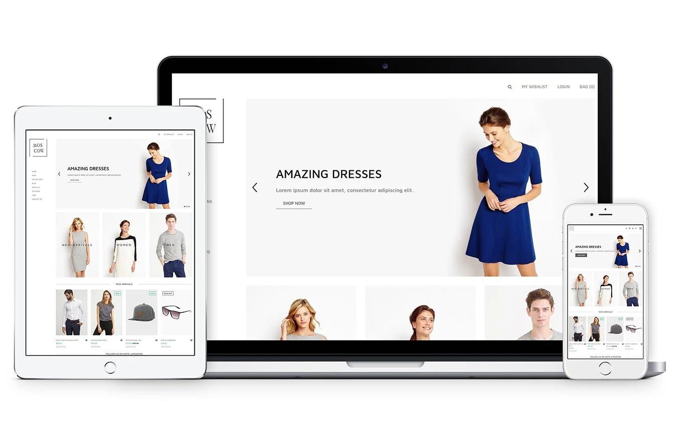
Shopify product page examples show how layout, product images, productdescriptions, reviews, and clear calls to action turn browsers into buyers. If your pages suffer from slow loading, weak copy, or clumsy mobile views, it can be hard to know which fixes will move the needle. Want concrete Shopify product page examples That Convert and a short list of elements you can copy from top page templates, product videos, trust signals, upsells, cross-sell tactics, and A/B testing to raise your conversion rate? To turn those ideas into working pages, PagePilot's AI page builder drafts product page templates, suggests better product page copy and image placement, and helps you test variants so you can copy what works without writing code or hiring a designer.
Summary
- Product page clarity matters more than traffic: 90% of consumers say product page quality influences their purchase decisions, so tightening headlines, image placement, and microcopy is often more leveraged than acquiring new visitors.
- Inaccurate or vague descriptions impose real costs: 50% of online shoppers return products because of them. This means precise specs and a short guarantee near the CTA cut returns and support load.
- Multimedia and social proof move the needle dramatically: product videos increase conversions by about 80%, and pages with customer reviews see up to a 270% lift. Prioritize demo clips and highlighted reviews where doubt is highest.
- AI-driven variant testing delivers faster signals: 75% of new Shopify stores report sales gains after implementing AI testing, and winning variants often emerge in under two weeks when teams run focused hypotheses.
- A minimal, repeatable asset set speeds execution, for example, three headline variants can be produced in under 20 minutes, and hero images sized 1200 to 2000 px and under about 300 KB keep pages performant across devices.
- Scaling exposes manual workflow limits, so limit active experiments to two per page and run two-week sprints; otherwise, variant counts and review cycles balloon, resulting in rollouts that take days rather than minutes.
This is where PagePilot's AI page builder fits in: it generates structured templates and publishable variants, enabling teams to create and publish test-ready Shopify product pages in minutes.
Why Shopify Product Page Examples Matter

High-performing Shopify product page examples matter because they turn guesswork into repeatable hypotheses you can test quickly and expose the specific page elements that actually drive revenue. When you study examples that sell, you learn which structure, images, and phrasing make shoppers decide now instead of later.
How Do Examples Accelerate Real Learning?
When you compare live pages side by side, you compress months of trial and error into a few clear contrasts:
- A headline that sets the frame
- An image that answers the first question
- Microcopy that removes hesitation
This is not aesthetic copying; it is controlled experimentation, where each element becomes a falsifiable hypothesis you can swap and measure. The result is faster insight and fewer wasted design cycles.
Why Do Shoppers React So Strongly To Page Quality?
According to Shopify, “90% of consumers say that product page quality influences their purchase decision.”
Shoppers treat the product page before they click ‘Buy’ like:
- A contract
- Evaluating clarity
- Credibility
- Usefulness
That finding explains why improving page clarity and relevance is often higher leverage than hunting for new traffic.
What Failures Do Examples Help You Avoid?
This problem appears across new stores and catalog-heavy sellers: teams treat product pages as creative projects rather than measurement problems, so copy drifts, descriptions become inaccurate, and operations pay the price with higher returns and support headaches. The reality is clear: poor descriptions drive downstream costs and churn.
This aligns with Shopify: “50% of online shoppers return a product due to inaccurate product descriptions,” so studying examples reduces execution errors that eat margins.
The Scaling Paradox: Why Manual Editing Becomes a Growth Bottleneck
Most teams handle product pages by hand-editing templates and iterating visually. That approach works at first, but as SKUs, ad angles, and channels multiply, feedback loops stretch into days and mistakes scale.
Teams find that platforms like PagePilot, which:
- Import page structures
- Auto-generate variants
- Push templates directly to Shopify
It compresses testing cycles from days to minutes while keeping consistent messaging across ads and funnels.
What Do You Actually Copy From Examples?
Copy the testable parts:
- Framing headline
- Hero image set
- Social proof placement
- The one-line purchase rationale that sits above the CTA
Think in components, not entire designs. An example is like a proven recipe:
- You borrow the technique
- Keep your flavor
- Test whether the audience prefers sweet or salty
That mindset stops endless tweaking and turns product pages into a source of repeatable wins.
The Scientific Pivot: From Aesthetic Inspiration to Evidence-Based Growth
When you start treating examples as experiments instead of inspiration, the work changes from guessing to building a short list of high-impact tests you can run this week, measure next week, and scale the winners after that.What happens next will challenge how you think about conversion mechanics, and it’s not where most people look.
What Makes a High-Converting Shopify Product Page?
A high-converting Shopify product page answers the remaining practical questions most stores miss:
- How pricing and trust are presented
- Which small interface details reduce hesitation
- How the page continues to drive lift as traffic scales
Get those mechanics right, and your experiments stop being noisy guesses and become predictable improvements to conversion and average order value.
How Should Price And Value Be Presented?
Start with a clear pricing frame that guides judgment, not confuses it. Use an anchor price, a single prominent buy option, and an optional bundle tier beneath it so shoppers can compare at a glance. Show the total cost up front, including estimated shipping and taxes, because surprise fees are the most common cause of cart abandonment.
Make the guarantee explicit, concise, and placed near the CTA so that the final doubt is
resolved at the decision point.
Where Do Microcopy And Tiny Ux Fixes Matter Most?
Microcopy is the silent salesperson. Label shipping times with exact ranges, put size conversion charts where people expect them, and keep the Add to Cart button visible on mobile screens. From audits and client work, a consistent pattern emerges: teams that bury shipping and returns lose momentum on mobile, and making Add to Cart more prominent recovers many of those lost clicks.
Use session recordings and heatmaps to identify the one tap or scroll that breaks the flow, then revise the few words surrounding that interaction.
Do Multimedia And Social Proof Still Move The Needle?
Yes, and the proof is dramatic. According to Shopify, “Adding a video to your product page can increase conversions by 80%.” Demonstration media accelerates decision-making by showing the product in use rather than just listing features.
And social proof belongs where doubt is highest, which is often right beside the CTA; consider that Shopify: “Product pages with customer reviews can see a 270% increase in conversion rates.” Use short clips, customer photos, and a highlighted five-star snippet so that someone skimming the page gets reassurance in one glance.
How Should Urgency And Offers Be Used Without Damaging Brand Value?
Use scarcity and urgency as tactical tests, not as the store's identity. If you run timers or low-stock badges, apply them selectively and measure lift on a small percentage of traffic. Bundles work better long term because they increase perceived value without training customers to wait for a sale.
Treat promotional messaging as a separate creative asset so that, when an offer ends, the product page still reads as a premium presentation.
What Technical Details Quietly Sabotage Conversions?
Structured data, fast first content paint, and accessible markup matter as much as copy. Product schema helps with search and rich snippets, while lazy-loading images and properly sized media reduce load times.
Accessibility is not optional either; descriptive alt text, clear focus order, and large tap targets prevent tiny errors from becoming big losses. Run an automated test suite on each template and gate releases behind a performance budget so pages do not degrade as you add more assets.
What Breaks When You Scale, And How Do You Avoid It?
Most teams manage product pages in theme editors or with one-off custom code because it is familiar and cheap early on. That works until variants, ad angles, and inventory controls multiply, and then copy diverges, specs go stale, and launches take days.
Platforms like PagePilot provide:
- Template-driven
- Shopify-native publishing
- Automated variant generation
- Ready-to-import creative feeds
It compresses page production from multi-day rollouts to minutes while keeping messaging consistent across funnels.
How Should You Measure And Iterate After Launch?
Measure small wins and the thin signals. Track micro-conversions such as image zooms, video plays, and FAQ expansions, not just purchases.
Run single-element A/B tests:
- Headline
- Media type
- Price presentation
- Microcopy for shipping
Pair quantitative tests with session replays so you see why a variation won.
Keep:
- Experiments short
- Sacrifice vanity metrics if they do not predict purchases
- Promote only after they have replicated in a second audience
Treat the product page like a fitting room; give people the lighting, the mirror, and someone who answers the right question at the right moment, and they will buy more often. That simple fix works until you hit the one layout or creative choice most teams never test.
Related Reading
- How to Make Your Shopify Store Look Professional
- How to Increase Conversion Rate Shopify
- How to Get More Sales on Shopify
- Best Size for Shopify Product Images
- eCommerce Product Page Optimization
- Shopify Banner Size
- How to Create Multiple Product Pages in Shopify
- How to Change Favicon on Shopify
- How to Add Size Chart in Shopify
- How to Customize Shopify Checkout Page
21 Shopify Product Page Examples for Inspiration

1. Fluxies
Fluxies sells leak-proof panties and reusable pads with a clear sustainability focus. The product pages use bright, lively layouts and prominent CTAs, and the Build a Set configurator lets shoppers assemble matched products without leaving the page.
What matters here is audience fit, not flash; clear CTAs and a guided bundle reduce hesitation among shoppers who prioritize comfort and environmental impact.
2. Ketnipz
Ketnipz centers the artist’s pastel ‘bean’ character and positions the art front and center on the product. The page strips away noise, pushing product photography and artwork; navigation keeps the merch visible on the homepage.
For brands targeting teens and young adults, minimal friction and a strong visual identity matter more than complex features.
3. Allbirds
Allbirds offers footwear and everyday apparel, with filters that help shoppers quickly find the right shoe. High-quality photography and a sticky header keep choices discoverable.
The value proposition rests on material storytelling, so product pages use close-up texture shots and short, benefit-focused copy rather than technical specs.
4. MVMT
MVMT organizes watches and accessories by style and use, pairing sharp photography with straightforward product groupings. The images read like lifestyle editorial, which supports an affordable-luxury perception.
Neat categorization and professional shots are the levers to test first for mid-priced fashion accessories. If you want to replicate this professional aesthetic quickly, using an AI page builder can help you generate high-converting layouts in seconds.
5. Teddy Fresh
Teddy Fresh uses artist-driven visuals and whitespace to make colorful pieces feel premium. An Artist Spotlight section showcases collaborations and creates social proof without relying on influencer noise.
The lesson: controlled white space plus curated art elevates drop-style apparel.
6. RadioShack
RadioShack’s Shopify store aggregates a broad electronics assortment with conventional category navigation and clear product metadata. The advantage here is breadth presented with utility, which helps shoppers who moved from physical aisles to online search find parts and accessories quickly.
7. Cowboy
Cowboy sells e-bikes with a clean, design-forward aesthetic that mirrors the product. Product pages rely on lifestyle imagery and an app-integration callout. When a product is new or technical, pairing elegant visuals with a single clear functional benefit shortens the buyer’s attention span and moves them toward a decision.
8. Popsockets
Popsockets turned a simple phone grip into a brand by using bold visuals and collaborations across the homepage and product pages. The site offers limited drops and category-driven campaigns to keep repeat buyers engaged.
For commodity-like items, brand scaffolding and seasonal drops preserve perceived uniqueness.
9. Fybelle
Fybelle is a single-product store for a painless hair removal device, using a feminine color palette and a front-page price comparison versus alternatives. The single-product format lets the page control the narrative from lead benefit to objection handling, which works well when you can address common cost and pain objections in-line.
10. The Honey Pot
The Honey Pot centers vaginal wellness and herbal ingredients with clear mission-forward product pages. Multiple product lines are sorted by concern, and the design uses color and imagery to signal category intent.
When health emotion is a driver, explicit education and empathic microcopy calm purchase anxiety. Building these detailed, trust-based sections is much easier with an AI page builder, which ensures every trust signal is placed perfectly.
The Efficiency Gap: Why Manual Workflows Stifle Scaling
Most teams manage product pages in the familiar way, by editing themes and juggling assets in spreadsheets, because that workflow is simple at first. Over time, variant counts, ad angles, and campaign needs fragment content and slow launches.
Teams find that platforms like PagePilot reduce friction by generating conversion-first templates, pushing them directly to Shopify, and turning multi-day launches into minutes while keeping messaging consistent.
11. Meow Meow Tweet
Meow Meow Tweet uses meticulously branded colors and eco claims across product pages, pairing bulk options with a refill program and clear sustainability badges. This signals credibility to low-waste shoppers and reduces the mental work of comparing refill economics.
12. Manscaped
Manscaped positions men’s grooming as:
- A complete system
- With bundled kits
- Sleek imagery
- A health partnership is prominently featured on product pages
For categories where trust matters, aligning with a named cause and showing a polished product builds perceived professionalism.
13. Inside Weather
Inside Weather offers customizable furniture with detailed specs and upfront production notes, which prevents returns and clarifies expectations. The layout keeps configuration choices visible and documents lead times, which is essential when purchase commitments include long lead times.
14. Brosa
Brosa structures pages so shoppers can scroll curated room sets and add pieces without leaving the view, using filters and a compact hamburger menu for quick navigation. For furniture, context, and room visualization beat isolated shots every time.
15. Decoralist
Decoralist emphasizes the breadth of its collection and filtering by material and color, and it keeps editorial content on product pages to inspire use cases. When selection is your advantage, combining strong filtering and inspirational content reduces decision paralysis.
16. Outer Aisle
Outer Aisle frames low-carb grocery items with recipe tie-ins and a store locator, balancing e-commerce purchase with offline discovery. Food brands that pair product benefits with recipes help buyers envision daily use, shortening the path from curiosity to cart.
To quickly launch multiple recipe-themed variants of a product page, many successful brands turn to an AI page builder to streamline the creative process.
17. Beavertown Brewery
Beavertown leans into distinctive illustration and playful tone across product pages and merch, using tight category placement and clear CTAs. For beverage brands, a strong on-page brand personality can convert casual fans into repeat buyers.
18. Twrl Milk Tea
Twrl’s product pages:
- Combine bold type
- Clear CTAs
- High-quality product photos
- Social proof via Instagram images at the footer
Their canned format benefits from consistent imagery and community curation, which help maintain trust despite being a non-perishable product.
19. Pipcorn
Pipcorn offers snack varieties by shape and texture and provides build-a-bundle options on the product page. Neutral tones make product photography pop, and the merchandising tactic of shape-based navigation simplifies browsing for a snack category that can otherwise be noisy.
20. PetCulture
PetCulture separates dog and cat assortments and highlights trusted brands and dietary filters. Product pages place feeding guidelines and ingredient callouts where shoppers expect them, preventing returns and reducing post-purchase questions.
21. The Pawtrait
The Pawtrait turns pet photos into merch with:
- Guided upload flows
- Previews
- Clear sample galleries that show finished products
The product page educates through examples, uses customer reviews to demonstrate quality, and offers instant visual confirmation with mockups.
Why These Examples Matter In Practice
Which element to copy first? Follow the friction. When a shopper’s first question is about fit, add size guidance or a short video.
When hesitation is about trust:
- Show guarantees
- Build partnerships
- Provide clear specifications
This pattern appears across product types: removing the single largest unknown on the page yields the biggest lift.
Visual Hierarchy as Behavioral Architecture: Guiding the Customer’s Next Click
How do we know design choices actually move behavior? According to the Site Builder Report, “21 well-designed single-product Shopify stores,” focused stores often convert better because the page controls the entire decision.
Since “59% of consumers say that product page design influences their purchase decision,” according to It's Fun Doing Marketing, visual clarity should be treated as a primary experiment, not an afterthought. You can start these experiments today by using PagePilot to test different visual hierarchies and see what resonates most with your customers.
Isolating the Variables: How Constraint-Based Testing Accelerates Learning
This pattern repeats when teams run fast experiments over two-week windows: test one visual change and one copy change per page, measure micro signals like add-to-cart rate and video plays, then promote the winner.
That constraint-based approach keeps learning sharp and avoids the “change everything at once” problem, which obscures which adjustment actually moved the metric.
The Trust-Speed Tradeoff: Automating the ‘First Handshake’ at Scale
Think of a product page as the first handshake before someone steps into a store; if the handshake is firm and confident, the rest of the conversation starts on a note of trust, not doubt.This list shows what the best pages do, but the part most store owners struggle with is how to get those pages live fast without hiring an agency. The answer often lies in modern automation, specifically, leveraging an AI page builder to handle the technical heavy lifting so you can focus on strategy and growth.
Related Reading
- How to Add a Pop Up on Shopify
- Shopify Variants vs Options
- How to Add Frequently Bought Together on Shopify
- Shopify Order Confirmation Page
- How to Choose a Shopify Theme
- Product Recommendations Shopify
- Best Shopify Themes for Conversion
- Shopify Websites Examples
- High Converting Product Pages
- Best One Product Shopify Theme
How to Apply These Examples Without Hiring Designers or Copywriters

You can apply high-performing product page examples without hiring designers or copywriters by using a repeatable, asset-light workflow:
- Capture the page structure you want
- Feed one strong URL or a brief into an AI page generator
- Replace or refine a small set of assets and copy variants before launching quick tests.
That approach gets you a publishable page quickly and makes the work measurable rather than requiring endless tweaking.
What Minimal Assets Do You Actually Need?
- Hero image, one lifestyle shot, and one close-up, each at 1200–2000 px on the long edge, saved as WebP and under about 300 KB.
- One 10–20 second demo or use-case clip, vertical and horizontal crops.
- Three short benefit bullets (15–25 words each), one one-line guarantee placed near the CTA, and a 50–120 word product description for SEO.
- Three short customer review snippets or one five-star highlight.
Collecting just these items ensures a template looks deliberate on desktop and mobile.
How Do You Produce Copy That Converts Without A Writer?
- Use tight, testable prompts that produce variants focused on one dimension, for example: tone (friendly vs authoritative), angle (time saved vs ROI), or objection handled (shipping, returns, durability).
- Create three headline formulas and test them: problem-solution, benefit-first, and social-proof-first. Keep each headline to 6–10 words.
- For body microcopy, write the short answer to the shopper’s single biggest doubt, then truncate it into a one-line elevator pitch and a 50-word explainer. That gives you three length options to apply to the hero, bullets, and description.
- When we run this pattern, producing three headline variants and a short description takes under 20 minutes, and the difference in add-to-cart rate is usually visible within a two-week window.
Where Should You Get Visuals Quickly While Maintaining High Quality?
- Pull supplier images and UGC you already have rights to, then run two quick edits: background removal and a neutral color grade. That alone turns rough supplier shots into hero-ready images.
- If you need original photos, shoot with a phone in soft daylight, on a plain background, and using a simple tripod. Capture these frames: product alone, product in hand, product in context, and a short demo. One 30-minute session will yield all three required images plus a short clip.
- Use an AI image enhancer to upscale thumbnails and export both square and 16:9 crops so the same asset works for hero, thumbnails, and ads.
How Do You Run Tests Quickly Without Analysts Or Designers?
- Limit each experiment to a single variable, for example, headline only, hero image only, or price presentation only. Duplicate the product page, or use a split-URL test, to ensure traffic routes cleanly.
- Pick one primary metric, typically add-to-cart rate or checkout conversion, and two secondary micro metrics like video plays and CTA clicks. Run the test for at least one typical sales cycle (typically 7–14 days) or until the primary metric shows a clear lift.
- Use simple kill rules: if an alternative fails to beat control by a pre-set margin by the midpoint, stop it and replace it with a new idea. This keeps your queue fresh and prevents slow-moving tests from wasting time.
The Velocity Trap: Why Operational Friction Stalls Scaling
The familiar approach is to copy pages, edit assets in separate tools, and paste the results into theme editors, since it requires no new steps.
As variant counts, campaign angles, and SKUs grow:
- Decision friction multiplies
- Deadlines slip
- Quality drifts
Teams find that platforms like PagePilot centralize:
- The process of importing a source URL
- Generating structured templates
- Producing multiple headlines and media variants that you can push directly to Shopify,
It reduces repetitive editing and keeps messaging consistent across launches.
How To Turn These Steps Into A Two-Step Nightly Routine
- Select one live example and place the six assets above into a single folder. Generate three headlines and image variants with your AI assistant.
- Upload the variants, create a split test, and route a portion of traffic or ads to each page.
Review micro metrics after 7 days, kill losers, and scale the winner. Repeat. Doing this twice a week replaces months of slow manual refinement with a steady cadence of small, interpretable wins.Think of it like a cookbook, not a renovation: you are swapping spices and plating, not rebuilding the kitchen. That fix appears useful, but the next question illustrates why data-driven testing often outperforms intuition over the long term.
Why AI Testing Beats Guesswork for New Shopify Stores

AI testing beats guesswork because it replaces hope with a rapid, measurable loop: generate variants, route traffic, observe real shopper behavior, then scale the winners. When you compress that loop from weeks to days, you stop betting on instincts and start compounding small, provable wins.
To achieve this level of speed, many stores use PagePilot.ai to instantly generate the assets needed for high-velocity testing.
How Quickly Do Results Show Up In Real Stores?
When you flip the testing cycle from manual edits to automated variant generation, signals appear fast. In live pilots that focused on five distinct angles per SKU, winning variants usually emerged inside a single sales cycle, often under two weeks, because you can run more hypotheses in parallel and catch what actually moves add-to-cart.
The outcome is not just theoretical, Shopify Blog: “75% of new Shopify stores see an increase in sales after implementing AI testing, which explains why speed is not vanity when it produces early revenue signals.”
Which Experiments Give You The Highest Roi First?
Prioritize the tests that change the shopper’s first 10 seconds:
- Ad-to-landing alignment
- Hero image variant tied to the campaign creative
- The one-line purchase rationale above the CTA
Also test source-specific messaging, for example, different hero frames for paid social versus organic search.
You can streamline this by using PagePilot.ai to create source-specific landing pages that perfectly match your ad creative. Treat each element as a falsifiable hypothesis and map it to a simple board so that every test has a clear success condition, metric, and a 7–14-day window.
How Should You Allocate Traffic And Budget To Learn Fast?
If you have low baseline traffic, focus paid spend on a split test to quickly reach a minimum signal, then shift organic traffic to the winning page.
Use simple allocation rules:
- Start with a 10 percent holdback on the control
- Run the rest across two to four variants
- Apply a pre-defined kill rule at day seven if a variant trails by a meaningful margin
This keeps the queue moving and prevents slow, inconclusive experiments that feel productive but teach nothing.
Breaking the Scaling Ceiling: Moving from Maintenance to Momentum
Most teams maintain page edits in theme editors because they are familiar and require no new tools.
That workflow works early, but as angles, channels, and SKUs multiply:
- Review cycles lengthen
- Inconsistent components slip into production
- Coordination costs rise with time and errors
Platforms like PagePilot centralize template generation, push structured variants directly to Shopify, and automate asset pairing, reducing layout-optimization time and repetitive editing. As a result, teams spend less time reconciling versions and more time scaling winners.
What Common Traps Make Ai Tests Lie To You?
Running multiple uncontrolled changes at once, testing during abnormal traffic spikes, and optimizing for micro metrics that do not predict purchases will all produce misleading winners.
The fix is constraint-based testing:
- One variable per test
- Replicated on at least two traffic cohorts
- Paired micro-to-macro validation
A lift in video plays predicts a lift in checkout rates before you promote it to the full audience.
How Do You Organize A Test Calendar That Doesn’t Explode?
Treat test design like inventory management. Create a one-page experiment brief for each variation with:
- Traffic source
- Conversion goal
- Expected minimum detectable effect
- A hard stop date
Queue tests in two-week sprints and limit active experiments per product page to two, so analysis stays clean, and learnings stack instead of colliding.
Integrating PagePilot.ai into your workflow lets you populate this calendar with fresh designs without taxing your creative team. When you do this, the work feels less like endless tweaking and more like a disciplined research program.
From Aesthetics to Evidence: Why the ‘Lab Mindset’ Outperforms the ‘Showroom’ Approach
Think of the product page as a simple lab bench, not a showroom. On a bench, you run controlled trials, record outcomes, and discard failed reagents quickly. In a showroom, you polish a presentation for subjective approval, which looks neat but rarely yields repeatable results.
Adopt the lab mindset and your next successful variant will be the result of process, not luck.Curiosity Loop
That solution creates momentum until you hit one stubborn obstacle nobody talks about. Most store owners assume they need a massive design budget to stay competitive, but PagePilot.ai removes that barrier entirely, allowing solo founders to out-test and out-convert established brands.
Related Reading
- Shopify T-shirt Store Examples
- Shopify Beauty Stores
- Shopify Electronics Store
- Shopify Contact Us Page Example
- Best Shopify Theme for Print on Demand
- Best Trust Badges for Shopify
- Pagefly Alternatives
Start a FREE Trial and Generate 3 Product Pages with Our AI Page Builder today
When you need a product page live in hours to test an ad angle, the copy-and-paste grind eats momentum and ad budget.
Platforms like PagePilot let you paste a competitor or supplier URL to generate a conversion-focused product page and upgraded product images, and you can start a free trial to create three publishable pages with no credit card required.