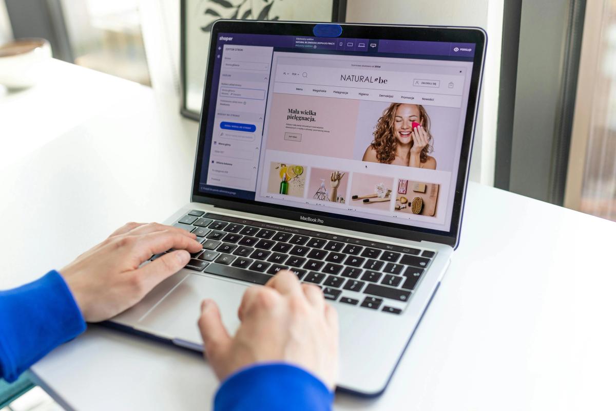
You've just spent weeks perfecting your Shopify store design, studying countless Shopify product page examples to create the perfect shopping experience. But here's what most merchants miss: the order confirmation page is where your real opportunity begins. After a customer completes their purchase, they're in a unique state of mind, receptive and engaged, yet this page often sits neglected, displaying nothing more than a basic transaction receipt. This article will show you exactly how to transform your Shopify order confirmation page from a dead end into a revenue-generating asset that strengthens customer relationships, increases repeat purchases, and maximizes the value of every transaction.
PagePilot's AI page builder helps merchants build optimized order confirmation pages that convert, using smart recommendations for upsells, cross-sells, and customer retention strategies tailored to your store's unique needs.
Summary
- The order confirmation page stands out because 70% of shoppers view it, making it one of the most frequently visited pages in the entire funnel. Merchants see this visibility as an opportunity to layer in upsells, cross-sells, and loyalty programs without risking the original sale.
- Even perfectly optimized confirmation pages can't fix upstream conversion problems. When your site converts at 1.5%, that means 98.5% of visitors never reach checkout. They leave during product evaluation or cart review. Even tripling the effectiveness of the confirmation page only accounts for 1.5% of total traffic.
- Product pages function as decision engines where buying intent converts or evaporates. According to consumer research from The Good, 87% of consumers prioritize product content in their purchasing decisions. Visitors arrive with questions about whether the product solves their problem, justifies the price, and comes from a trustworthy brand.
- Product visuals carry more weight than most merchants realize. Google's mobile shopping research found that people who search and shop on smartphones at least once per week say product images are the feature they turn to most. Poor visuals create friction even when the copy and pricing are strong.
- High-performing Shopify stores test product ideas and page variations five times more frequently than stores stuck at 1% conversion. They're not necessarily smarter, just faster at validating what works. Speeding up the learning cycle and killing bad ideas before they drain ad budgets.
PagePilot's AI page builder helps merchants optimize product pages where buying decisions are made, generating conversion-focused layouts and copy in minutes rather than days, so testing velocity isn't bottlenecked by manual page creation.
Why the Shopify Order Confirmation Page Gets So Much Attention

The order confirmation page draws obsessive focus because it sits at the exact moment when trust peaks and buyer's remorse hasn't yet crept in. You've already closed the sale. The customer feels good. Unlike the locked-down checkout flow, this is one of the few post-purchase spaces where Shopify merchants can still add messaging, offers, or guidance without hitting platform restrictions.
The Untapped Funnel Finale
That attention makes sense on the surface. According to a 2025 Shopify metrics analysis, approximately 70% of shoppers view the order confirmation page, making it one of the most reliably viewed touchpoints in the entire funnel. The buyer is present, engaged, and in a positive emotional state.
Any additional prompt feels like found money, a chance to squeeze more value from a moment that already worked.
The Logic Behind the Fixation
Most merchants treat the order confirmation page like a bonus round. The hard work is done. Conversion happened. Now they can layer in upsells, cross-sells, loyalty program sign-ups, or social proof requests without risking the original sale. It's a low-risk, high-visibility opportunity that doesn't require rethinking product pages, rewriting ad copy, or fixing broken checkout flows.
Capturing Post-Purchase Momentum
The appeal is simple. You're speaking to someone who just proved they trust you enough to hand over money. They're not comparison shopping anymore. They're not debating whether your product solves their problem. They've committed, and in that brief window before the dopamine fades, they're more receptive to next steps than they'll ever be again.
Why This Framing Quietly Overstates Impact
The problem isn't that the order confirmation page lacks value. The obsession with optimizing it distracts from the bigger issue: most conversions die long before anyone reaches checkout. Merchants pour energy into perfecting post-purchase messaging, yet their product pages convert at 1%, and their ad-to-landing-page drop-off is 80%.
The order confirmation page can't fix weak positioning, unclear value props, or friction-heavy user experiences upstream.
The Scalability Trap
You can add the perfect upsell offer, the most compelling loyalty pitch, or the smoothest referral ask. But if only a tiny fraction of your traffic makes it to that page in the first place, you're optimizing the wrong part of the funnel. The order confirmation page supports retention and lifetime value. It doesn't create demand or recover lost intent.
Overcoming Manual Optimization Friction
Most teams handle post-purchase optimization by manually tweaking confirmation page elements, testing different offers, or adding third-party apps one at a time. As your product catalog grows and testing velocity becomes critical, that manual approach:
- Fragments across tools
- Slows down experimentation
- Makes it hard to maintain consistency
AI-Driven Retention at Scale
Tools like PagePilot's AI page builder help merchants apply the same conversion-focused thinking to confirmation pages that they use on product pages, with smart recommendations for upsells and retention strategies that fit your store's behavior, without requiring design skills or developer support.
The Real Cost of Misplaced Focus
When you treat the order confirmation page as the final frontier of conversion optimization, you're implicitly accepting that everything before it is good enough. You're saying the product page worked well enough. The checkout flow was smooth enough. The traffic quality was high enough.
For most stores, none of that is true. They're losing 95 out of 100 visitors before anyone ever sees a confirmation screen.
Foundation Over Finish
The confirmation page matters. It's worth optimizing. But it's not where your biggest gains live. It's the polish after the foundation is solid, the final touch after the structure holds. Focusing there first is like obsessing over the perfect thank-you card while your front door is still broken.
Related Reading
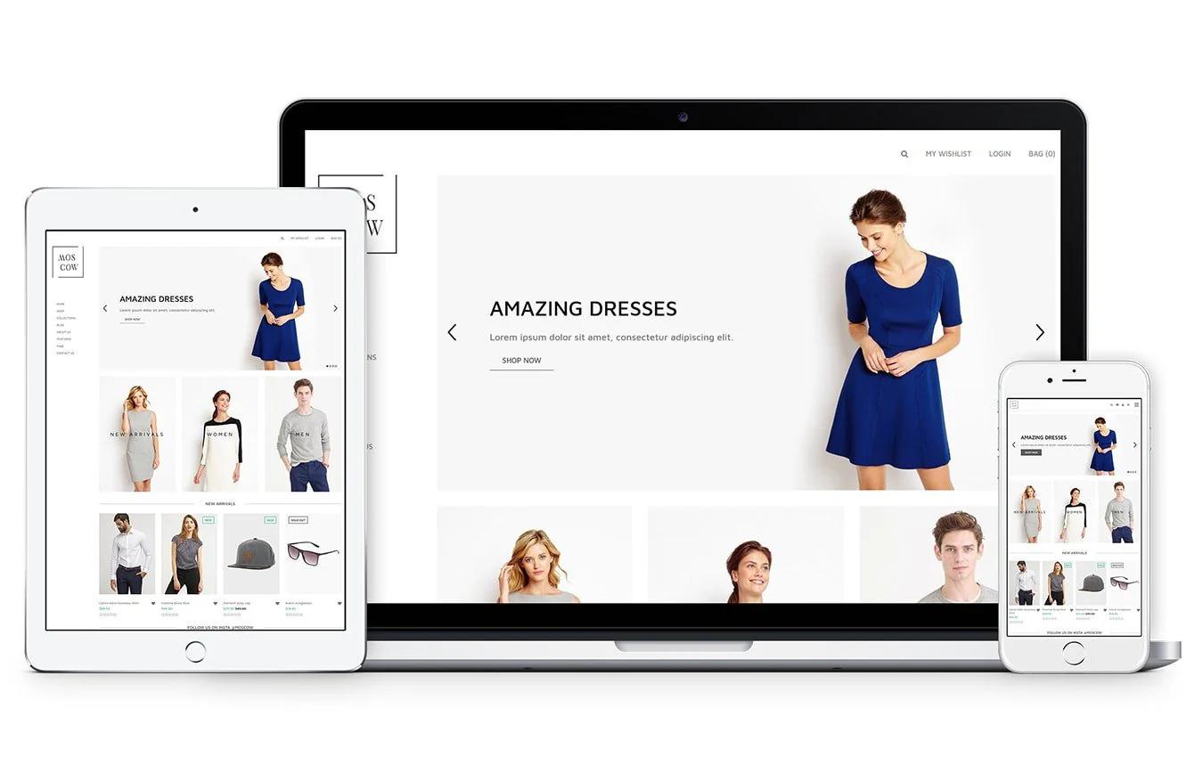
- Shopify Product Page Examples
- How to Make Your Shopify Store Look Professional
- How to Increase Conversion Rate Shopify
- Best Size for Shopify Product Images
- eCommerce Product Page Optimization
- Shopify Banner Size
- How to Create Multiple Product Pages in Shopify
- How to Change Favicon on Shopify
- How to Add Size Chart in Shopify
- How to Customize Shopify Checkout Page
What You Can Actually Improve on a Shopify Order Confirmation Page
You can improve clarity, reduce anxiety, and build long-term engagement. The order confirmation page is most effective when it reinforces the buyer's decision, sets realistic expectations, and creates pathways for future interaction without forcing immediate action.
Reassurance Through Transparent Communication
Buyers experience a predictable emotional arc after clicking "complete order." Relief, then doubt. Did I make the right choice? When will this arrive? What if something goes wrong? The confirmation page is designed to address those questions before they escalate into support tickets or refund requests.
Trust Through Radical Transparency
Show exactly what they ordered, including product images, quantities, and variant details. State the shipping timeline in plain language, not vague promises like "ships soon." If there's a risk of delay (custom products, international shipping, pre-orders), say it now. Transparency builds more trust than optimism.
The Cost of Delivery Friction
According to checkout usability research, approximately 18% of U.S. online shoppers abandon their carts because delivery times are not clearly communicated at checkout. That same uncertainty doesn't vanish after purchase. It just transforms into buyer's remorse.
Include direct contact methods. Not a generic "support@" email buried in the footer, but a visible link to order tracking, a phone number if you offer it, or a chat option that actually works. When customers know help is accessible, they're less likely to panic and more likely to wait patiently.
Post-Purchase Actions That Reduce Friction
The confirmation page can guide customers toward behaviors that make your life easier without making it feel like work. Implementing order tracking links can reduce "where is my order?" inquiries by 40%, as highlighted in a recent consumer report on post-purchase experience. This efficiency isn't about upselling; it's about meeting fundamental customer expectations for transparency. That's operational efficiency disguised as customer service.
Frictionless Account Adoption
Encourage account creation if they checked out as a guest, but frame it around convenience, not obligation. "Save this info for next time" works better than "create an account now." The decision is already made. They're no longer in transaction mode. They're in relief mode, looking for the easiest path forward.
If you're collecting email or SMS opt-ins for shipping updates, now is the time to ask. They want those updates. You're not interrupting their intent. You're serving it. Just don't bundle it with marketing language that makes them suspicious. "Get notified when your order ships" converts. "Join our VIP list for exclusive offers" feels like bait-and-switch.
Trust Signals That Reinforce Professionalism
Branding consistency matters more here than most merchants realize. If your product pages look polished but your confirmation page feels like a generic Shopify template, you've introduced doubt. The subconscious question arises: Is this a legitimate business, or did I just hand my credit card to a dropshipper who'll disappear?
Establishing Brand Authority
Use your logo, colors, and tone of voice. Include a brief "what happens next" section that walks through fulfillment, shipping, and delivery in simple steps. If you have a physical address or business registration details, show them. These aren't legal requirements on the confirmation page. They're psychological anchors.
Validation Over Vanity
Social proof works here, too, but only if it's relevant. "Join 50,000+ happy customers" feels hollow. Statements such as "Most orders arrive within 3-5 business days" or "98% of customers rate their experience 4+ stars" provide context that reduces anxiety. The goal isn't to impress. It's to confirm they made a safe choice.
Low-Friction Engagement Opportunities
You can introduce the next steps without demanding immediate action. Referral programs, content hubs, or loyalty program invitations work because customers are already in a positive emotional state. They just gave you money. If the ask is easy and feels like a natural extension of that relationship, some will say yes.
Authentic Referral Incentives
Referral links perform better here than on product pages because the value exchange is clear. They know what they bought. They can recommend it authentically. But the offer has to be simple. "Share this link, get $10 off your next order" works. "Complete these five steps to unlock rewards" doesn't.
Value-First Engagement
Content engagement (blog posts, how-to guides, product care tips) adds value without asking for anything. If someone just bought a skincare product, a link to "How to layer serums for best results" would be helpful. It positions your brand as helpful rather than transactional. And it keeps them in your ecosystem longer, which increases the likelihood they'll remember you when they need to reorder.
Scaling Beyond Manual Management
Most teams handle post-purchase optimization by manually editing confirmation page templates, testing different upsell offers, or layering third-party apps that slow down load times. As your product catalog expands and you test multiple offers simultaneously, the manual process creates inconsistencies and limits how quickly you can iterate.
AI page builder applies the same conversion-focused structure to confirmation pages that it uses for product pages, using smart recommendations for post-purchase actions based on customer behavior, without requiring design work or developer time.
The Upsell Question Nobody Asks
Can you add an upsell or cross-sell offer to the confirmation page? Yes. Should you? Only if it's genuinely complementary and doesn't disrupt the primary goal of reassurance. Offering a discounted cleanser to someone who just bought a moisturizer makes sense. A furniture store pushing unrelated products feels desperate.
The risk is cognitive overload. The buyer just completed a decision. Their brain is tired. If you immediately ask them to make another purchase decision, you're betting they have the energy to do so. Most don't. And if the offer feels pushy, you've turned a positive moment into a negative one.
Holistic Success Metrics
Test it, but measure more than revenue. Track support ticket volume, refund requests, and repeat purchase rates. If your upsell increases immediate revenue but decreases long-term retention, you've optimized the wrong metric.
The Hidden Belief That Limits Results

The limiting belief is this: if the order confirmation page is visible and post-purchase, it must be a conversion lever. But visibility doesn't equal influence. The confirmation page appears only after the decision has been made. It can reinforce, clarify, or guide what happens next, but it cannot create the sale itself. That work was completed earlier, on pages that most merchants barely optimize.
Why This Belief Persists
The confirmation page feels like an opportunity because it's one of the few touchpoints merchants fully control after Shopify's checkout takes over. You can't redesign the payment form. You can't A/B test the cart layout without apps. But the confirmation page? That's yours. So it becomes the default place to experiment, not because it's the highest-impact area, but because it's the most accessible.
The Illusion of Optimization
This creates a false sense of progress. You add an upsell block, tweak the thank-you message, and test a referral widget. Metrics move slightly. Revenue ticks up a fraction of a percent. It feels like optimization. But you're improving a page that only 2% of your traffic ever sees, while 98% bounce somewhere upstream.
The real issue isn't what you're doing on the confirmation page. It's what you're not doing on the product page, the landing page, the ad-to-site handoff. Those moments determine whether someone converts. The confirmation page only determines what happens after they already chosen you.
The Math That Reveals the Problem
If your site converts at 1.5% (slightly above the Shopify average), that means 98.5% of visitors never reach checkout. They leave during browse, product evaluation, or cart review. Even if you tripled the effectiveness of your confirmation page (impossible, but hypothetically), you would still reach only 1.5% of total traffic. The ceiling is built in.
The Leverage of Upstream Gains
Compare that to improving your product page conversion rate from 1.5% to 2.5%. That's a 67% increase in buyers, not a marginal lift on people who already bought. The confirmation page can't recover lost intent. It can't fix unclear messaging. It can't convince someone who left because your product didn't make sense or your shipping costs felt too high.
Productivity vs. Strategy
Most merchants spend hours tweaking post-purchase flows while their product pages use generic templates, stock photos, and bullet points that could describe anyone's product. They optimize the last 2% of the journey while ignoring the first 98%. That's not a strategy. That's avoidance dressed up as productivity.
The Custom Design Bottleneck
When testing velocity matters and you're running multiple products simultaneously, manually building and optimizing each product page creates a bottleneck that slows everything down. Merchants end up recycling the same layouts, copying competitor structures, or launching with half-finished pages because custom design takes too long.
Tools like PagePilot's AI page builder let you generate conversion-optimized product pages in minutes, applying the same structured thinking to the pages where buying decisions actually happen, so you're not stuck choosing between speed and quality when the real leverage is upstream.
What Gets Sacrificed When Focus Shifts Too Late
When teams obsess over post-purchase optimization, they implicitly accept that their pre-purchase experience is good enough. They're saying the product page converted well enough. The value proposition landed well enough. The trust signals worked well enough. But "good enough" in e-commerce usually means "losing 98 out of 100 visitors."
Beyond Post-Purchase Repair
The confirmation page can't fix weak product-market fit. If buyers weren't convinced before checkout, no amount of thank-you messaging will retroactively create excitement. It can't clarify a value proposition that was murky on the product page. It can't rebuild trust that was never established in the first place.
The Invisible Audience Gap
And critically, it can't touch the majority of your audience. The people who bounced after three seconds. Those who added items to the cart but never started checkout. The visitors who compared your product to a competitor's and chose the other one. None of them sees your beautifully optimized confirmation page. They're gone before it loads.
Where the Real Leverage Lives
The confirmation page supports retention, repeat purchase behavior, and lifetime value. Those matters. But they only matter after you've solved the harder problem of getting people to buy once. If you're converting 1% of traffic, you don't have a retention problem yet. You have an acquisition and conversion problem.
Intent-Shaping Touchpoints
The pages that determine whether someone becomes a customer in the first place are where the biggest gains live. The ad creative that sets expectations. The landing page that matches the promise. The product page that builds belief. The cart experience that removes friction. Those touchpoints shape intent, build trust, and create urgency. The confirmation page inherits the momentum generated by those pages.
When you optimize in reverse order (post-purchase first, pre-purchase later), you're polishing the roof while the foundation cracks. The confirmation page can enhance the overall experience. It cannot make a broken funnel work.
Where Revenue is Really Won (Before Checkout)
The buying decision crystallizes when a visitor evaluates your offer, understands what they're getting, and decides the value justifies the price. That moment occurs during browsing and product evaluation, not after checkout. By the time someone reaches the confirmation page, the sale already closed. You're just documenting what already happened.
The Funnel Math Nobody Wants to Face
Even strong Shopify stores convert between 1.5% and 3% of total traffic. That means 97-98.5% of visitors leave without making a purchase. They bounce from the homepage, exit during product evaluation, or abandon their cart before initiating checkout. The confirmation page never loads for them. They're gone before the transaction begins.
The Shift to Comparison-First SERPs
A recent analysis of 250 search results reveals that 169 of the top rankings for "best software" queries now prioritize product comparison content over individual product pages. This shift in SERP presentation highlights a growing consumer preference for side-by-side comparisons before making a purchase.
Where Intent Meets Reality
Buyers research harder before they click. They compare features, read reviews, and evaluate alternatives long before they land on your site. By the time they arrive, they've already formed expectations. Your product page either confirms or contradicts those expectations. That's where intent converts or evaporates.
The Post-Purchase Limitation
The confirmation page only appears after someone decides you were worth the risk. It can't create that decision retroactively. It can't fix unclear messaging, weak positioning, or trust gaps that formed earlier. If 98% of your traffic never converts, optimizing for the 2% who do is missing the real problem.
Where Intent Actually Forms
Product pages are decision engines. Visitors arrive with questions. Does this solve my problem? Is it worth the price? Can I trust this brand? Will it arrive on time? Your product page answers those questions through images, copy, social proof, and structure. If the answers feel convincing, they are added to the cart. If not, they leave.
The Cost of Hesitation
Most merchants underestimate the importance of clarity at this stage. Vague product descriptions, generic bullet points, and stock photos don't build belief. They create hesitation. When someone can't picture how the product fits into their life or solves their specific problem, they tend to take no action. They'll keep browsing, compare alternatives, or abandon the tab entirely.
The Power of Upstream Conversion
The gap between a 1.5% and a 3% conversion rate isn't due to post-purchase optimization. It's about how well your product page communicates value, removes friction, and builds confidence before the add-to-cart click. Double your product page conversion rate and you've doubled revenue without changing anything downstream.
The Friction Points That Kill Conversions Early
Cart abandonment is around 70% across e-commerce, but that statistic masks where the real damage occurs. Many merchants focus on cart page optimization (trust badges, countdown timers, exit-intent pop-ups) while ignoring the structural issues that drive abandonment.
The Wall of Forced Registration
Forced account creation before checkout creates a massive drop-off. Customers who just want to complete a purchase hit a wall: they must provide an email, password, and profile setup before they can proceed. That friction point happens before checkout even begins. The confirmation page never appears because the buyer abandoned three steps earlier.
The Hidden Cost Drop-off
Hidden shipping costs that only appear at checkout trigger sticker shock. The visitor added to the cart based on one price expectation, then discovered the real total was 20% higher. They close the tab. They compare prices on competitor sites. They decide it's not worth it. Again, the confirmation page does not load. The sale died at cost transparency.
The Manual Creation Bottleneck
Most teams handle product page creation by manually building layouts, writing copy from scratch, or copying competitor structures that may or may not convert. As your catalog grows and you test multiple products simultaneously, the manual process becomes the bottleneck. You're either launching with half-finished pages or spending days on design when speed matters more.
Tools like PagePilot's AI page builder generate conversion-optimized product pages in minutes by applying structured layouts and persuasive copy patterns to the pages where buying decisions happen, so you're not stuck choosing between launch velocity and page quality.
The Invisible Cost of Optimizing Backward
When you obsess over confirmation page tweaks (better upsell offers, clearer order summaries, loyalty program prompts), you're implicitly accepting that everything upstream worked well enough. You're saying the product page converted adequately. The cart flow was smooth enough.
The value proposition landed clearly enough. But for most stores, none of that is true. They're hemorrhaging potential buyers during evaluation and consideration, then optimizing the experience for the tiny fraction who made it through.
Prioritizing Conversion Over Retention
The confirmation page supports retention and lifetime value. Those metrics matter for long-term profitability. But they only become relevant after you've solved the harder problem of converting first-time visitors into buyers. If your store converts 1% of traffic, you don't have a retention problem yet. You have a conversion problem. Fixing the confirmation page won't change that ratio.
Inherited Momentum
Product pages set expectations, build trust, and create urgency. They answer objections before they form. They demonstrate value in concrete terms. They make the purchase feel safe and justified. The confirmation page inherits the momentum generated by earlier touchpoints. It can reinforce a good decision. It cannot manufacture a belief that never existed.
Related Reading
- Shopify Variants vs Options
- How To Add Frequently Bought Together On Shopify
- Shopify Variants Vs Options
- How To Add Size Chart In Shopify
- Best Shopify Themes For Conversion
- Product Recommendations Shopify
- How To Change Favicon On Shopify
- Shopify Order Confirmation Page
- How To Choose A Shopify Theme
- How To Customize Shopify Checkout Page
A Smarter Optimization Stack for Shopify Stores
High-performing Shopify stores don't start with checkout tweaks or post-purchase hacks. They start where buying decisions are actually made: before checkout ever begins. Their optimization stack is built to improve upstream intent, clarity, and confidence, so every downstream metric benefits as a result.
Test Product Ideas and Angles Quickly
Winning stores don't assume they know what will convert. They test early and often. Different value propositions. Different hooks and angles. Different ways of framing the same product.
Fast testing reduces guesswork and prevents months of ad spend behind ideas that never had strong intent in the first place. When you can validate demand in days instead of weeks, you compress the learning cycle and kill bad ideas before they drain your budget.
Speed as a Competitive Advantage
The pattern surfaces repeatedly: stores that convert at 3% test five times more frequently than stores stuck at 1%. They're not smarter. They're faster. They launch, measure, iterate, and move on. Speed becomes the competitive advantage because it exposes what works before competitors finish their first design revision.
Create Differentiated Product Pages, Not Clones
Most Shopify product pages fail because they look and sound like everyone else's. High-performing stores deliberately break that pattern by leading with a clear, specific value proposition. They explain why the product exists, not just what it is. They structure pages around buyer objections, not feature lists.
The Impact of Content on Conversion
Differentiation is what makes shoppers stop scrolling and start considering. According to [The Good's consumer research](https://thegood.com/insights/product-descriptions/), 87% of consumers cite product content as a key factor in their purchasing decisions. Your product pages must hit the mark, or visitors leave before they ever consider buying.
Specifics Over Generics
When your page reads like a template, shoppers assume your product is generic too. They default to price comparison because nothing else distinguishes you. Differentiation isn't about being clever. It's about being specific enough that someone can picture exactly how this solves their problem.
Upgrade Visuals So Products Don't Look Interchangeable
Product images aren't decoration. They're decision tools. Stores that convert well invest in visuals that clearly and in context show the product, communicate benefits (not just appearance), and reduce uncertainty about:
- Size
- Use
- Outcomes
According to Google's mobile shopping research, individuals who use their smartphones to search and shop at least once a week identify product images as the feature they rely on most when making decisions. When visuals do the heavy lifting, copy doesn't have to work as hard.
The Visual Friction Gap
Poor visuals create friction even when everything else is in order. A shopper can't tell if the jacket will fit their style. They can't see how the supplement packaging looks in real life. They can't visualize the product in their home. That uncertainty becomes hesitation, and hesitation becomes abandonment.
Validate Demand Before Scaling Ads
Instead of scaling ads and hoping the page converts later, smarter stores validate product-page conversion first. They look for strong add-to-cart and checkout initiation signals. They scale only once the page proves it can sell. This reverses the usual failure pattern.
- Fewer wasted clicks.
- Better unit economics.
- Faster learning.
The Ad Spend Death Spiral
The store owner who spends $4,000 testing broad audiences, interest targeting, and funnel optimization without first validating the product page is wasting money. The CPMs remain high because the page doesn't convert, so the algorithm continues to search for cheaper traffic that will. But cheaper traffic converts even worse, creating a downward spiral.
The Production Bottleneck
Most teams handle product page creation by manually building layouts, writing copy from scratch, or copying competitor structures that may or may not convert. As your catalog grows and you test multiple products simultaneously, the manual process becomes the bottleneck. You're either launching with half-finished pages or spending days on design when speed matters more.
Tools like PagePilot's AI page builder generate conversion-optimized product pages in minutes by applying structured layouts and persuasive copy patterns to the pages where buying decisions happen, so you're not stuck choosing between launch velocity and page quality.
Why This Stack Works
Optimizing before checkout improves everything that follows. Clearer intent and stronger differentiation lead to higher add-to-cart rates, better checkout completion, fewer refunds and chargebacks, and stronger post-purchase engagement.
When shoppers arrive at the order confirmation page already confident in their decision, that page becomes a reinforcement, not a rescue attempt. The sale was won on the product page. The confirmation page simply documents the transaction and sets expectations for next steps.
The Focus of Scale
The stores stuck at 1% conversion keep optimizing the confirmation page because it feels productive. Stores scaling to seven figures optimize their product pages because that's where intent converts into revenue. The difference isn't effort. It's focus.
Improve Conversions Before Checkout With PagePilot (Start a FREE Trial and Generate 3 Product Pages)
If you're spending time tweaking the Shopify order confirmation page and still not seeing meaningful growth, the issue isn't on the post-purchase side. It's what happens before checkout. The buying decision forms on the product page, not after someone hands over their credit card. That's where PagePilot changes the equation.
AI-Driven Speed and Scale
Instead of squeezing marginal gains out of the confirmation page, PagePilot's AI page builder helps you optimize the part of the funnel where buying decisions actually happen. You can turn any competitor or supplier URL into a high-converting product page in minutes, test new products and angles faster without committing weeks to manual page builds, and launch pages quickly without writing or designing from scratch. That speed lets you focus on testing and scaling, not fighting with templates.
If you want to improve Shopify conversions where buying decisions are actually made, start a free PagePilot trial today and generate 3 product pages for free. No credit card required.
Related Reading
• Shopify Beauty Stores
• Pagefly Alternatives
• High Converting Product Pages
• Best One Product Shopify Theme
• Best Trust Badges For Shopify
• Shopify Electronics Store
• Shopify Contact Us Page Example
• Shopify T-shirt Store Examples
• Best Shopify Theme For Print On Demand