Picture this: you spent weeks sourcing products and building your store, but shoppers leave on the product page. Small images, inconsistent fonts, and thin descriptions break trust and stop purchases. On Shopify product page examples, a clear layout, strong product photography, consistent branding, and compelling calls to action often determine whether a visitor becomes a customer. Which page elements are costing you conversions? This article gives practical design fixes, copy tips, and real page examples to help you make your Shopify store look professional. To help you put those ideas into practice, PagePilot's AI page builder creates polished product pages and full page templates fast, so you can test layouts, improve mobile experience, and add reviews and trust signals without code.
Summary
- Website design drives credibility: 75% of consumers judge a company based on its site design, meaning aesthetics and a clear layout directly influence purchase intent and perceived value.
- Unattractive content or a sloppy layout triggers early drop-off: 38% of people stop engaging with a website if its content or layout is unattractive. Hierarchy, image quality, and consistent typefaces are conversion levers.
- First impressions and micro-interactions matter significantly; 94% of first impressions are shaped by web design. Tactile feedback, loading placeholders, and consistent focus states help prevent minor frictions from eroding trust.
- Image quality and local visual presence are conversion signals. 67% of consumers say product image quality is very important, and 60% are more likely to consider a business when images appear in local search. Consistent hero shots and scale references reduce returns and increase discoverability.
- Social proof is functionally mandatory, since 92% of consumers read reviews before buying, and 88% trust online reviews like personal recommendations, and operational rules plus a monitoring threshold, for example, flagging pages where add-to-cart drops 20 percent below the catalog median, keep that proof credible and actionable.
AI page builder addresses this by producing repeatable, device-optimized templates and pushing them into Shopify with one click, shortening launch cycles while preserving visual and copy guardrails.
Why a Professional-Looking Shopify Store Matters

A professional-looking Shopify store matters because it turns hesitation into action:
- A clear visual structure and confident design signal trust
- Reduce friction
- Increase the likelihood that a visitor becomes a buyer
When your pages look deliberate and well-organized, you shorten the decision path and make conversion the default next step.
Why Does Visual Credibility Change What People Buy?
According to Stanford University, 75% of consumers judge a company's credibility based on its website design, meaning aesthetics are not decoration; they are a primary trust signal that influences purchase intent and willingness to pay.
That matters because perceived value often outpaces product specs; a tidy layout and consistent brand cues let you position the same item at a higher price without provoking buyer suspicion.
How Fast Do People Abandon Unattractive Pages?
The moment content or layout looks sloppy, engagement collapses, and that loss happens before most merchants notice, which is why Adobe found that 38% of people will stop engaging with a website if the content or layout is unattractive.
This means poor hierarchy, mismatched images, or inconsistent typefaces turn product pages into stop signs for otherwise interested shoppers.
What Patterns Have I Seen When Stores Try To Solve This?
This pattern appears across new stores and small agencies: merchants try to differentiate by swapping colors or adding badges, but a generic template still reads as generic. Designing vertical-specific themes, supported by simple conversion evidence, creates real differentiation.
When a client does not buy the custom theme, it often still sells on theme marketplaces because other merchants want that ready-made, credible look. The emotional fallout is real, too; teams get exhausted trying to polish a template while conversion drifts.
The Psychology of Consistency: Protecting Your Ad Spend at Scale
Most teams stick with default themes because they are familiar and fast. That works at first, but as product tests multiply, the same defaults create a twofold cost:
- Diminishing returns on ad spend
- Inconsistent customer experiences across pages
Platforms like PagePilot provide instant, psychologically optimized layouts and one-click Shopify integration, enabling teams to move from fragmented tweaks to repeatable, conversion-focused pages, reducing launch time and maintaining consistent visual quality across dozens of tests.
What Should You Prioritize Next To Protect Your Conversion Rate?
Focus on repeatability and test velocity. Use proven templates, clean image treatments, and consistent messaging blocks that you can quickly swap in and out.
When you treat visual polish as an experiment variable instead of a permanent project, you:
- Launch faster
- Learn faster
- Avoid sunk-cost edits that never improve results
Think of a product page as a thirty-second sales conversation, not a brochure. The page should answer the buyer’s unspoken questions before they ask, and appear to have been built by someone who understands what matters.
Related Reading
- Shopify Product Page Examples
- How to Increase Conversion Rate Shopify
- How to Get More Sales on Shopify
- Best Size for Shopify Product Images
- eCommerce Product Page Optimization
- Shopify Banner Size
- How to Create Multiple Product Pages in Shopify
- How to Change Favicon on Shopify
- How to Add Size Chart in Shopify
- How to Customize Shopify Checkout Page
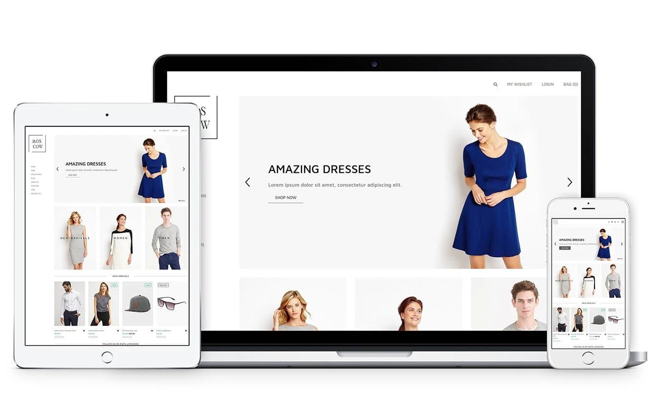
Get the Basics Right: Clean Theme, Simple Navigation, Clear Branding
Start by choosing one clean, lightweight theme and treating it as an experimentation platform: lock in core design decisions, then iterate by swapping copy and images while running rapid A/B tests. Get a simple, scannable menu, a single dominant call to action, and a single visual hierarchy on product pages, so every element either drives sales or is removed.
Which Theme Should I Choose And Why?
Pick a theme built for speed and predictability, not visual fireworks.
Look for:
- Minimal CSS
- Limited third-party scripts
- Straightforward section controls
You can scale variations without custom development. This is why many teams favor themes like Dawn: they provide a predictable structure and allow you to tweak Liquid and CSS without degrading performance. The pattern is clear, especially when stores move platforms.
How Should Navigation Be Organized to Prevent Customers from Guessing?
Design navigation for skimming. Use a single-level primary menu with clear category names, reserve a compact secondary menu for account/help links, and keep the product taxonomy shallow so users reach product lists in two clicks. Use descriptive labels, not clever ones, and place search and cart in consistent, thumb-friendly spots on mobile.
Remember that most shoppers prefer simplicity, which aligns with Web Design Trends Report 2023: 75% of users prefer websites with a clean theme and simple navigation. Trim choices until every click has purpose.
How Do You Ensure Consistent Branding Without Overdesign?
Choose one headline font, one body font, and a three-color palette that includes:
- A dominant CTA color
- A muted background tone
- An accent color for trust signals
Create a short brand rulesheet:
- Logo scale
- Hero image crop
- Button radius
- Microcopy voice
- The exact phrase for shipping and returns
Enforce those rules by baking them into reusable sections or template blocks so every product page looks like it came from the same team, even when different people edit content. Using an AI page builder can automate this process, ensuring your branding remains consistent across all new landing pages you launch.
What Technical Steps Can Protect Speed And SEO During Customization?
Optimize:
- Images to WebP
- Serve scaled images for device widths
- Lazy-load below-the-fold assets
Preload the hero image to improve Largest Contentful Paint and avoid heavy sliders or autoplay videos that consume CPU on mobile. Keep fonts to one or two weights and self-host or use a single provider to avoid extra TCP handshakes.
High-Performance Architecture: Scaling Speed and SEO Simultaneously
Also, keep your app stack lean:
- Uninstall unused apps
- Consolidate features into a single extension when possible
- Preserve canonical tags and clean URLs during migrations to prevent duplicate content issues.
To minimize technical bloat, many sellers prefer a streamlined AI page builder that generates clean, high-performance code without requiring multiple heavy Shopify apps.
The “Scale Paradox”: Why Manual Polish Becomes a Growth Bottleneck
Most teams manage page polish manually through iterative theme edits and ad hoc copy changes because it feels familiar and low-cost. That approach works until you need to launch dozens of product pages quickly; then edits fragment, visual rules drift, and consistency collapses into rework and missed tests.
Teams find that platforms like PagePilot provide instant, conversion-focused templates and one-click Shopify integration, compressing launch cycles from days to hours and restoring consistent visual and copy rules across tests.
How Should You Structure Product Copy And CTAs So Design Decisions Actually Convert?
Lead with a single-sentence value proposition above the fold, then use three short benefit bullets and one clear action. Place social proof near the CTA and make the add-to-cart persistent but unobtrusive on scroll. Use concise microcopy for error states and shipping information so customers feel confident without having to hunt for details.
Treat each product page like a 30-second conversation:
- Open with value
- Remove objections quickly
- Give one natural next step
If you are struggling to write persuasive copy for every SKU, an AI page builder can generate both the layout and the sales text simultaneously to maintain a high conversion rate.
The Silent Trust-Killer: How Presentation “Noise” Undermines Ad Spend
Think of a theme as clothing for your product: a well-fitting, basic theme makes the product look intentional, while mismatched accents make it look accidental. That contrast becomes painfully obvious when you scale tests across dozens of SKUs.That confidence holds until the way you present the product undermines it, in plain sight.
Build Credibility Through Imagery and Product Presentation
High-quality imagery builds credibility by doing two things at once: it shows the product exactly as it is, and it makes that truth feel effortless to understand.
You earn trust by removing ambiguity, and you sustain it by making every product appear to belong to the same thoughtful collection.
How Should Imagery Convey Material And Scale?
When we audit visual systems for stores, the common failure is not a single bad photo; it is inconsistent signals. Use a single focal length and crop rule for the hero shot across the catalog to ensure consistent proportions as shoppers move between products. Add a simple scale shot that includes a common object or a ruler to remove size guesswork.
For texture and finish, soft-proof images for the intended output, and favor traditional photography when reflective or glossy textures require exact light behavior, as AI often struggles to capture accurate highlights and depth on those surfaces.
When Is AI Imagery Appropriate, And How Should You Mix It With Real Photography?
This pattern appears across small brands and dropship stores: AI handles lifestyle mockups and social-ready scenes quickly, but it fails when detail fidelity or accurate reflections matter.
Use AI to create mood shots, backgrounds, or staged contexts that you will never print at full size, and reserve real photography for the hero, close-up texture images, and any shot that will be used for product detail claims. That split keeps costs low while protecting the moments that determine returns and reviews.
Why Does Local Image Presence And Fidelity Matter Beyond The Product Page?
According to Google, 60% of consumers are more likely to consider or contact a business whose images appear in local search results. Visual presence in search directly affects discoverability and inbound interest, so your catalog images are also a marketing channel.
And MDG Advertising, 67% of consumers say the quality of a product image is very important in selecting and purchasing a product, which means image fidelity is not decorative; it is part of the product promise shoppers use to decide.
How Do You Make Image Production Repeatable And Fast Without Sacrificing Consistency?
Design a lightweight production contract:
- Three required photo types per SKU
- Exact crop ratios
- Two approved color-cast references
Automate background removal and templated placements so every image fits within a predefined frame for the product page and ads. Name files and their variants using a predictable convention, then use version control.
For example:
- SKU_hero_1x.jpg
- SKU_macro_2x.webp
- SKU_lifestyle_16x9.webp
This lets you swap images programmatically during A/B tests and keeps your visual rules from breaking down as you scale to dozens of SKUs.
Breaking the “Ad-Hoc” Cycle: Centralizing Assets for High-Velocity Scaling
Most teams manage imagery through ad-hoc uploads and freelancer handoffs because that workflow is familiar and feels flexible. That works until you need to launch dozens of pages quickly, and consistency breaks down, costing time in rework and lost ad performance.
Teams find that solutions like PagePilot centralize:
- Image templates
- Apply consistent crops and metadata
- Push ready assets into Shopify with one click
It compresses manual image prep from days to hours while keeping presentation uniform across tests.
How Should You Test Image Choices Without Freezing Launches?
Treat image tests like short sprints.
Pick:
- One high-traffic SKU
- Run a three-day split testing hero composition A versus B
- Measure add-to-cart and bounce within the first 48 hours
- Roll the winner to similar SKUs
Keep variants small, one variable at a time, so you learn quickly. Think of lighting and crop as conversion levers you can tune incrementally, not moral decisions that require consensus meetings.
What Role Should User Photos And Influencer Shots Play?
User-generated content is credibility currency, but it needs guardrails.
Solicit submissions with:
- A tight brief
- Ask for specific angles
- Offer a modest reward or exposure
Curate and edit UGC to match your catalog's crop and color balance, then label it clearly so shoppers are not misled. When UGC aligns with your product presentation, it reduces skepticism; when it contradicts your hero shot, it increases returns.
The fix is simple: Enforce visual rules before you publish the content.
Future-Proofing the “Digital Shelf”: Strategies for Infinite SKU Growth
Think of your product catalog as a retail shelf: a neat row of identical price tags reads as professional, a mixed set makes shoppers doubt every item.That tidy fix seems final until you realize the real challenge is making every future SKU look as if it always belonged there.
Create a Professional Feel on Every Product Page

A polished product page comes from predictable structure, precise language, and an operational system that enforces those rules every time you publish, so each SKU reads like it was curated, not patched.
Get the small pieces right, then automate the repeatable parts so you can launch fast without losing quality.
How Should You Standardize Copy So Pages Feel Expert Without Endless Rewrites?
Create a short library of content modules:
- A one-line product promise
- Three benefit bullets
- Two objection responses
- A legal-safe shipping snippet
If you treat those modules as atomic units, editors can assemble a consistent page in minutes instead of hours.
Achieving “Processing Fluency”: The Science of Instant Customer Trust
To ensure these modules are applied perfectly to every new SKU, an AI page builder can automatically synthesize your brand’s tone and structure into ready-to-use sections.
For speed, lock variations:
- One module for domestic shipping
- One for international, one for warranty language
- Surface them through selectable fields in your CMS
Non-writers can publish without breaking tone.
What Micro-Interactions Make A Page Read As Intentional?
Small, consistent interactions send a loud signal.
Use:
- Clear focus states
- Tactile button feedback on mobile
- A visible loading placeholder for the hero image
Nothing feels broken while assets load, because tiny friction multiplies into distrust. That matters because ResearchGate reports that 94% of first impressions are shaped by your site’s web design, and when interactions align with visual polish, shoppers assume the product and service will match that quality.
Many top sellers use an AI page builder to deploy high-fidelity micro-interactions across their entire catalog without manually coding custom Liquid sections for each product.
Where Do Teams Break When They Try To Scale A Presentation?
Most teams manage page launches through email and ad hoc uploads because they are familiar and require no new tools.
This works at first, but as SKUs multiply:
- Feedback fragments across inbox threads
- Visual rules drift
- Inconsistent microcopy or image crops erode perceived quality
Teams find that platforms like PagePilot centralize template rules, push ready sections to Shopify with one click, and compress review cycles from days to hours while keeping every page within the same visual and copy guardrails.
Which Signals Should You Monitor So That A Page Fails Quietly, Not Loudly?
Track relative performance, not absolutes. Flag product pages where the add-to-cart rate falls 20 percent below the catalog median, or where time-on-page drops sharply while bounce rises, and inspect for visual or copy drift. Monitor pre-purchase support inquiries per SKU and return rates for new SKUs.
Spikes often indicate:
- Unclear size cues
- Missing scale images
- Vague shipping copy
If you notice a specific template consistently underperforming, you can use an AI page builder to rapidly roll out an updated, data-backed version of that layout across your underperforming pages.
How Do Accessibility And Localized Details Change Perceived Professionalism?
This pattern appears consistently across dropship catalogs and small brands: unclear shipping and return language creates hesitation and often leads to abandoned carts.
Make shipping and returns visible:
- Written in plain language
- Localized for currency, units
- Typical delivery windows
Add clear alt text, 16px body font on mobile, and thumb-friendly tap targets so the page feels built for humans, not just for algorithms.
Beyond the First Click: Establishing Implicit Promises Through Visual Logic
Think of the product page like a well-pressed shirt on a salesperson, not a poster in a window: the fit and seams are quiet, but they change everything a shopper assumes about what happens next.
That polished surface is only half the story; what customers believe about you next will surprise you.
Related Reading
- How to Add a Pop Up on Shopify
- Shopify Variants vs Options
- How to Add Frequently Bought Together on Shopify
- Shopify Order Confirmation Page
- How to Choose a Shopify Theme
- Product Recommendations Shopify
- Best Shopify Themes for Conversion
- Shopify Websites Examples
- High Converting Product Pages
- Best One Product Shopify Theme
Add Social Proof to Build Trust and Reduce Friction

Social proof short-circuits doubt by substituting your voice for a buyer's; use targeted, timely proof, and you remove the specific objections that keep people from clicking ‘Buy’.
Put social evidence where it answers the one question still in the shopper’s head, make it verifiable, and keep it current so it never reads like a leftover prop.
Where Should Proof Appear, And Why Does Placement Matter?
Think in terms of questions, not decoration.
A single, scannable credibility stack should address the following sequence:
- Who bought it
- What they thought
- Why was their concern solved
That stack belongs in three tight places:
- The snippet shown to skimmers (short headline + star rating)
- A visible micro-testimonial addressing the top objection
- A compact verification element on the purchase path
Use short, objection-focused quotes next to the CTA, and a separate “verified buyer” badge inside the cart, so trust remains evident at the final click. Add review schema so search results surface your rating in discovery, as those impressions influence first clicks before your landing page loads.
Which Types Of Social Proof Actually Move Conversions?
Not all proof is equal. Aggregate ratings signal safety, recent user photos signal reality, and objection-specific testimonials remove single-point hesitation.
Prioritize three proven formats in this order:
- Verified one-line endorsements that rebut the most common objection
- User-submitted images or short videos that show scale and texture
- A dynamic activity indicator, like “12 people viewed this in the last hour,” that restores momentum
Treat influencer posts as amplification, not substitution, by converting their content into labeled, verifiable reviews on your product page. Think of a well-chosen testimonial like a magnifying glass placed over a single worry, making it impossible to ignore.
How Should You Collect, Moderate, And Scale Credible Proof Without Slowing Launches?
This pattern appears across small stores and launches:
- Teams launch a product
- Hope reviews will trickle in
- They panic when traffic arrives
- None arrive
Solve that with an operational playbook, not hope.
Send the first review request at:
- The delivery window that matches your product, typically 3 to 14 days after fulfillment, depending on lead time
- Follow with a single SMS or email reminder
- Include a micro-prompt that asks for one sentence plus a photo
Automate:
- Verification flags for orders
- Auto-translate reviews for localized pages
- Surface only verifies submissions by default
If you need immediacy, use a small, time-limited incentive for photo submissions, but label incentives clearly to preserve authenticity.
Eliminating “Review Decay”: Why Proof Freshness is the New Trust Currency
Most teams manage review capture through scattered tools and inboxes, which is fine at first.
As SKUs multiply, that habit fragments:
- Feedback across channels
- Slows publishing
- Produces stale proof that hurts conversion
Platforms like PagePilot:
- Centralize ingestion
- Auto-format reviews into conversion-ready blocks,
- Push them to Shopify with one click
It compresses the time from submission to live proof from days to hours while preserving verification metadata.
How Do You Test Social Proof So You Learn Fast, Not Argue Forever?
Treat proof as an experimental variable.
Run short A/B tests that change only one element:
- Star visibility
- A photo versus no photo
- A long testimonial versus a short quote
- Fresh versus aged-review filters
If traffic is low, run sequential micro-experiments across similar SKUs for seven-day windows; if traffic is high, use split testing with the usual significance rules.
Monitor:
- Add-to-cart rate
- Cart abandonment
- Return rates as your primary signals
A fake-looking proof can reduce returns but still inflate short-term conversions. Keep variants narrow, measure quickly, and roll winners across the catalog through templates so good changes scale without rework.
How Do You Keep Social Proof Credible And Compliant Under Pressure?
- Set clear moderation rules before launch:
- No edits that change meaning
- No unlabelled paid endorsement
- Visible timestamps for recency
- Use a lightweight audit trail for each review that documents purchase verification and moderation steps, enabling quick dispute resolution.
- Localize units and delivery expectations in the review metadata to avoid surprises for international buyers.
- Label user-generated images with simple alt text and a crop standard, so UGC matches your catalog visually and does not create a contradictory expectation.
Signal Discrepancy: The Hidden Friction of “Mixed” Review Ratings
Remember how hard new owners find it to get early traction and visibility, and how that anxiety pushes them toward quick fixes. Social proof is the right lever, but only when it is collected and deployed with a launch-first playbook that keeps pace with iteration.
According to Fan & Fuel, 92% of consumers read online reviews before buying, making missing or stale reviews a direct conversion tax. And BrightLocal finds that 88% of consumers trust online reviews as much as personal recommendations, so reviews can stand in for word-of-mouth when you present them honestly.That solution sounds final, until you notice one detail that quietly erodes trust in the exact moment someone reaches for their phone.
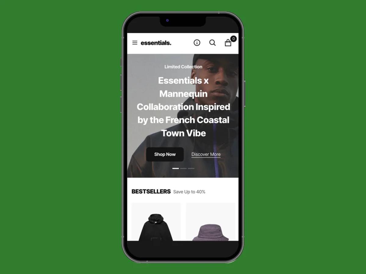
Use Mobile-First Design (Where Most Purchases Happen)

Mobile-first design is nonnegotiable if you want predictable conversions on Shopify, because phones shape what visitors will tolerate and what they will buy.
Focus on performance, fast payment flows, and device-aware content so every interaction on a small screen naturally leads to checkout.
What Performance Signals Should You Be Tracking For Mobile?
Measure conversions by device, not just traffic.
Track:
- Add-to-cart rate
- Payment completion rate
- Short-session drop-off for mobile specifically
Correlate them with Web Vitals such as Time to Interactive and First Input Delay to determine whether the page feels fast or merely appears fast. In practice, pages that reach Time to Interactive quickly keep users engaged; pages that lag show high micro-dropoff.
If your current theme feels sluggish, an AI page builder can help you deploy lean, high-performance layouts that are pre-optimized to meet Google's strict mobile speed requirements. This is a pattern we see when stores scale ad spend without device-level instrumentation: clicks arrive, but mobile visitors never complete small actions because the page is still parsing scripts when they tap.
How Do You Reduce Checkout Friction On Mobile Devices?
Optimize the payment path first. Ensure the page offers native wallets and accelerated checkout options, presents localized payment methods, and enables browser autofill for address and card fields so users can complete in two taps. According to OuterBox, 79% of smartphone users have made an online purchase on their mobile device in the last 6 months, so shoppers expect stored credentials and one-tap flows.
Using an AI page builder ensures your “Add to Cart” and “Buy Now” buttons are optimally placed for thumb reach, reducing the physical effort required to complete a purchase. When they do not find them, abandonment spikes. Also, make form fields device-friendly by using proper input types, minimizing required fields, and surfacing clear inline validation so a single typo does not collapse the sale.
When Should You Prioritize Network-Aware Asset Delivery Over Fancy Visuals?
Use adaptive serving from the start: serve scaled images and lighter scripts to phones on slow connections, and richer assets only when the device and network allow it. That means implementing server-side detection or client hints to swap image resolutions, using a service worker to cache common assets, and deferring nonessential third-party tags. This becomes critical as catalogs and installed apps grow.
The failure mode is predictable: it occurs when five or more external scripts execute on page load and page weight balloons, and the result is measurable: mobile conversions decline while desktop conversions hold steady. An AI page builder automates this by dynamically resizing images and managing script budgets, so your page weight stays low even when you add high-resolution product photography.
How Do You Test Mobile Changes Without Breaking Velocity?
Run short, focused experiments targeted at mobile KPIs. Pick one micro-variant, for example, switching to a one-step checkout or toggling native wallet visibility, and run it for a 3 to 7 day window on similar SKUs.
Monitor:
- Add-to-cart rate
- Payment completion
- Returns
Keep variants surgical, so you learn something actionable within a single cycle, then roll winners across matching product groups.
Scaling the “Single Source of Truth”: Why Manual Themes Eventually Break
Most teams handle mobile polish through ad hoc theme edits and a growing list of apps because that workflow is familiar and low-friction. That familiar approach works early, but as launches multiply, review threads multiply too, visual rules drift, and performance regressions sneak in between edits.
Teams find that platforms like PagePilot centralize:
- Device-optimized templates
- Automate image sizing and script budgets per device
- Push ready pages with one-click Shopify integration
It compresses launch cycles from days to hours and maintains consistent performance as volume increases.
What Does Good Mobile Ux Feel Like In Practice?
Imagine a cashier who rings up a customer while the customer is still deciding on a small add-on, not after they step away; the sale happens because the friction never appears. On mobile, that means the CTA is contextual, payment is remembered, forms are invisible when possible, and essential trust signals are present earlier in the flow.
Small fixes compound; one extra required field or a single heavy script can erase the gains from five high-quality images. You will want to see how these practical, device-first tactics fit into a workflow that accelerates launches and maintains consistency across dozens of SKUs.
Related Reading
- How to Add a Pop Up on Shopify
- Shopify Variants vs Options
- How to Add Frequently Bought Together on Shopify
- Shopify Order Confirmation Page
- How to Choose a Shopify Theme
- Product Recommendations Shopify
- Best Shopify Themes for Conversion
- Shopify Websites Examples
- High Converting Product Pages
- Best One Product Shopify Theme
How PagePilot Helps You Build a Professional, High-Converting Shopify Store Faster
If you are tired of letting design details slow every launch, I get it. Those small decisions eat up the time you need to test products and identify what actually sells.
Teams that try PagePilot say it turns hours of manual layout and copy polish into an AI workflow that produces consistent, test‑ready pages and pushes them into Shopify, so you can focus on:
- Offers
- Traffic
- Learning faster