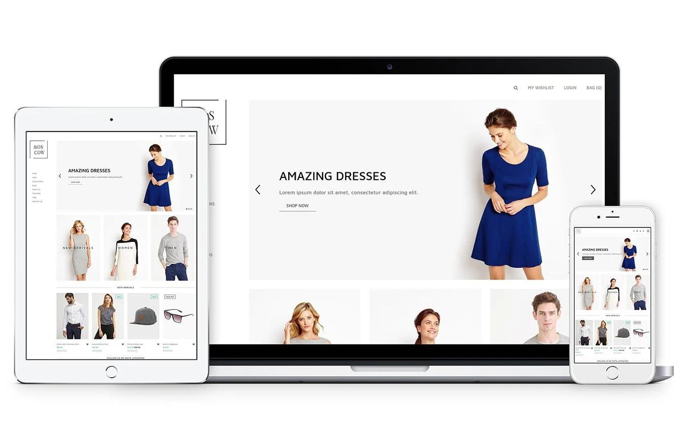
Traffic without sales feels like running in place. If your Shopify store attracts visitors but conversions lag, small changes on the product page can make a big difference. This article offers practical conversion rate optimization tips and real Shopify product page examples, covering clear call-to-action, trusted reviews, mobile optimization, faster page speed, A/B testing, better product images, and checkout simplification to reduce cart abandonment and increase sales. Ready to test simple page changes that move the needle? PagePilot's AI page builder helps you turn those ideas into high-converting pages fast with templates, A and B test setups, and built-in trust sections, so you can focus on improving conversions rather than code.
Summary
- Conversion rate improvements drive revenue more than extra traffic; a 1 percent lift in conversion rate is linked to a 10 percent increase in revenue, and conversion work can reduce customer acquisition cost by about 50 percent.
- First impressions are decisive: users form an impression in roughly 50 milliseconds, and 38 percent will stop engaging if the content or layout is unattractive. Perceived speed and thumb-size clarity matter more than cosmetic polish.
- Match the hero to the traffic source, and use short product videos where appropriate. Product pages with videos can boost conversion rates by up to 80 percent, making a 20- to 60-second demo a high-impact experiment.
- Design mobile-first interactions that reduce taps and typing, because 53 percent of smartphone users are more likely to shop with a company they can message directly, and one-handed layouts with larger tap targets significantly increase interactions per visit.
- Checkout friction is a leading cause of abandonment: 28 percent of US shoppers leave carts due to long or complicated checkouts, and 18 percent abandon because they do not trust the site with their payment details. Therefore, inline validation, tokenized payments, and clear payment copy are essential.
- A/B testing yields measurable gains when done with discipline. Isolated cases show up to 300 percent uplift, but a practical benchmark is about a 20 percent average sales increase. Run narrow, hypothesis-driven tests and measure downstream metrics like retention and return rates.
PagePilot's AI page builder addresses this by generating and publishing multiple product page variants in minutes, with built-in A/B testing and ready-to-use trust sections to reduce manual rebuild time and keep microcopy consistent.
Why Shopify Conversion Rates Matter More Than Traffic
Conversion rate matters more than raw traffic because it turns clicks into cash. Improving how your pages convert increases the value of every visitor you already pay for, so the fastest path to profitable growth is to improve what happens after someone arrives.
Why Does Conversion Outrank Increasing Traffic?
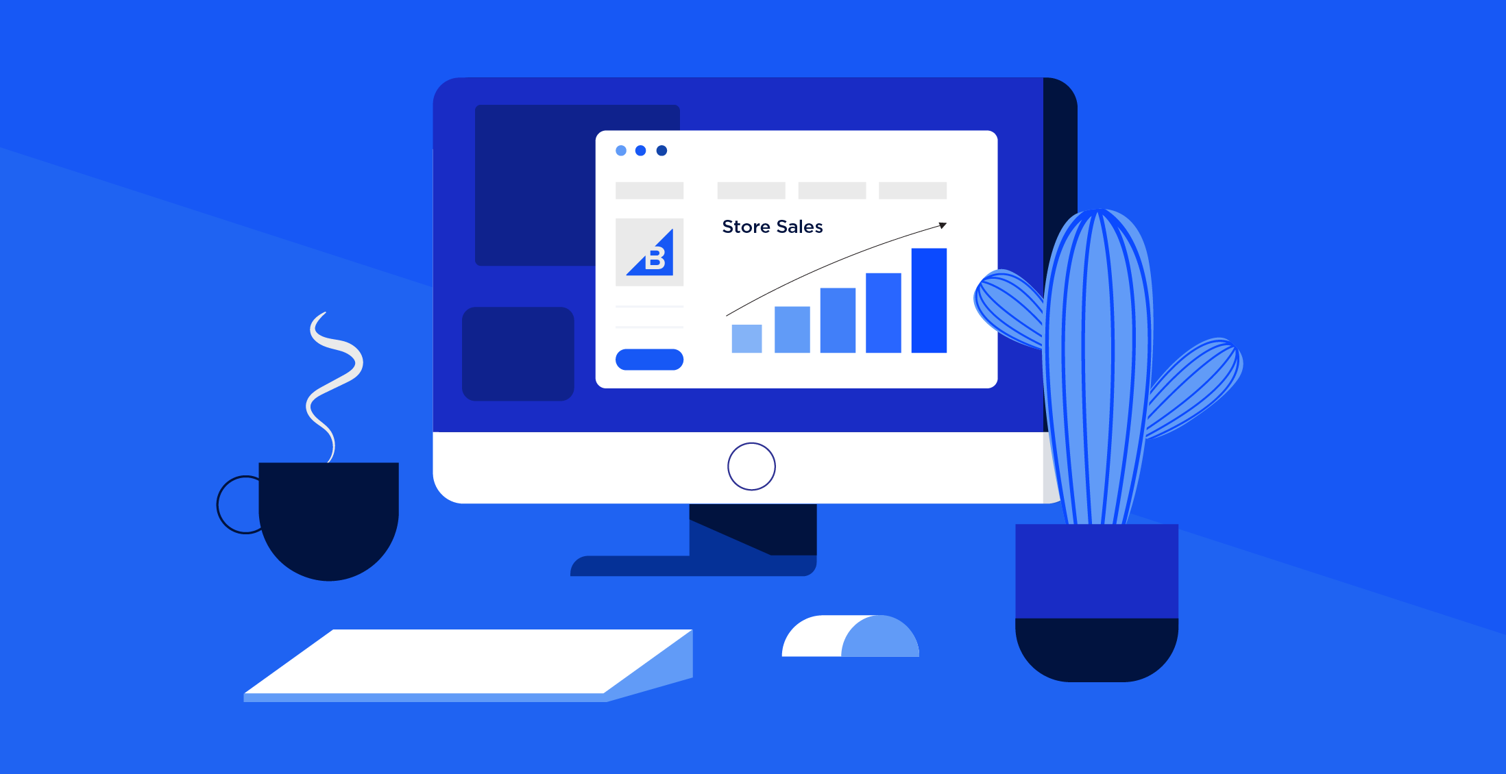
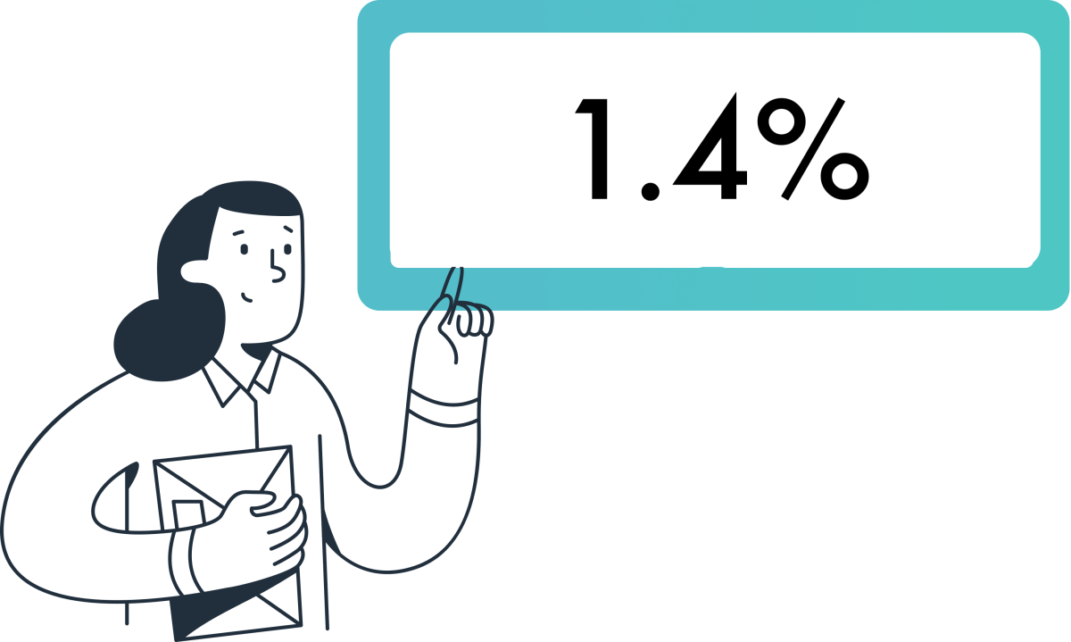
Conversion multiplies every acquisition dollar, which means small lifts scale quickly into meaningful revenue. According to Shopify Blog, increasing conversion rates by 1% can lead to a 10% increase in revenue.
That math shows why optimizing the page people see first is higher-leverage than buying another thousand clicks. When you target conversion, you change the denominator in every ROI equation, not just the numerator.
Where Do Stores Actually Lose Sales?
This pattern appears across early-stage dropship shops and established DTC stores: visitors drop out when the page fails to answer the obvious questions in the first few seconds.
These factors create a friction stack that kills momentum:
- Surprise checkout costs
- An unclear product purpose
- Weak visuals
- Slow mobile load times
- Missing trust signals
It’s exhausting for owners to watch ad costs climb while the checkout flow quietly leaks sales, because fixing the wrong part of the funnel wastes time and budget.
How Do You Decide What To Fix First?
If you have only a few hours or a small budget, prioritize fixes that reduce uncertainty and accelerate decision-making, not cosmetic changes.
Make:
- Price and shipping transparent
- Show clear returns and delivery windows
- Enable Shop Pay or digital wallets
- Tighten the headline and value proposition so the page answers “why this” in under three seconds.
Conversion work lowers acquisition waste, which is why Nethority. Improving conversion rates can lead to a 50% reduction in customer acquisition costs, which changes how aggressively you can scale ads.
The Cost of “Safe” Workflows: Why Manual Handoffs Kill ROI
Most teams handle page creation with long handoffs and ad-hoc templates because it feels familiar and safe.
That works at first, but as experiments multiply, those handoffs become a bottleneck:
- Pages take days to build
- Iterations slow
- Testing momentum stalls while ad spend continues to roll
Platforms like PagePilot centralize:
- Product data extraction
- Ship pre-built high-converting layouts and psychological triggers
- Publish directly to Shopify
It compresses page creation from days to minutes and converts iteration time into measurable tests.
Why Not Push For Bigger Conversion Gains Right Away?
Some tactics feel productive but miss the target. For example, adding checkout upsells increases average order value, but it does not address the clarity or trust issues that determine whether someone buys in the first place. The failure mode is predictable: you optimize for one metric while the primary gate, purchasing confidence, remains cracked.
The right order is simple, rigorous, and human-first:
- Remove surprise costs
- Make benefits obvious
- Reduce purchase steps
- Layer on revenue enhancers
The 50-Millisecond Verdict: Designing for Immediate Trust
Think of your store like a bucket with a slow leak. Pouring more water in without finding and patching the holes only increases waste. Each conversion fix you make is a patch; some patches are tiny and cheap, others take work, but the rule holds: patch early, measure fast, and double down on what seals the bucket.What this means for your next sprint is straightforward: it changes how you:
- Budget ad spend
- Staffing
- Testing cadence
The surprising part? What happens in the first five seconds will decide if any of these fixes matter.
Related Reading
- Shopify Product Page Examples
- How to Make Your Shopify Store Look Professional
- How to Get More Sales on Shopify
- Best Size for Shopify Product Images
- eCommerce Product Page Optimization
- Shopify Banner Size
- How to Create Multiple Product Pages in Shopify
- How to Change Favicon on Shopify
- How to Add Size Chart in Shopify
- How to Customize Shopify Checkout Page
- How to Customize Shopify Checkout Page
Optimize the “First 5 Seconds” Experience

You fix the first five seconds by matching the page to the person who just clicked, then removing anything that forces a decision before they understand value. Many successful stores use an AI page builder to prioritize content delivery and small trust cues, enabling rapid iteration to identify which signals actually hold attention.
What Should The Hero Prioritize For Different Visitors?
This pattern is consistent across different creatives: visitors who clicked a lifestyle video expect context and a story, while those who clicked a close-up expect specs and price. Use simple traffic-driven rules to swap headlines, images, and the primary CTA so the hero directly echoes the ad or referrer.
That one-to-one match reduces confusion instantly because the visitor hears the same message twice, first in the ad and then on the page.
How Do You Make The Page Feel Instant, Even Before All Assets Have Loaded?
Perceived speed matters as much as raw load time.
Implement:
- Skeleton screens and prioritize the main headline, primary image, and CTA in the critical render path
- Preload the hero font
- Use low-quality image placeholders that swap to full-resolution images after the first paint
According to the UX Knowledge Base Sketch, users form an impression of a website in just 50 milliseconds; that tiny window determines whether a user gives you a second to explain yourself. To meet this standard, using a specialized AI page builder ensures your layout is optimized for the “first paint,” deciding whether a user gives you a second to explain yourself or bounces immediately.
Which Minimal Trust Cues Actually Stop People From Bouncing?
The mistake is thinking trust requires long explanations. Small, upfront signals rule: a one-line returns promise, the number of verified reviews with an average rating, and a single familiar payment icon placed near the CTA. Since 38% of people will stop engaging with a website if the content or layout is unattractive.
According to the UX Knowledge Base Sketch, design clarity must be legible at thumb size and free of visual clutter so that trust cues are recognized at a glance.
How Should You Run Experiments That Focus On Those First Seconds?
Run narrow, rapid A/B tests that change only one surface signal at a time, for example, headline copy or hero image, and segment results by traffic source.
Track short-horizon metrics:
- Time to paint
- Percentage of visitors who interact within five seconds
- Immediate bounce cohorts by creative
This helps you avoid optimizing for vanity metrics and helps you identify which first-impression elements actually improve conversion rates for each audience. Leveraging an AI page builder allows you to auto-extract product data and generate multiple high-converting hero variants in minutes.
Breaking the Creative Bottleneck: The Shift from Static to Fluid Content
Most teams stick with one static hero because it feels safe. That works until ad volume grows and variants multiply, then producing new page versions becomes the bottleneck.
Solutions like PagePilot:
- Auto-extract product data
- Generate multiple high-converting hero variants
- Publish them to Shopify in minutes
It compresses iteration from days to minutes, so testing stays ahead of ad creative.Think of the first five seconds like a single hinge on a heavy door; if it squeaks, the whole house feels unwelcoming. But the real test is what happens next: whether attention turns into exploration or becomes a lost click.
Improve Product Page Conversion Drivers
How Should Content Be Sequenced To Help People Make Decisions Faster?
Start with a single claim explaining why this product exists, then follow with one confident proof point and a clear, action-oriented CTA. After that, reveal technical details and return information only when someone scrolls or hovers.
When we rebuilt a high-traffic product page in a ten-day sprint, we:
- Focused the hero statement
- Moved verification next to the CTA
- Deferred specs
The result was a measurable drop in mid-page exits and a cleaner path to purchase. The pattern is simple: reduce cognitive choices early, then satisfy remaining curiosity in small, predictable steps.
Where Does Video Fit Into The Decision Flow?
Use short product videos to replace guesswork where images and copy fall short. According to MerchMetric, product pages with videos can increase conversion rates by up to 80%. A 20-60-second demo that shows how the product is used is more effective than a bullet list.
Add an autoplay muted hero clip or a short user-testimonial reel, but keep alternatives for slower connections. The first test I run is simple: swap an image-only hero for a 30-second use-case clip and measure purchase rate and time to cart, not just play rate.
Which Trust Signals Should Be Visible At The Moment Doubt Appears?
Contextualize reviews and proof. Instead of a long review section at the bottom, surface a single verified quote that addresses the top objection for that variant, then let customers drill into more reviews. Show return windows, a delivery promise, and a “verified purchase” badge next to each testimonial.
Also, optimize the images surrounding those cues, as visual quality determines whether trust is recognized at a glance. MDG Advertising reports that 67% of consumers say the quality of a product image is very important in selecting and purchasing a product. In practice, a crisp lifestyle shot plus one contextual review often outperforms a page crowded with features and no human signal.
What Microcopy And Interactive Elements Actually Remove Hesitation?
Microcopy must anticipate the five most likely objections and address them in line. Near the CTA, use short lines like “Ships in 1–2 business days, free returns in 30 days” and size-swapping suggestions such as “If you are between sizes, pick the larger.”
Add interactive confirmations, such as a delivery date calculator that shows the expected arrival time before checkout. These small confirmations remove perceived risk and work far better than generic badges because they provide concrete, near-term expectations.
The Handoff Tax: Quantifying the Cost of Creative Friction
Most teams create product pages with slow handoffs and one-off edits, which feels safe early on. That familiar approach breaks down as variants and experiments multiply, with pages taking days to produce and updates lost in threads.
Platforms like AI page builders offer an alternative approach:
- They automatically extract product data
- Generate prebuilt conversion layouts
- Publish directly to Shopify
It reduces page creation from days to minutes while keeping proof blocks and microcopy consistent across variants.
How Do You Test These Drivers Without Endless Design Cycles?
Adopt narrow, hypothesis-driven A/Bs. Test one driver at a time, for example, video presence versus no video, or contextual review placement versus generic review blocks. Track short-horizon metrics, such as add-to-cart rate and percentage of visitors who view the delivery promise, then follow through to checkout conversion and return rates.
Segment results by traffic source and creative to identify which signals convert which audiences. When experiments conflict, favor the variant that reduces returns or customer questions, because long-term profit is more reliable than a short spike in clicks.Think of conversion drivers as a relay race, not a single sprint; each element hands off confidence to the next, and a weak handoff is where sales are lost. That solution works until you hit the one device that now decides most purchases.
Strengthen Mobile Experience (Where Most Purchases Happen)
A mobile-first product page is about making decisions feel effortless on a small screen:
- Reduce taps
- Reduce typing
- Place the single purchase action within thumb reach
Many high-growth brands now use an AI page builder to ensure these technical mobile-first requirements, like thumb-zone mapping and asset prioritization, are baked into the page from the moment it’s generated. When you design for one-handed use and unstable networks, you stop losing customers to tiny frictions that never show up in desktop tests.
Which Interaction Details Actually Change Behavior On Mobile?
When we audited 14 Shopify stores across ten product categories during a 30-day sprint, a tight set of surface changes produced the biggest wins:
- Increase tap target size
- Collapse optional inputs
- Prefer toggles or pickers over free-text fields
Those changes eliminate hesitation, as customers rarely want to pause to hunt for a button or type a long address on a crowded bus. Think in terms of gestures, not pages, and measure the result as interactions per visit, not just pageviews.
How Should You Manage Media And Assets To Ensure Pages Load Instantly?
Use responsive image sets and modern formats served conditionally, not a single one-size file.
Serve:
- WebP or AVIF is supported
- Falls back to JPEG only when necessary
- Uses srcset to deliver the smallest image for the current viewport and DPR
Add conditional asset loading based on connection speed so a user on 3G sees essential visuals first, while higher-fidelity images load for faster connections. In practice, this reduces time to meaningful paint and cuts perceived lag more than fancy design tweaks. When using an AI page builder, these performance optimizations are usually automated, ensuring that high-fidelity images don't kill your conversion rate on slower mobile networks.
Why Mobile Messaging Belongs In The Conversion Flow
If you let customers start a conversation when they have a doubt, many will choose that over leaving the page. According to Facebook, 53% of smartphone users are more likely to shop with a company they can message directly. Having an immediate messaging path reduces abandonment by resolving the small questions that block a purchase.
Integrate quick replies, one-tap FAQ, and a visible messaging CTA that pre-fills context so the rep or bot can answer without asking the customer to repeat details.
What Breaks As You Scale Mobile Experiments?
The familiar approach is to bolt mobile fixes onto desktop templates because it feels faster.
That works early, but as variants multiply:
- The asset pipeline and content rules fracture
- Images and copy diverge across versions
- Performance regresses
The hidden cost is slow iteration: updates that should take minutes now take days, and each delay leaks test momentum and ad spend.
How Platforms Change That Trade-off
Most teams handle page builds through manual edits and file uploads, which is comfortable at first. As complexity grows, the work fragments and launch velocity collapses.
Solutions like PagePilot provide:
- Mobile-first templates
- Automatic product data extraction
- Built-in image optimization
- Ready-made messaging CTAs
It compresses page creation from days to minutes while keeping performance rules consistent across variants. Teams that switch see faster iteration without sacrificing the small, device-specific details that actually move conversion.
Which Mobile Experiments Should You Run First?
Run short, focused A/Bs that change only one tactile thing:
- Tap size
- Input reduction
- Wallet vs card flows
- Messaging CTA presence
Track immediate metrics like:
- Add-to-cart rate within the first 15 seconds
- Percentage of visits using biometric or wallet checkouts
- Message-originated conversions
Treat each test as a mini sprint with a single hypothesis, because small changes compound rapidly on mobile.A narrow hallway is easier to run through when the lights are on, and the exits are obvious; optimize for that clarity to capture customers who would otherwise brush past. That improvement helps, but the checkout stage hides the stubborn friction that quietly eats profit.
Related Reading
- How To Add A Pop Up On Shopify
- Shopify Variants vs Options
- How To Add Frequently Bought Together On Shopify
- Shopify Variants Vs Options
- Shopify Websites Examples
- How To Add A Size Chart In Shopify
- Best Shopify Themes For Conversion
- How To Choose A Shopify Theme
- Product Recommendations Shopify
- Shopify Order Confirmation Page
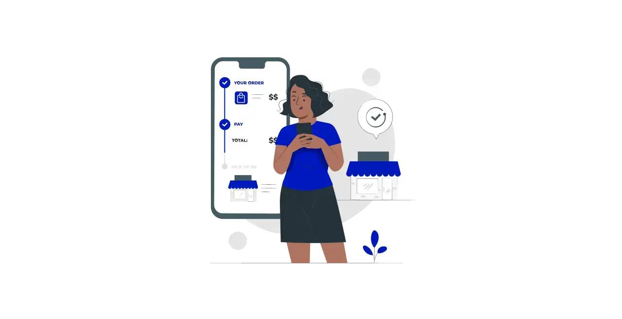
Reduce Friction in the Checkout Process

Checkout friction is the last-mile problem: you either move someone smoothly from intent to payment, or you give them a reason to leave.
Fixing the checkout means:
- Shrinking cognitive load
- Eliminating surprise
- Instrumenting the flow
With these factors, you know exactly where momentum stalls.
What Tiny Interactions Actually Break Momentum?
Small, opinionated behaviors kill more sales than big mistakes. Inline validation that flags a postal code as an error without an immediate fix feels like a trap; slow address lookup that asks the same fields twice feels like busywork.
Conditional fields and predictive address autocomplete reduce typing and decision friction, and collapsing nonessential inputs into a single “more options” reveal keeps the screen simple on mobile. Across dozens of Shopify experiments, the repeat failure mode is the same: error-prone fields and unexpected form friction that create hesitation and drop-off, not aesthetics or extra copy.
How Common Is Abandonment Due To Long Or Confusing Checkout?
According to Baymard Institute, 28% of US online shoppers abandon their carts due to a long or complicated checkout process. Simplifying the sequence and reducing required inputs are not optional; they are the baseline for recovery.
How Do You Fix Payment Trust Without Expensive Certifications?
Trust is not a badge cluster; it is a clear sentence at the right moment. Use hosted payment fields or tokenization so card entry never leaves the secure provider. Then place a short line near the card input to explain this, for example: “Card processed securely by Stripe, not stored here.” Keep the visual flow on your domain so an unexpected redirect does not trigger an alarm.
The Micro-Trust Framework: Addressing “The Moment of Doubt”
When a shopper hesitates, a concise tooltip explaining refunds and dispute protections often calms the impulse to abandon by addressing the specific emotional concern at the point of payment.
Baymard Institute reports that 18% of shoppers abandon their carts because they don’t trust the site with their credit card information. This is a measurable conversion lever, not a cosmetic nicety.
The Cognitive Fluency Effect: Why Consistency Speeds Up Decisions
Most teams build checkout copy and trust cues by hand because it feels simple and safe.
As variants multiply and ad traffic scales, that familiarity creates inconsistency:
- Different pages show different shipping promises
- Payment icons
- Microcopy
This confuses returning visitors and pollutes tests.
Platforms like PagePilot keep verification blocks consistent across variants by automatically inserting validated payment copy, payment icons, and shipping promises into every hero and checkout handoff, reducing rollout time from days to hours and keeping experiments clean.
What Metrics Tell You Where To Focus Engineering Time?
Track micro-conversions, not just final conversion. Measure field error rate per input, time to complete the payment form, percentage of sessions that switch to a wallet, and bounce rate immediately after the payment page loads.
- If the postal code field has a 12 percent error rate, that is your engineering KPI.
- If mobile wallet usage is 60 percent among social traffic, prioritize wallets and one-tap flows for that cohort.
Instrument server-side latency for shipping calculations, because a 400 to 800 millisecond delay in rate lookup creates the same psychological pause as a confusing form.
Which Recovery Tactics Actually Reclaim Revenue?
Use abandonment flows that respect the reason they left. If a user exits the form before completing, restore their partially filled cart with a “resume checkout” link that pre-populates fields and directs them to a single-step payment screen.
If they left after seeing the unexpected cost, send a short message that highlights a specific shipping option and delivery window.
Conversational Microcopy: Turning Transactional Steps into Relationships
Keep copy human and specific, not generic. Also, preserve the session with a cart token and enable one-click restore from email or SMS so the path back feels like picking up where they left off, not starting over.Checkout is like a handshake; if it is awkward, the deal never happens. That feels like progress, but the harder question about which offer, message, and layout actually hold buyers at the last click is coming next.
A/B Test Offers, Messaging, and Page Layouts
A/B testing offers, messaging, and page layouts are the three levers that move conversion quickly, but only when you design experiments to expose interactions and long-term value. Run narrowly scoped, statistically sound tests that measure the right metrics, then treat winners as hypotheses to scale, not gospel.
Leveraging an AI page builder allows you to rapidly generate the variations needed to run narrowly scoped, statistically sound tests that treat winners as hypotheses to scale, not gospel.
What Specific Offer Variations Should You Test First?
Start with the choices that change the purchase calculus, not the visuals:
- Alternative bundle mechanics
- Explicit risk-reversal language
- Subscription versus one-time pricing
- Payment options like:
- BNPL
- Wallets
Run head-to-heads with the creative and traffic source held constant, because a better bundle for one audience may perform worse for another. Prioritize tests that affect revenue per visitor or lifetime value, not just immediate clicks, and always include a return-rate check so a short-term lift does not become a long-term cost.
How Do You Structure Message Tests So They Produce Reliable Answers?
Pre-register a clear hypothesis, define a single primary metric, and size the minimum detectable effect you care about. Use factorial designs when you suspect interactions, for example:
- Headline
- Social proof
- CTA text
Each additional factor increases the required sample size. If you want fast wins, run carefully controlled two-arm tests on one high-impact message at a time.
Using a specialized AI page builder makes it easier to deploy these message-specific variants across segmented traffic without creating a technical bottleneck. Treat micro-conversions such as add-to-cart and time-to-first-action as early signals, and only promote variants for full-scale rollouts after revenue per visitor and return rates are validated.
Which Layout Experiments Reveal Hidden Interactions Between Content And Behavior?
Measure layout changes against behavior metrics, not just conversion rate. Try moving the CTA to three placements, adding a persistent buy bar, or collapsing long feature lists into progressive reveals, and pair them with heatmaps and session recordings to understand why people act.
Layouts often create interaction effects with messaging or offers, so run a short factorial to test those pairings before full rollout. Remember, a layout that improves engagement on desktop may harm mobile performance, so split-test by device and treat mobile as a separate funnel.
What Test Hygiene Prevents False Positives And Wasted Effort?
Lock down traffic sources, freeze site-wide UI changes, and route variants with feature flags to avoid rollout leakage.
Use:
- An A/A period to validate instrumentation
- Set sensible stopping rules
- Correct for multiple comparisons when you run many variants
If you review results without pre-specifying a plan, you invite noise; instead, use agreed-upon thresholds for sample size and statistical methods, and document the decision to ship or roll back.
The Versioning Debt: Why Manual Management Kills Test Velocity
Most teams build variants by hand, then manage them in scattered folders and threads, because that workflow feels low-friction at a small scale. As variants multiply, versioning breaks, copy drifts, and experiments slow to a crawl, turning speed into the hidden cost of control.
Platforms like PagePilot:
- Centralize variant generation
- Keep the verification copy consistent across versions
- Publish directly to Shopify
It compresses iteration from days to minutes while preserving experiment hygiene.
How Should You Value A Winning Variant Beyond The Headline Uplift?
Move past single-session wins and measure downstream effects, such as:
- Three-month retention
- Return rates
- Support ticket volume per cohort
Use holdout groups to estimate causal revenue lift and calculate expected value per visitor before you commit ad spend to a variant.
Also, build a rollback plan that tracks early warning signals, because any lift that increases returns, chargebacks, or negative reviews will erode long-term profit.
Which Statistical Approach Should You Prefer, And When?
Frequentist tests give clear yes or no answers for fixed-horizon experiments, while Bayesian methods let you run adaptive checks and express uncertainty more transparently. If you need rapid decisions on low-risk copy or visual tweaks, sequential Bayesian methods can shorten time to action.
For any change that affects the checkout flow or pricing, prefer conservative frequentist planning with explicit power calculations, because the cost of a false positive can be higher than the cost of a delayed winner.Think of testing like tuning an engine: adjust one dial, monitor RPMs, then try the next. Making multiple dials at once gives you a sense of progress, but you will not know which change actually increased power.
The Compounding Effect: Why 20% Wins are the Engine of Scale
According to Unbounce, “A/B testing can increase conversion rates by up to 300%.” That upper bound demonstrates what well-targeted, creative experiments can achieve in isolated cases, not the baseline outcome for every test.
And the same article states that: “Companies that use A/B testing see an average of 20% increase in sales,” which is the more practical benchmark you should use when planning test value and ad budget allocation.
What Quick Operational Rules Save Time And Keep Learning Compoundable?
Always tie each experiment to a single decision you can act on, archive variants and creative metadata, and keep a changelog linking each test to traffic segments and start/stop dates.
Automate rollback thresholds and use a single source of truth for on-page microcopy to ensure trust signals remain identical across variants. That discipline lets you chain experiments, not re-run the same question under slightly different conditions.That sounds like closure, but the part that actually determines how quickly you turn tests into a reliable scale is still pending.
How PagePilot Helps You Increase Shopify Conversion Faster
If you want to increase Shopify conversion faster, stop letting manual page rebuilds and slow experiments eat your time and momentum.
We recommend you consider PagePilot, which generates and publishes high-converting Shopify product page variants in minutes from existing URLs.
It enables you to:
- Run rapid A/B tests
- Refine messaging and visuals quickly
- Scale what actually drives revenue without hiring additional designers or copywriters
Related Reading
- Shopify T-shirt Store Examples
- Shopify Beauty Stores
- Shopify Electronics Store
- Shopify Contact Us Page Example
- Best Shopify Theme for Print on Demand
- Best Trust Badges for Shopify
- Pagefly Alternatives