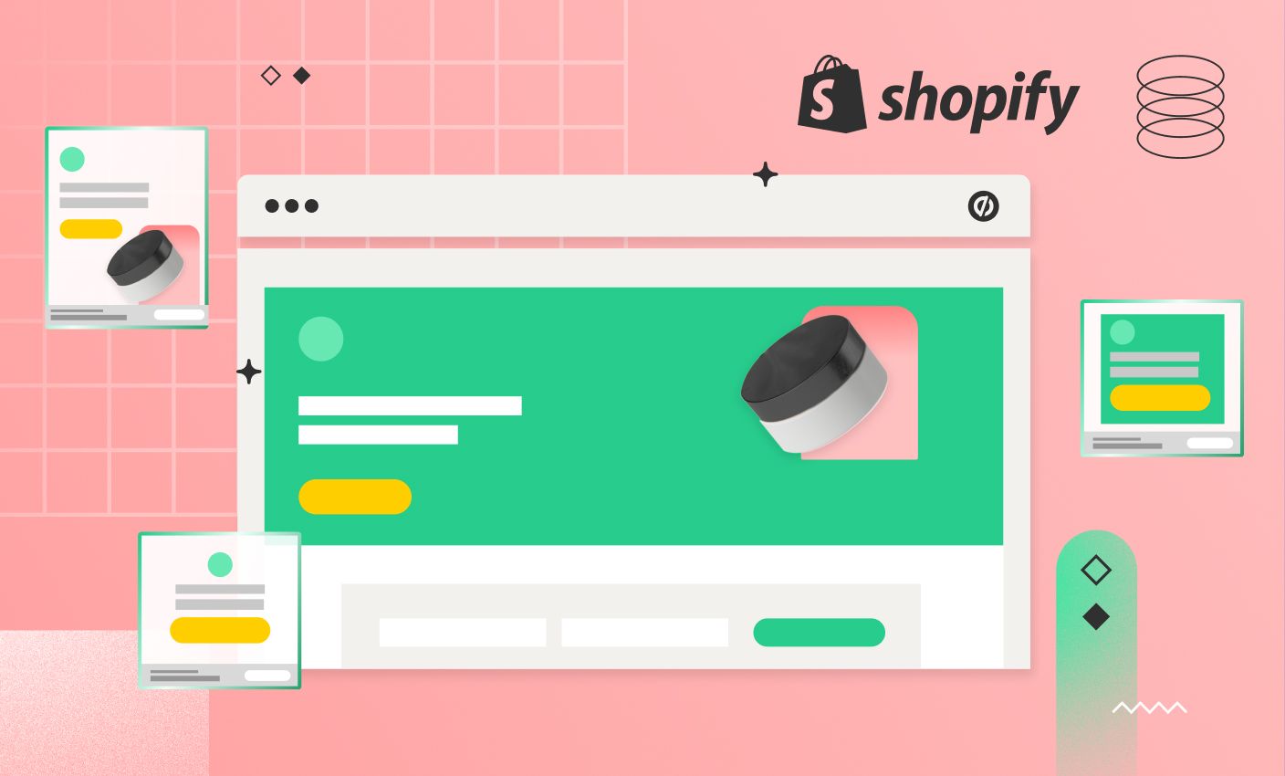
You want a landing page that converts, not one that gets lost in theme settings and slow load times, which is why choosing the best Shopify Page Builder matters. Maybe you need a quick product launch page, a signup page, or a sale-focused page—how you handle layout, copy, CTA, mobile design, and page speed will change your results. This article walks you through how to create a landing page on Shopify with clear examples, template picks, and simple A/B testing tips to lift conversions. To help you build faster, PagePilot’s AI page builder turns those steps into ready-to-use pages, suggests headline and layout tweaks, and pushes optimized pages straight to your Shopify store so you can test templates and copy without the guesswork.
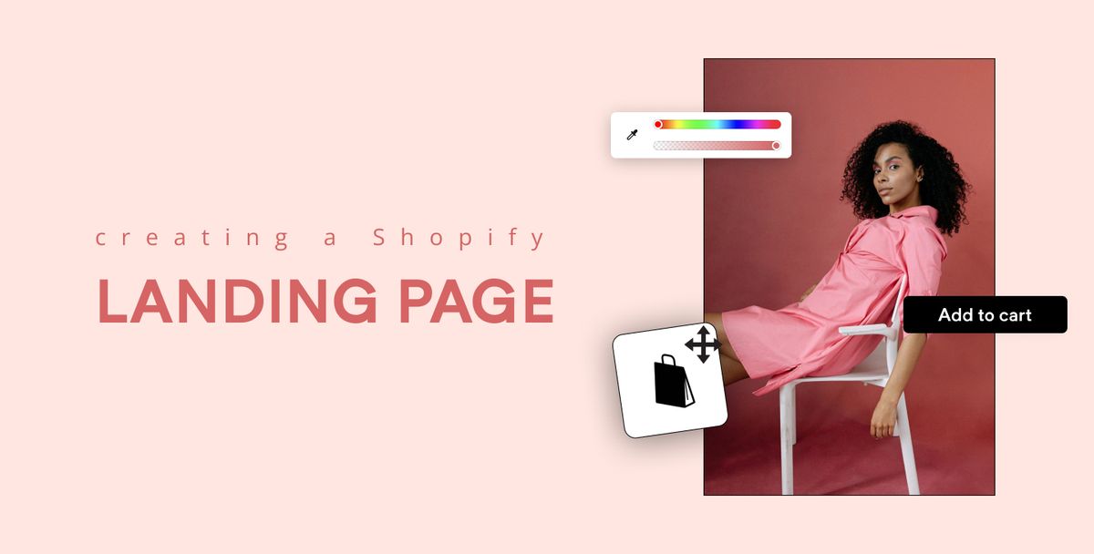
What is a Landing Page in Shopify?
A Shopify landing page is a store web page built for one clear purpose: to get visitors to take a single action. That action can be a purchase, an email signup, a product collection view, an app install, or a click through to a promotion. Landing pages differ from product pages because they remove distractions and guide visitors to act now.
How Well Do They Work?
Ecommerce landing pages convert at about 4.2 percent on average (Backlinko). Tests run by Monetate show that sending traffic to a dedicated landing page instead of a product detail page can double conversion rates, producing a directly proportional lift in revenue.
Key to Brand Authenticity
Social proof matters: a 2023 S&P Global survey found that 62% of enterprises rated increasing user-generated content as highly important for building brand authenticity. User-generated content often appears on high-performing landing pages. What makes a landing page succeed in Shopify is the alignment of:
- Message
- Design
- Traffic source
- Measurement
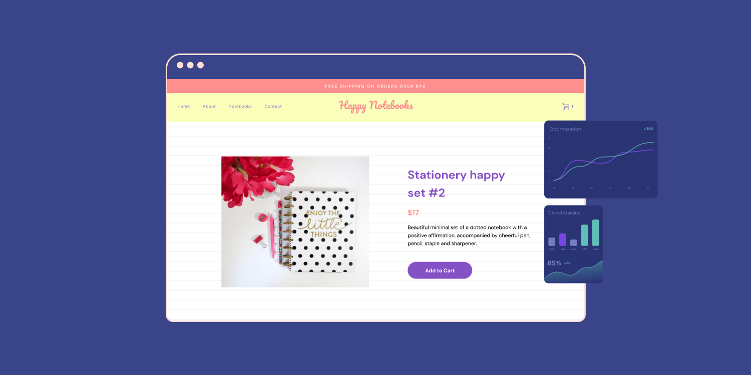
Hero Headline That Grabs Attention
Your headline must state the main benefit in plain language and do it fast. Use a large font in the hero section and simple phrasing that matches the ad or link sending traffic to the page. Ask yourself: Does the headline match the promise in the email, paid ad, or Instagram post? If not, adjust copy or creative so visitors see a consistent message immediately.
Persuasive Copy That Sells the Benefit
Use short blocks of copy that focus on outcomes rather than features. Speak in the voice of your buyer. Break text into scannable bullets and a short hero paragraph that explains what the product or offer does for the customer. Include one or two objection breakers, such as simple returns or fast shipping details.
Design That Directs the Eye and Reduces Friction
Keep the layout uncluttered. Use contrast to lead attention to the CTA and the product image. Make navigation minimal or remove it so visitors cannot wander away. Use content blocks or sections to organize proof, product details, and FAQs so the page reads like a focused argument for conversion.
CTA Placement and Wording That Makes the Next Step Obvious
Use a clear, prominent call to action in the hero section and repeat it after proof points. Use active verbs tied to the offer, such as Get My Pack, Start Free Trial, or Claim Discount. Make buttons large, high contrast, and reachable on mobile without requiring too much scrolling.
Social Proof That Builds Trust Fast
Add reviews, star ratings, customer photos, press mentions, and numbers sold. Video testimonials and user-generated content increase credibility. Place a short review or rating near the hero and a fuller proof section lower on the page to support more cautious buyers.
Email Capture and Form Design That Converts
If your goal is lead generation, keep forms short. Ask only for the essentials, typically email and first name. Offer a clear incentive such as a discount, free guide, or early access. Use a confirmation modal or thank you screen to explain the next steps and reduce buyer uncertainty.
Mobile Optimization and Responsive Layout
Most Shopify traffic now arrives on phones. Make buttons thumb-friendly, use images sized for mobile, and test the page on real devices. Remove nonessential elements that increase load time or push the CTA below the fold.
Page Speed and On-Page SEO
Compress images, lazy load media, and avoid heavy scripts. Faster pages improve conversion and reduce paid media cost per acquisition. Add a focused meta title and description that match the traffic source and use a readable URL for ad tracking and shareability.
A/B Testing and Measurement Plan
Run A/B tests on headline, CTA, hero image, and social proof placement—track conversions with UTM parameters, Shopify analytics, Google Analytics, and your email provider. Set a minimum sample size before declaring a winner, and then iterate on the winning variation.
Questions to Ask Before You Build a Shopify Landing Page
- What is the single conversion goal?
- Where will traffic come from, and does the page match that source?
- Which objection must be addressed first for this audience?
- How will you measure success, and which analytics will you check daily?
Quick Checklist for Launch
Have a headline, hero image, one primary CTA, review or UGC, a short benefits section, a straightforward form or buy button, fast load time, mobile test, tracking in place, and at least one A/B test queued.
Related Reading
- Does Shopify Host Websites
- Is It Worth Buying a Prebuilt Shopify Store
- How Much Does It Cost to Build a Shopify Website
- Shopify Product Page Customization
- What is Custom Liquid Shopify
- How to Customize a Shopify Website
- Shopify Speed Optimization
How to Create a Landing Page on Shopify: Step-by-Step Process
Start in the Shopify admin. Go to Online Store → Pages and click Add Page. Give the page a short, descriptive title and add any basic copy in the content field if you want a starting point. Save the page so you can reference it while building the layout.
Pick a Layout with the Theme Editor or a Custom Template: Choose How It Looks
Open Online Store → Themes → Customize and use the template chooser to load the page you just created. If you need a different structure than your standard pages, duplicate your theme and add a new template file under Templates, for example, page.landing.json, then assign that template to your page.
Website Content Layout Suggestion
Use sections and blocks without writing code to place:
- A hero
- Feature list
- Testimonial block
- Product blocks
Build High-Converting Sections: What to Include and Where to Put It
Lead with a strong hero section:
- Headline
- Supporting subhead
- Primary call to action
- A high-quality image
- Short video
Follow with product highlights that include benefits, short bullet features, and a clear buy path to specific product variants or collections. Add social proof with reviews, logos, or user photos, then place a secondary CTA and a risk reducer, such as:
- A guarantee
- Shipping promise
End the content area with a compact FAQ or technical specs that answer common buying objections.
Write Copy and Prepare Visual Assets: Words and Images That Sell
- Write a single clear value proposition and repeat it with focused benefits rather than lengthy descriptions.
- Use short paragraphs, bullets, and bolded lines for scannability on desktop and mobile.
- Provide image assets sized for the web and compressed for performance, and include a product or lifestyle hero image plus supporting detail shots that show scale and usage.
- Use descriptive alt text and image file names for accessibility and search.
Connect Forms, Popups, and Email Capture: Collect Leads and Build Lists
- Decide if this landing page will capture emails, preorders, or direct buys.
- Add a built-in form block, or use an app like Klaviyo, Privy, or a page builder form to integrate signups into your email flows.
- Use hidden fields or UTM capture to track traffic sources.
- Trigger a lightweight pop-up or slide-in only when the visitor displays exit intent or after a specific scroll depth to avoid disrupting first impressions.
Optimize for Mobile and Performance: Make It Load Fast and Convert
- Preview the page in the theme editor mobile view and on a real phone.
- Ensure hero text stays readable and CTAs remain tappable without hidden elements.
- Compress images, lazy load media, and remove unused scripts to cut page weight.
- Test the interaction time and aim for a fast load so users reach the CTA quickly.
Set SEO, URL, and Tracking: Make the Page Findable and Measurable
Edit the page URL handle, meta title, and meta description in Shopify so search snippets match your campaign message. Add structured data for product pages if you show price and availability. Insert UTM-tagged links into marketing emails and ads. Connect Google Analytics, Facebook pixel, or server-side tracking to measure:
- Sessions
- Conversions
- Revenue
Use a Third-Party Page Builder: When You Need Advanced Design or Speed
If your theme editor limits layout or conversion elements, consider a page builder app like:
- PageFly
- Shogun
- GemPages
- PagePilot
Without editing Liquid, these let you drag-and-drop:
- Complex grids
- Countdown timers
- Sticky CTAs
- A/B testing elements
- Custom forms
Choose a builder that exports clean code and keeps mobile styles separate to avoid unnecessarily increasing page weight.
Test, Iterate, and Measure Conversions: Keep Improving Copy and Design
Run A/B tests on your headline, hero image, CTA text, and product order to find what moves the needle. Use heatmaps and session recordings to spot friction points in the checkout flow. Track the conversion rate, average order value, and add to cart rate, then implement the winning variant as a permanent update to improve traffic conversion over time.
When to Use Custom Templates or Liquid: For Unique Flows and Tight Control
Use a custom page template or edit Liquid when you need:
- Server-side logic
- Dynamic sections driven by metafields
- Integration with external APIs
Create a child template for a campaign to avoid changing your central theme and deploy code through a testing theme. Keep template changes minimal and version-controlled so you can roll back quickly if something breaks.
Launch Checklist: Last-Minute Pre-Launch Items to Verify
Confirm that your primary CTA links to the correct product variant or checkout intent by testing forms, payment methods, and shipping rules from multiple devices and browsers. Check analytics events and UTM parameters. Verify that robots do not block the page and that canonical tags point to the intended destination.
Focus on Speed and Results
Want faster test cycles and higher converting pages? Our AI page builder will help you test products, ideas, and angles much faster: give our AI a competitor or supplier URL, and it will create a high-converting product page using content and structure found on that site. At the same time, our AI Product Image function upgrades visuals so you do not compete with your competitor's exact copy and product images. Start a FREE Trial and generate 3 product pages for free today (no credit card needed).
Using Apps to Build Better Landing Pages
Apps let you stop guessing about design and start executing campaigns.
- They connect directly to your Shopify store
- They pull product data
- They allow you to assemble pages that match checkout flows and theme settings.
Essential Page Builder Features
Use app templates for product launches, promotions, and lead capture pages so you can publish faster. Look for features like:
- Conversion-focused templates
- Mobile responsive controls
- SEO fields
- Analytics hooks
- Integrations with email platforms such as Klaviyo or Mailchimp
Want to reduce development bottlenecks and test creative ideas this week instead of next quarter?
Drag and Drop: Design Without a Developer
Drag-and-drop builders like PageFly and GemPages put layout control in your hands. You pick a template, swap in a hero image, set a clear headline, add product galleries, testimonials, countdown timers, and a focused call to action. Control spacing, fonts, and visibility by device so the landing page looks sharp on mobile and desktop. Many builders expose SEO settings and meta tags, let you add custom scripts for tracking, and support lazy loading to keep page speed reasonable. Will you strip navigation and run a single CTA test on your next campaign?
AI Tools: Generate High-Converting Pages Fast
AI-powered tools such as PagePilot speed up page creation by generating layouts and copy from a competitor or supplier URL. They can craft headline options, suggest CTAs, and enhance product photos so your visuals look unique. Use AI to create a first draft, then edit for brand voice and accuracy. Run A/B tests on AI variants to see which messaging and layout lift conversions. Keep a close eye on legal rights for images and on factual product details pulled from suppliers, so nothing posts incorrectly. How will you balance AI speed with human oversight?
No Code Creativity: Launch, Test, and Scale Quickly
No code builders make iteration practical. Launch a landing page, hook it to analytics and heatmaps, run A/B tests for headlines and hero images, then iterate on winners. Best practices for creating a high-converting landing page on Shopify:
- Lead with a single clear value proposition.
- Use a strong single CTA.
- Reduce form fields.
- Display social proof and trust badges near the CTA.
- Add urgency with timers when appropriate.
- Keep images optimized for fast loading.
- Ensure mobile-first layout.
Configure UTM tracking, set canonical and meta tags, and connect conversion pixels before you publish. Ready to pick an app and run a live test this week?
Related Reading
- Hire Someone to Build Shopify Store
- Shopify User Experience
- How to Add Products to Shopify
- How to Design Shopify Website
- How to Create a New Page Template in Shopify
- Shopify Mobile Optimization
- How to Add a Review Section on Shopify
Tips for Designing Effective Landing Pages on Shopify

Visual hierarchy tells visitors where to look and what to do next. Make the headline and unique value proposition the most significant elements in the hero section. Use contrast and spacing to highlight the benefits, and give your primary CTA button the highest visual weight. Place supporting CTAs and trust signals lower or to the side so the main action stays obvious. Place the CTA where the eye naturally rests.
Color That Sells: Psychology and Contrast
- Choose colors that match your brand personality and trigger the correct emotional response from shoppers.
- Use a single high contrast color for your primary CTA so it stands out from product shots and background panels.
- Test color choices against conversion rate goals and use A/B testing to find what moves the needle in terms of clicks.
- Use color contrast ratios that meet accessibility standards so more users can complete checkout.
Typography That Reads Fast
Select readable, on-brand fonts that perform well on both desktop and mobile. Use size and weight to establish a clear hierarchy:
- Large headline
- Medium subheadings
- Smaller body copy
Limit font families to two or at most three and maintain consistent spacing for product descriptions and feature lists. Make sure fonts render quickly by using system stacks or optimized web fonts.
Space That Guides, Not Crowds
White space reduces cognitive load and highlights product content and CTAs. Group related elements and leave room between sections so users can scan rather than struggle. Use margins and padding to separate the:
- Hero
- Benefits
- Social proof
- Checkout cues
Let each block breathe so the following action becomes obvious.
Showcase Products With Photo and Video That Close Sales
High-quality photography and a short demo video increase trust and quickly explain the use. Offer multiple angles, close-ups, and contextual shots that show scale and function. Use short looping GIFs or clips for action moments, but do not autoplay videos that drain bandwidth. Label images with descriptive alt text to boost accessibility and SEO.
Flow That Leads to Checkout
Structure the page from hook to purchase:
- Headline and UVP
- Problem and solution
- Features and benefits
- Product details
- Social proof
- Pricing
- CTA
Place the hero section above the fold, with a clear CTA and a compact benefits list underneath. Use clear product descriptions, bullet features, and a visible trust badge near the add to cart button so the path to purchase is friction-free.
Design Mobile First and Tap Friendly
Start with the smallest screen and expand to larger viewports so every element stays usable on phones. Keep copy concise, compress images for mobile, and make buttons large enough for thumbs. Ensure the responsive layout keeps the hero, product gallery, and buy flow immediate and straightforward.
Speed Wins: Page Speed Optimization
Slow load time kills conversion and search rank. Aim for under three seconds and prioritize critical rendering paths so the hero content appears fast. Test with real device metrics and budget JavaScript to include only essential scripts.
Speed Tool: Image Compression and Formats
Compress images and serve modern formats like WebP where supported, to cut payload while preserving sharpness. Use responsive srcset so the browser picks the correct file for the device and avoid sending desktop images to phones.
Speed Tool: Slim Code and Cache
Minify CSS, JavaScript, and HTML to reduce file size, and enable browser caching for assets so returning visitors load pages faster. Use a content delivery network for global speed and keep third-party scripts limited to essentials.
Speed Tool: Avoid Autoplay Video
Turn off autoplay for video on landing pages to prevent heavy data use and unexpected playbacks that slow rendering. Offer precise play controls and small preview images that keep hero speed high.
SEO That Pulls Organic Traffic
Even landing pages built for paid traffic should follow SEO basics to pick up search clicks and lower acquisition cost. Choose an SEO friendly URL that includes the target keyword and keep it short. Use a compelling meta description that invites clicks, and place your primary keyword naturally in the headline and subheadings.
On Page SEO: Keyword Placement and Structured Data
Integrate your target phrase in the hero headline, H2s, and in product descriptions without stuffing. Add structured data for product, price, and reviews so search engines can surface rich results and you can increase CTR from organic listings.
On Page SEO: Clean Code and Speed
Search engines favor fast, clean pages, so keep the markup lean and remove redundant scripts that block rendering. Optimize images and serve assets compressed so both users and crawlers receive content quickly.
Test and Iterate: CRO Practices for Shopify Landing Pages
Run A/B tests on headlines, CTA copy, image order, and pricing blocks to incrementally raise the conversion rate. Track heatmaps and funnel drop off to identify friction in the product page and checkout flow. Use learnings to refine product descriptions, trust signals, and headline angles.
Rapid Testing and Unique Pages
Want to speed up testing and execution? Our AI page builder will help you test products, ideas, and angles much faster: give our AI a competitor or supplier URL, and it will create a high-converting product page using content found on that site. At the same time, the AI Product Image tool upgrades visuals so you avoid competing with the exact copy and photos. Start a FREE trial and generate three product pages for free today, no credit card required.
5 Best Examples of Shopify Landing Pages
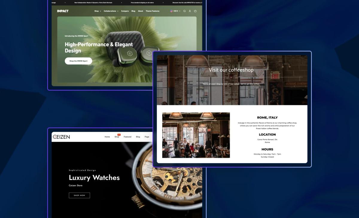
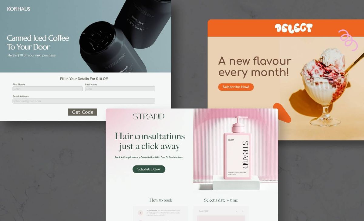
1. True Botanicals: Subscription Landing Page That Converts
True Botanicals centers this page on a single goal: get visitors to subscribe. The hero area leads with the savings message and the gift offer. The copy explains the membership benefits and gives customers control over delivery frequency. Images show product detail and lifestyle shots that support:
- Trust
- Product quality
Trust cues and clear pricing statements reduce friction and speed decision-making.
How to Recreate This on Shopify
- Use a subscription app like Recharge or Shopify Subscriptions to handle recurring billing and frequency options.
- Build a focused landing page with a strong headline, a short benefit paragraph, and a single clear call to action labeled Subscribe.
- Show the math: state the percent savings and the tangible gifts next to the price so customers see value immediately.
- Add trust badges, ingredient detail, and short social proof snippets near the CTA to ease purchase anxiety.
- Make the layout mobile first, and test page speed and image compression to keep load times low.
- Want a quick test? Run an A/B test comparing a headline that highlights the 15 percent savings to one that highlights the free cleanser.
2. Wholier: Product Landing Page That Answers Questions and Closes Sales
Wholier uses a classic product landing layout that addresses buyer concerns for health items. The headline and sub-headline highlight organic plant-based protein and prebiotics, directly addressing the ingredient and safety questions many buyers have. The page layers information:
- Benefits
- Ingredient transparency
- Trust badges
- A buy more, pay less subscription option
A sticky add-to-cart bar stays visible as you scroll, nudging action without interrupting the reading flow.
How to Recreate This on Shopify
- Use Shopify sections and a product template to create a long-form product page. Include a strong hero, benefit blocks, and ingredient breakdowns.Add a subscription option that shows a clear discount for recurring orders to lift average order value and reduce churn in paid acquisition.
- Implement a sticky add-to-cart element using your theme editor or a small script to keep the CTA accessible on mobile and desktop.
- Place trust badges and certifications close to the purchase area so shoppers see credibility exactly when they need it.
- Track conversions in GA4 and use UTM tags to measure how different traffic sources respond to the subscription offer.
Which detail would your customers want up front: ingredient origin or clinical benefits? Test order and placement to find out.
3. Baboon To The Moon: Collection Page That Sells a Season
Baboon To The Moon keeps the collections page minimal and focused on new seasonal colors and product combinations. Big, clear headlines announce the collection. Hover states reveal closer views and an add-to-cart button, allowing shoppers to act without viewing the full product page.
That interaction shortens the path from discovery to checkout and supports quick buying on both mobile and desktop.
How to Recreate This on Shopify
- Use a collection template with a clean grid and large images. Enable hover swap to show alternate views and reveal an add to cart button on hover.
- Group seasonal products into a dedicated collection and use custom collection descriptions to feed SEO and on-page context.
- Keep the add-to-cart flow simple and allow quick cart previews or mini carts to prevent disruption to the shopping journey.
- Use high-quality images and ensure lazy loading so page speed stays high even with many SKUs.
- Consider merchandise blocks that highlight new colors and best sellers at the top of the collection to guide first clicks.
Want to know what converts best on your collection page? Try swapping the headline copy and tracking clicks on the hover add-to-cart button.
4. Aisling Organics: Special Offer Landing Page That Groups Solutions
Aisling Organics builds a special offer page around bundled solutions for specific customer needs. The page pairs product images with subtle animation that increases perceived product appeal. Free shipping removes a common barrier. The bundles present value and simplify the decision by offering curated sets instead of requiring shoppers to assemble their own kit.
How to Recreate This on Shopify
- Create dedicated pages for bundles using Shopify product pages or page builder sections. Use transparent pricing that shows savings versus buying items separately.
- Display shipping promises prominently and avoid hidden fees that drop at checkout. That reduces cart abandonment.
- Use light motion or hover animation to draw attention to the product without creating a distraction. Test animation on mobile to keep performance intact.
- Add social proof and reviews for the bundle or individual items within it, so shoppers see both product credibility and the value proposition.
- Use bundle apps or simple SKU bundles to keep inventory accurate and the checkout flow seamless.
Which bundles would your audience appreciate most? Use customer data or a short survey to guide bundling decisions.
5. Wild: Seasonal Sale Page with Urgency and Story
Wild opens its spring sale page with a clear headline, "Spring Sale: 20 Percent Off," and a time-limited reminder to create urgency. The page uses on-brand imagery and a video that demonstrates product use and differentiates it from mass market alternatives. Throughout the page, spring-themed art and clear "add to cart" buttons invite quick action, while product shots support the story of sustainability and efficacy.
How to Recreate This on Shopify
- Use a countdown timer app or a simple dynamic banner to show limited-time offers and create urgency near the CTA.
- Add short product videos hosted on your store or embedded from a trusted host to increase conversion and reduce product questions.
- Place add to cart buttons close to product images and use themed visual assets to tie the sale to a season or event.
- Keep product architecture simple so sales traffic can add items to the cart and checkout without friction. Monitor inventory and sales velocity to avoid stockouts during promotions.
- Use targeted promo codes and email retargeting to capture visitors who leave without buying and to measure return on ad spend.
What video length works best for your audience: 15 seconds or 60 seconds? Test both and measure watch-through rates and conversions.
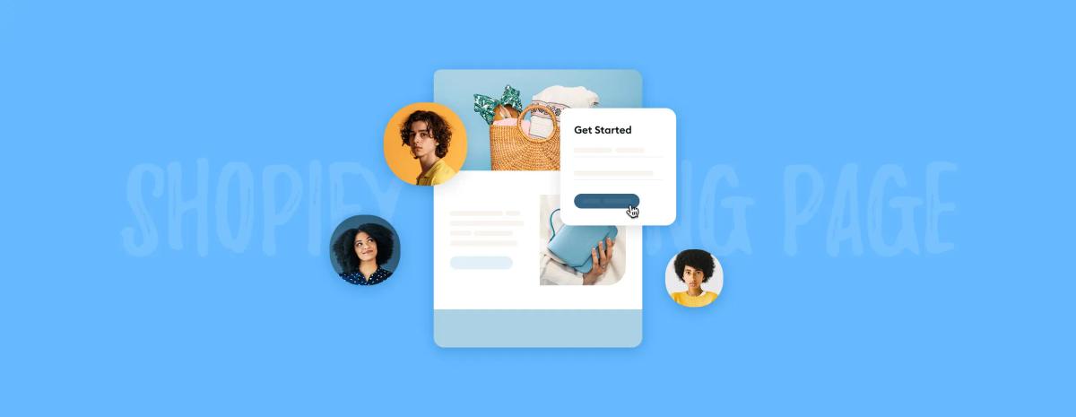
Start a FREE Trial and Generate 3 Product Pages with Our AI Page Builder Today
PagePilot is an AI page builder designed to create high-converting product pages on Shopify quickly. Give the tool a competitor or supplier URL, and it pulls copy, layout cues, and core selling points from that page. The builder then rearranges those elements into a clean product page that matches Shopify's structure, including:
- A headline
- Product description
- Hero image
- Trust badges
- Clear add to cart placement
Want to compare a few angles quickly? PagePilot generates variants so you can test different headlines, product benefits, and calls to action without building each page by hand.
How PagePilot Speeds Product and Angle Testing
How do you test new products faster? PagePilot automates the setup steps you typically repeat. It creates a ready-to-publish product page with SEO-friendly titles and meta tags, a mobile-responsive layout, and conversion-focused sections like product details, social proof, and urgency timers. You can launch more landing pages and run split testing across variants to learn what converts best for paid traffic and organic search. Which angle will win on Facebook or Google Ads? PagePilot gets you live faster so you find out sooner.
AI Product Image Improvements That Remove Copycat Problems
Cloning a competitor’s text is one thing. Using the same product shots is another. PagePilot:
- Uses an AI Product Image function to upgrade visuals
- Enhances photos
- Swaps backgrounds
- Adds contextual mockups
- Produces multiple hero images sized for Shopify product galleries and landing page banners.
That gives you custom visuals that stand out in feeds and on the product page, while maintaining fast loading times to improve page speed and reduce bounce rates.
Step by Step: How to Create a Landing Page on Shopify with PagePilot
Want a practical path from idea to live landing page? Start by feeding PagePilot a competitor or supplier URL. Review the generated page template and edit the:
- Headline
- Product description
- Features
- Pricing
Replace or approve AI-enhanced product images and configure variants and shipping info. Connect the page to your Shopify product and set up the URL and meta description for search. Add tracking pixels and UTM parameters for campaign attribution. Publish and send traffic from ads or email to begin measuring conversion rate and average order value.
Landing Page Elements That Drive Conversions on Shopify
Which parts matter most on a Shopify landing page? Headline clarity, a strong hero image, concise product benefits, a bold call to action, and visible trust signals, including:
- Reviews
- Guarantees
Use structured data and clear meta tags to help search engines show the right info. Keep load times low by optimizing images and lazy loading the gallery. Place upsells or bundle offers near the add to cart button and show stock or timer cues when relevant to reduce hesitation.
Testing, Analytics, and Iteration for Better Results
How will you know what works? Use split testing to compare headlines, images, and page layouts. Track the following:
- Conversion rate
- Click through to check out
- Average order value
- Return on ad spend
Inspect heatmaps and session recordings to see where visitors pause or drop off. PagePilot exports clean variants so you can run split testing without having to recreate pages in Shopify each time.
Integrating PagePilot with Shopify Workflows and Ads
PagePilot builds pages that map to Shopify product pages and landing page templates, allowing you to link them directly from:
- Google Ads
- Facebook Ads
- Email campaigns
- Social posts
Configure your checkout, shipping, and tax settings in Shopify as usual. Use unique landing page URLs and UTM tags to separate campaign performance. Want to retarget visitors who left without buying? Add pixels before you publish and set a retargeting list.
Security, SEO, and Mobile First Design Considerations
Make sure your landing page loads fast on phones and desktops. PagePilot produces mobile-responsive sections and optimizes image sizes for Shopify galleries to preserve speed and reduce bounce. Verify meta tags, canonical tags, and schema to support product rich snippets. Keep checkout and payment methods secure and easy to understand to minimize cart abandonment.
Getting Started: Free Trial, Quick Workflow, and What You Get
Ready to try it without risk? Start a free trial and generate three product pages for free with no credit card needed. Enter a competitor or supplier URL, review the AI-generated pages and images, make edits as needed, and then publish directly to your Shopify store or export the assets for manual upload. Which product idea do you want to test first?