You've spent hours driving traffic to your store, but visitors keep leaving without buying. The problem isn't your product or pricing. It's your product page. Converting browsers into buyers depends on how you present your offer, and studying successful Shopify product page examples reveals patterns that consistently drive sales. This article breaks down proven eCommerce product page optimization techniques that transform underperforming pages into conversion machines, covering everything from product descriptions and images to trust signals and mobile responsiveness. The good news? You don't need a development team to implement these strategies. PagePilot's AI page builder helps you create optimized product pages that incorporate best practices from top converting stores, letting you test different layouts, copy variations, and design elements without touching a line of code. Whether you're launching your first product or refining existing pages, you'll discover actionable tips to boost your conversion rate and revenue.
Summary
- Companies spend an average of $92 on customer acquisition for every $1 invested in improving the actual buying experience, according to HubSpot's research. This imbalance explains why stores can scale traffic efficiently but watch conversion rates stay flat or decline.
- Typical eCommerce conversion rates range from 2.5% to 3%, according to Endertech, a figure that hasn't meaningfully improved for most stores despite constantly changing design trends and purported best practices. Store owners make small changes like button colors or headlines without addressing the core problem: their pages don't help customers decide.
- Forrester Research found that 50% of potential purchases are lost because users can't find the information they need. This isn't a design problem; it's a decision support problem. Pages fail to surface the right details at the right moment, so customers move on rather than dig deeper through cluttered layouts and buried essential information.
- Product pages with videos can increase conversions by up to 80% according to Lebesgue's research. Video shows products in motion, demo scale, reveals details static images miss, and keeps visitors engaged longer. Someone using the product or explaining features outperforms text descriptions because it answers buyer questions faster than doubt can form.
- The Spiegel Research Center found that 93% of consumers say online reviews impact their purchasing decisions. However, placement matters as much as quantity. Social proof works when it appears near decision points where visitors evaluate whether to trust you enough to buy, not buried at the bottom of pages or hidden behind tabs.
PagePilot's AI page builder generates sales-optimized product pages in minutes from URLs, compressing the creation process from days into minutes and turning optimization from a slow design project into a rapid testing system.
The Real Problem with eCommerce Product Page Optimization

Most store owners think eCommerce product page optimization is about tweaking buttons, colors, or copy. The real issue is simpler and more frustrating: their product pages don't help customers make a decision. That's why traffic comes in, ads run, people land on pages, but conversions stay flat.
According to Endertech, the typical eCommerce conversion rate ranges from 2.5% to 3%. That number hasn't meaningfully improved for most stores, even as design trends, tools, and supposed best practices keep changing. The pattern repeats across industries: traffic grows, ad spend increases, yet revenue per visitor barely moves.
What Happens When Optimization Doesn't Work
Store owners start making small CRO changes. A different button color. A new headline. Another badge or trust icon. These tweaks rarely move the needle. Not because optimization doesn't work, but because these changes don't address the real problem.
Testing multiple optimization changes can actually make conversion worse, not better. We've seen stores with 73% cart abandonment rates test dozens of changes, each of which somehow drove the rate higher. The frustration builds: every change seems to hurt conversion rather than help it.
The Cycle That Keeps Stores Stuck
The familiar approach is to follow advice from articles, courses, and blog posts. Add trust badges. Create urgency with countdown timers. Simplify forms. Change button text. These tactics become a checklist, applied without context or understanding of your specific customers' needs.
As you add more elements to address perceived gaps, pages become heavier.
- More badges
- More testimonials
- More reasons to trust
- More features highlighted
The page now contains everything a “best practice” article recommended, yet conversions remain stuck. Important information gets buried under layers of optimization attempts, and customers can't find what they need to make a decision.
Store owners feel trapped in an ineffective cycle
They know something isn't working, but generic advice keeps pointing them toward surface-level changes. The real problem goes unaddressed: the page doesn't guide customers through a clear decision-making process.
What Customers Actually Need
Customers don't need more elements. They need fewer reasons to hesitate. When a product page clearly answers what the product is, why it's worth buying, and what to do next, conversions improve naturally. Until then, no amount of button testing will fix a page that doesn't help customers make up their mind.
The challenge isn't identifying which shade of green converts better. It's removing friction from the buying decision. That friction shows up in different forms: unclear product benefits, missing information that answers common objections, confusing navigation, hidden costs, or cluttered layouts that bury the purchase path.
Beating the Competition Through AI-Powered Speed
Traditional approaches to fixing these problems require hiring designers, copywriters, and developers.
- Each change takes time.
- Each test requires coordination.
Speed to market becomes a bottleneck while competitors launch and iterate faster. For dropshippers testing multiple products, this delay means missing opportunities before trends shift.
Tools like PagePilot's AI page builder change this dynamic by generating sales-optimized layouts in minutes from product links. Merchants can rapidly test different products and page structures while competitors are still in the design phase, turning optimization from a technical challenge into a scaling opportunity.
The Power of Strategic Subtraction
The belief worth challenging is this: product page optimization isn't about adding more elements. It's about removing everything that stands between a customer's interest and their decision to buy. Most stores optimize by addition when they should optimize by subtraction.
But knowing what to remove requires understanding why those elements fail in the first place.
Why Most Product Page “Optimizations” Fail

Most product page optimizations fail because they treat conversion as a design problem rather than a decision-making one. Store owners stack tactics without understanding the sequence customers move through when evaluating a purchase. The result isn't a better page. It's a page with more elements but less clarity about what to do next.
The Isolated Tactic Trap
A new button gets added because a blog post said it worked. A trust badge appears because a competitor has one. A headline changes based on a copywriting formula. Each decision makes sense in isolation, but none of them connect to how a visitor actually scans, hesitates, compares, and decides.
The problem compounds when these changes pile up without testing the context.
- What converts a $15 impulse product won't work the same way for a $300 considered purchase?
- What resonates with cold Facebook traffic differs from what resonates with warm email subscribers?
Yet the same optimizations get copied across products, audiences, and traffic sources as if context doesn't matter.
Pages become cluttered patchworks:
- More icons promising fast shipping.
- More sections explaining features.
- More copy is trying to overcome objections.
Clarity disappears under the weight of best practices that weren't designed to work together.
When More Actually Means Less
Store owners optimize by addition because subtraction feels risky. Removing an element might hurt conversion, so the safer bet seems to be adding another trust signal, another testimonial, another reason to believe. This logic breaks down when customers can't find the information they need because it's buried under layers of reassurance.
The friction doesn't come from what's missing. It comes from what's in the way.
Customers Arrive Ready to Evaluate
GE Capital Retail Bank found that 88% research product information before buying. They're not browsing aimlessly.
They're hunting for specific answers:
- Does this solve my problem?
- Is this worth the price?
- What happens if it doesn't work?
When a page forces them to dig through clutter to find those answers, hesitation turns into abandonment.
The Data Reveals the Disconnect
Companies pour resources into driving traffic while starving the conversion experience. HubSpot's research shows businesses spend an average of $92 on customer acquisition for every $1 invested in improving the actual buying experience. That imbalance explains why stores can scale traffic efficiently but watch conversion rates stay flat or decline.
The Speed Problem Nobody Mentions
Traditional optimization creates another bottleneck: time. Testing a new layout requires:
- coordinating designers
- Copywriters
- Developers
Each iteration takes days or weeks. For dropshippers testing multiple products simultaneously, this delay becomes a competitive disadvantage. Trends shift, competitors launch faster, and opportunities close before the first test finishes running.
Tools like PagePilot's AI page builder compress this timeline by generating sales-optimized layouts in minutes from product links. Merchants can test different page structures across multiple products while competitors are still briefing designers. Speed to market shifts from a constraint to an advantage, turning optimization into a rapid testing system instead of a slow design project.
The Real Failure Point
The core issue isn't effort. Store owners work hard at optimization. The failure happens when optimization focuses on aesthetics instead of behavior, on individual sections instead of decision flow, on adding elements instead of removing friction.
Design for the Natural Flow of Decisions
A product page isn't a collection of independent parts. It's a sequence. Customers move through it in a specific order, and that order matters.
- They scan for relevance first.
- Then they evaluate credibility.
- Then they compare against alternatives.
- They assess risk before committing.
When optimizations ignore this sequence, they disrupt the natural decision-making process rather than support it.
Most optimization advice skips this entirely. It focuses on what to add to a page, not how customers actually decide to buy. Until that shifts, improvements will keep failing quietly, unnoticed and undiagnosed, while traffic continues flowing to pages that can't convert it.
But understanding why optimizations fail only matters if you know what optimization actually means in the first place.
Related Reading
- How to Make Your Shopify Store Look Professional
- How to Increase Conversion Rate Shopify
- How to Get More Sales on Shopify
- Best Size for Shopify Product Images
- Shopify Banner Size
- How to Create Multiple Product Pages in Shopify
- How to Change Favicon on Shopify
- How to Add Size Chart in Shopify
- How to Customize Shopify Checkout Page
What eCommerce Product Page Optimization Actually Means

eCommerce product page optimization means making customer decision-making easier. It's about removing every obstacle between curiosity and purchase. When a page forces visitors to hunt for information, reread descriptions, or second-guess their choice, friction accumulates. Conversions drop not because the product is wrong, but because the path to buying it feels unclear.
The goal isn't a prettier page. It's a page that answers the buyer's internal questions faster than doubt can form.
Where Most Optimizations Miss
Optimization fails when it treats pages as collections of independent elements rather than decision-making sequences. A customer doesn't randomly evaluate a product page. They scan for relevance, assess credibility, compare against alternatives, and evaluate risk before committing. That sequence matters.
When changes disrupt this natural flow, they create friction, even when they follow best practices. Adding a trust badge above the fold might test well in isolation, but if it pushes product details down and forces an extra scroll, it slows the decision process. A longer product description might answer more questions, but if it buries the purchase button, it adds hesitation at the critical moment.
The Pattern Repeats Across Tactics
Urgency timers that feel manipulative damage trust. Social proof that looks fake undermines credibility. Feature lists that don't connect to benefits create confusion instead of confidence.
What works isn't what looks optimized. It's what helps customers decide faster with less doubt.
But knowing what optimization means only gets you halfway there.
7 Proven eCommerce Product Page Optimization Strategies (That Work)

Seven specific changes consistently improve conversion rates across product categories, traffic sources, and price points. These aren't trends or theories. They're structural decisions that reduce friction in the buying process, and they work because they align with how customers actually evaluate purchases. When implemented together, they create compounding effects that transform underperforming pages into revenue-generating assets.
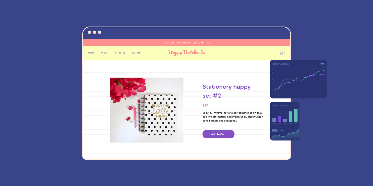
1. Clear, Instantly Understandable Hero Section
The top portion of your product page must communicate three things within two seconds: what the product is, what benefit it provides, and why it matters to the visitor. If someone lands on your page and needs to scroll, squint at small text, or decode vague language to understand what you're selling, they won't. They'll leave.
Product, Benefit, and Value Must Be Obvious Above the Fold
Ambiguous product names force cognitive work. “Aurora Pro Series” means nothing to a first-time visitor. “Wireless Noise-Canceling Headphones for Travel” communicates instantly. The difference isn't subtle. One requires interpretation, the other delivers clarity.
Price Visibility Matters More Than Most Store Owners Realize
Hiding the price or burying it below the fold doesn't prevent sticker shock. It creates suspicion. Visitors assume that if you won't prominently display the price, it's probably higher than they're willing to pay. Show it early, let them self-qualify, and keep the visitors who can afford what you're selling.
Implementation Starts With Ruthless Clarity
Use a product name that describes the item, not just a brand designation. Add a benefit-focused headline stating the primary outcome:
- “Sleep Cooler Through Summer Nights” beats “Premium Temperature-Regulating Fabric Technology.”
Display the price where visitors see it immediately, eliminating budget uncertainty before it becomes a reason to leave.
2. High-Quality, Optimized Product Images
Sharp, professionally lit product photography builds trust faster than any copy you can write. Blurry images, inconsistent lighting, or amateur composition create immediate doubt. Visitors make a snap judgment: if you can't photograph the product well, the product itself is probably substandard.
Images Must Also Load Without Perceived Delay
Research from Lebesgue indicates that product pages with videos can increase conversions by up to 80%. Video shows the product in motion, demo scale, reveals details static images miss, and keeps visitors engaged longer. Someone using the product, explaining features, or showing results outperforms text descriptions every time.
The minimum standard is five to seven high-resolution images showing different angles, close-up details, scale comparisons, and any color or configuration variations. Zoom functionality lets visitors inspect texture, stitching, or build quality. These details matter when someone can't touch the product before buying.
3. Benefit-Driven Product Descriptions
Customers don't care about features until they understand outcomes. “1200-watt motor” is a specification. “Blends frozen fruit in 30 seconds for smooth morning smoothies” is a result someone can visualize and want. The first requires translation. The second communicates value directly.
Most product descriptions bury benefits under technical details. Visitors scan for relevance, not specifications. They want to know what changes in their lives will result from buying this product. Better sleep. Easier meal prep. Less time cleaning. Fewer interruptions during work calls. These outcomes drive purchase decisions, not the technical features that enable them.
4. Social Proof In The Right Places
Reviews reduce perceived risk by showing others have purchased successfully and been satisfied. But placement matters as much as quantity. Burying reviews at the bottom of the page or hiding them behind tabs wastes their persuasive power. Social proof works when it appears near decision points, where visitors evaluate whether to trust you enough to buy.
Display average star rating and total review count prominently near the product name and price. This visibility creates immediate credibility. Feature two to three recent positive reviews without requiring clicks or scrolling. According to the Spiegel Research Center, 93% of consumers say online reviews impact their purchasing decisions.
That threshold provides sufficient social proof that visitors trust the collective judgment.
5. Strong, Frictionless Call To Action
The button visitors click to purchase must be immediately obvious, describe the clear next step, and appear without competing distractions. Weak calls to action use generic text that could mean anything. “Submit” doesn't communicate the outcome. “Click Here” creates uncertainty. “Continue” leaves the destination vague. Strong CTAs use specific, action-oriented language, making the result obvious: “Add to Cart” tells visitors exactly what happens when they click.
A single, visually prominent button in a contrasting color eliminates decision paralysis. Position it above the fold so visitors see it without scrolling, then repeat it below product details for those who need more information before committing. Remove or de-emphasize competing calls to action. “Add to Wishlist,” “Compare,” and “Share” buttons create friction by offering alternatives to the primary goal: purchase.
Button Size Matters More On Mobile
A minimum of 44x44 pixels ensures easy tapping on touchscreens. Smaller buttons force precision tapping, which frustrates mobile visitors and leads to abandonment. The call to action should be the easiest, most obvious interaction on the entire page.
6. Mobile-First Layout
Most traffic is mobile. In many eCommerce categories, 60% to 70% of visitors arrive from mobile devices. Pages designed for desktop and adapted to mobile create friction through tiny text, difficult navigation, and awkward layouts. Mobile visitors encounter horizontal scrolling, buttons too small to tap accurately, and content that requires zooming to read.
Design pages with mobile screens as the primary consideration. Large, touch-friendly buttons. Readable text without zooming, minimum 16-pixel font. Single-column layouts avoid horizontal scrolling. Simplified navigation reducing menu complexity. Test all functionality on actual mobile devices, not just desktop browser simulators that miss real-world touch interactions and rendering issues.
Beating the Design Bottleneck with AI-Powered Mobile Optimization
The traditional approach to mobile optimization required separate design processes, developer coordination, and extensive testing cycles. Each iteration took days. Merchants testing multiple products simultaneously faced a choice: launch with suboptimal mobile experiences or delay while perfecting layouts.
Tools like PagePilot's AI page builder generate mobile-optimized layouts automatically from product links, eliminating the design bottleneck entirely. Store owners can launch multiple product pages with mobile-first layouts in minutes, while competitors are still briefing designers on responsive breakpoints.
7. Speed Optimization
Product pages must load completely within two seconds. Every additional second beyond that threshold compounds abandonment. Visitors are impatient. They expect instant access to information. Slow loading creates frustration before they even see your product, and frustrated visitors don't convert.
Smart Tactics to Speed Up Your Site
Compress all images to the appropriate file sizes. Hero images under 200KB, thumbnails under 50KB. Minimize JavaScript and CSS file sizes, combining files where possible and removing unused code.
Lazy loading defers loading of below-the-fold images until visitors scroll, keeping the initial page load fast. Browser caching prevents returning visitors from re-downloading unchanged resources. Content Delivery Networks serve images and assets from servers geographically close to visitors, reducing latency.
These Strategies Work Together, Not Individually
The critical understanding is that these optimizations create compounding effects rather than isolated improvements. A clear hero section draws visitors to the page, but without high-quality images, they won't trust what they're seeing. Quality images build credibility, but without benefit-driven descriptions, visitors don't understand why they should care.
Social proof validates purchase decisions, but a weak CTA leaves visitors unsure about next steps. Mobile optimization and speed ensure visitors can actually access and interact with all these elements.
The Power of a Unified Strategy
Implementing one strategy while neglecting others creates incomplete experiences. Fast-loading pages with poor images waste the speed advantage. Strong CTAs on pages lacking social proof ask visitors to commit without providing reassurance. Beautiful design that loads slowly loses visitors before they see your optimization efforts.
The Pattern Holds Across Product Categories And Price Points
These seven strategies work because they align with how customers actually evaluate purchases: scanning for relevance, assessing credibility, comparing against alternatives, and evaluating risk before committing. Each strategy supports a specific stage in that sequence. Together, they create a frictionless path from interest to purchase.
But knowing these strategies and implementing them effectively are entirely different challenges.
Related Reading
- Best Shopify Themes For Conversion
- How To Add Frequently Bought Together On Shopify
- Product Recommendations Shopify
- Shopify Order Confirmation Page
- How To Choose A Shopify Theme
- Shopify Websites Examples
- Shopify Variants Vs Options
- How To Add A Pop-Up On Shopify
- How To Customize Shopify Checkout Page
Where Most Stores Go Wrong: Applying These Strategies

Execution fails when stores treat optimization strategies as a checklist rather than a connected system. Knowing you need social proof, fast load times, and clear CTAs doesn't guarantee they'll work together seamlessly.
The breakdown happens when implementation lacks consistency, when pages load slowly despite looking polished, or when testing cycles stretch so long that market opportunities close before you can iterate.
Using Generic Supplier Copy And Images
Stores copy product descriptions straight from AliExpress or wholesale suppliers. Those same words appear on dozens of competitor sites. The same stock photos show identical angles, identical backgrounds, and identical staging.
Technically, the page has a description and images. Functionally, nothing differentiates your product from the identical listing three search results away.
Poor Visual Hierarchy
Visual hierarchy guides attention through a deliberate sequence.
- You notice the product.
- Then the primary benefit.
- Then supporting details.
- The path to purchase.
When that sequence breaks down, customers don't know where to look first. They slow down as they try to orient themselves, and that hesitation compounds into abandonment.
The Power of Letting Elements Recede
A strong hierarchy requires intentional de-emphasis as much as intentional emphasis. Some elements need to recede so others can lead. Reviews don't need bright backgrounds if clear star ratings and quoted text already communicate credibility.
Trust badges work better as subtle reassurance near the CTA rather than prominent graphics above the fold. The product itself should dominate initial attention, not compete with decorative elements fighting for visibility.
Inconsistent Layouts Across Products
One product page positions the CTA above images. Another places it below the description. A third splits the difference with a floating button. One page shows reviews prominently. Another buries them in a tab. One has a detailed size chart. Another mentions sizing only in a single line of copy.
Customers notice inconsistency even if they don't consciously register it. The store feels:
- Less professional
- Less established
- Less trustworthy
When layouts shift unpredictably, visitors hesitate because the experience feels incohesive. They wonder if the business itself is equally inconsistent in how it handles orders, shipping, or returns.
Consistency Builds Subconscious Confidence
When key information appears in predictable locations, customers find what they need faster. They become familiar with your store's structure, reducing cognitive load on subsequent visits. That familiarity translates into faster decisions and higher conversion rates across your entire catalog.
Most stores end up with inconsistent pages because each product gets optimized individually without a unified template. Someone improves:
- Product A's layout.
- Product B gets updated with different ideas.
- Product C launches with whatever seemed best at that moment.
Without a systematic structure, variation creeps in unintentionally.
Slow Pages Caused By Oversized Assets
High-resolution images look impressive on desktop monitors. Videos demo products beautifully. Animation adds polish. Then you check the actual load times and discover that the page takes 4 seconds to become interactive. On mobile, it's worse. Visitors see blank space, then partial loading, then finally usable content.
They don't wait. Two seconds feels tolerable. Three seconds creates impatience. Four seconds trigger abandonment. Every second beyond that threshold compounds the problem exponentially. The page might be perfectly optimized once it loads, but most visitors never see that optimization because they leave before rendering is completed.
The Conflict is Real
Quality visuals build trust and showcase products effectively, but oversized files destroy performance. Stores choose visual quality and sacrifice speed, or they compress aggressively and accept degraded image sharpness. Either choice creates friction.
Solving this requires technical discipline that most store owners don't have time for.
- Image compression without visible quality loss.
- Lazy loading is implemented correctly.
- Code optimization that doesn't break functionality.
- Content delivery networks are configured properly.
Each improvement requires knowledge, tools, and ongoing maintenance as new products get added. Teams using tools like PagePilot's AI page builder avoid this problem entirely by automatically generating pages with optimized assets. Images get compressed appropriately. Layouts load fast on mobile and desktop. Store owners test product viability instead of debugging performance issues, turning technical optimization from a bottleneck into a solved constraint.
Testing Too Slowly, or Not At All
Optimization should be iterative. Test a layout. Measure results. Adjust based on data. Repeat. That cycle works when each iteration takes hours or days. It breaks completely when each change requires coordinating designers, rewriting copy, rebuilding pages, and deploying updates manually.
The Result
Pages look professionally designed. Best practices appear technically implemented. Social proof exists. Images are high quality. Descriptions mention benefits. CTAs use action language. On the surface, everything seems optimized.
Customers still hesitate. Conversion rates plateau. Traffic grows but revenue doesn't scale proportionally. Store owners add more trust badges, rewrite headlines, test different button colors. Small changes yield small results or none at all. The fundamental problem remains unaddressed.
How PagePilot Makes Product Page Optimization Faster

The bottleneck isn't identifying what makes product pages convert. It's building them fast enough to test what actually works in your market.
PagePilot compresses the entire creation process from days into minutes by generating complete, conversion-optimized product pages from a single URL. You input a competitor or supplier link, and the system outputs a ready-to-launch page with upgraded visuals, restructured copy, and proven layouts already applied.
That speed shift turns optimization from a design project into a testing system.
Removing The Redesign Requirement
Traditional optimization means starting from scratch every time. You research competitor pages, draft new copy, source or edit images, build layouts in your page builder, preview on multiple devices, adjust spacing, fix mobile issues, and finally publish. Each product demands the same multi-step process. Testing three different page structures for one product? Triple the timeline.
From Building to Launching with Automated Structural AI
PagePilot eliminates repetition by automating the structural work. The AI analyzes your source URL, identifies what product information matters to buyers, and then generates a complete page using frameworks that already align with purchase psychology.
Hero sections that communicate value instantly. Image galleries showing products from angles customers need to see. Benefit-focused descriptions that answer "why should I care?" before listing specifications.
You're not building pages anymore. You're reviewing and launching them.
Creating Distinction Without Manual Effort
Generic pages happen when stores copy supplier content verbatim. Same product photos on white backgrounds. The same feature lists translated poorly from Chinese. Same vague benefit claims that could describe anything. Your page becomes indistinguishable from two dozen competitors selling identical items, so customers default to price comparison.
Pagepilot Upgrades Source Materials Automatically
Product images get enhanced and differentiated through AI processing, transforming generic supplier shots into visuals that feel unique to your store. Copy gets restructured around specific use cases and outcomes rather than technical specifications nobody understands. The result is a page that positions the same physical product as a distinct offering worth evaluating on its own merits, not just price.
This Matters More As Competition Intensifies
When everyone sources from the same suppliers, distinctiveness determines whether you capture margin or race to the bottom. Manual differentiation requires hiring photographers and copywriters for every SKU. Automated differentiation makes it the default state.
Closing the Strategy-to-Execution Gap
You know social proof should appear near decision points. You understand benefit-driven copy converts better than feature lists. You've read that mobile layouts need touch-friendly buttons and single-column structures. Applying that knowledge consistently across dozens or hundreds of products? That's where execution breaks down.
PagePilot embeds proven structures into every generated page. Social proof appears where hesitation peaks. CTAs stay prominent without competing distractions. Mobile layouts render properly without manual responsive design work. The strategies you know matter get implemented automatically, so pages launch optimized rather than requiring post-launch fixes.
The gap between knowing and doing disappears when the system applies knowledge faster than you can manually.
Start a FREE Trial, Generate 3 Product Pages, and Optimize Smarter
You already know the strategies. You've seen the examples. The question now is whether you'll actually test them against real traffic in your store. Most merchants stop here. They bookmark the article, plan to revisit it later, and keep running the same underperforming pages while wondering why conversions stay flat.
The Alternative is Simpler Than You Think
Start a free PagePilot trial, generate three product pages, and let actual customer behavior show you what converts.
- No credit card required.
- No setup complexity.
Three pages give you enough variation to identify patterns without getting lost in endless testing. You'll see which headlines resonate, which layouts guide purchases, and which product angles create urgency instead of confusion.
Testing this way costs you nothing except the 20 minutes it takes to generate and publish the pages. Waiting costs you every sale you're missing while competitors who move faster capture customers you could have converted. The gap between knowing optimization strategies and applying them profitably closes the moment you start testing real pages against real visitors. Everything before that is just theory.
Start your free PagePilot trial, generate your first three pages, and find out what your customers respond to before you scale the wrong approach across your entire catalog.
Related Reading
- Best Trust Badges For Shopify
- Best One Product Shopify Theme
- Shopify Beauty Stores
- High Converting Product Pages
- Shopify Electronics Store
- Best Shopify Theme For Print On Demand
- Pagefly Alternatives
- Shopify T-shirt Store Examples
- Shopify Contact Us Page Example